CSS Animation
WebKit now supports explicit animations in CSS. As a counterpart to transitions, animations provide a way to declare repeating animated effects, with keyframes, completely in CSS.

With a recent nightly build, you can see the above animation in action.
Let’s take a look at how to use CSS animations, starting with an example of a bouncing box.
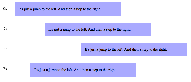
See this example live in a recent WebKit nightly build.
Specifying animations is easy. You first describe the animation effect using the @-webkit-keyframes rule.
@-webkit-keyframes bounce {
 from {
   left: 0px;
 }
 to {
   left: 200px;
 }
}
A @-webkit-keyframes block contains rule sets called keyframes. A keyframe defines the style that will be applied for that moment within the animation. The animation engine will smoothly interpolate style between the keyframes. In the above example we define an animation called “bounce” to have two keyframes: one for the start of the animation (the “from” block) and one for the end (the “to” block).
Once we have defined an animation, we apply it using -webkit-animation-name and related properties.
div {
 -webkit-animation-name: bounce;
 -webkit-animation-duration: 4s;
 -webkit-animation-iteration-count: 10;
 -webkit-animation-direction: alternate;
}
The above rule attaches the “bounce” animation, sets the duration to 4 seconds, makes it execute a total of 10 times, and has every other iteration play in reverse.
Now, suppose you want to party like it is 1995 and make your own super-blink style. In this case we specify an animation with multiple keyframes, each with different values for opacity, background color and transform.
@-webkit-keyframes pulse {
 0% {
   background-color: red;
   opacity: 1.0;
   -webkit-transform: scale(1.0) rotate(0deg);
 }
 33% {
   background-color: blue;
   opacity: 0.75;
   -webkit-transform: scale(1.1) rotate(-5deg);
 }
 67% {
   background-color: green;
   opacity: 0.5;
   -webkit-transform: scale(1.1) rotate(5deg);
 }
 100% {
   background-color: red;
   opacity: 1.0;
   -webkit-transform: scale(1.0) rotate(0deg);
 }
}

.pulsedbox {
 -webkit-animation-name: pulse;
 -webkit-animation-duration: 4s;
 -webkit-animation-direction: alternate;
 -webkit-animation-timing-function: ease-in-out;
}
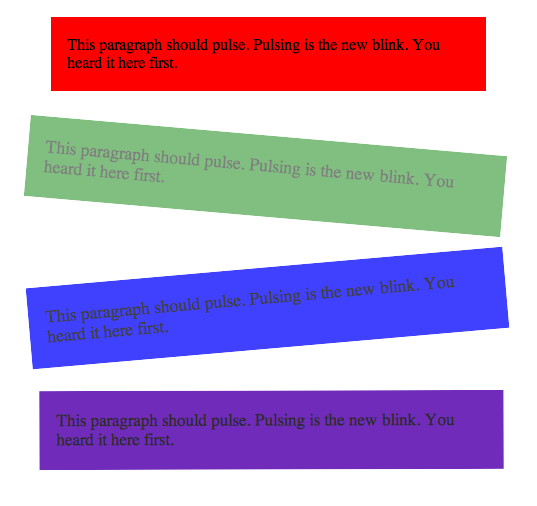
Again, see this example live in a recent WebKit nightly build.
Keyframes are specified using percentage values, defining the moment along the animation duration that the keyframe snapshots. The “from” and “to” keywords are equivalent to “0%” and “100%” respectively.
CSS Animations is one of the enhancements to CSS proposed by the WebKit project that we’ve been calling CSS Effects (eg. gradients, masks, transitions). The goal is to provide properties that allow Web developers to create graphically rich content. In many cases animations are presentational, and therefore belong in the styling system. This allows developers to write declarative rules for animations, replacing lots of hard-to-maintain animation code in JavaScript.
The other good news is that the WebKit on iPhone 2.0 already supports CSS Animations (as well as CSS Transforms and CSS Transitions). The iPhone implementation has been optimized for the platform so you get fantastic performance. Combining animations, transitions and transforms allows for some really impressive content.
We’re documenting these enhancements on webkit.org and are proposing the specifications to standards bodies. Note that since they are currently features specific to WebKit they are implemented with a -webkit- prefix, although the specifications do not use the prefix.
You can find more examples on Apple’s Web Applications Developer Center.
As always, leave feedback in the comments and file bugs at http://bugs.webkit.org/.