Make creative borders with background-clip border-area
How’d you like to use CSS to easily create a border from an image or gradient? Like this…

For years, we’ve had the ability to create a border using border-image — where an image gets sliced up into nine pieces and reassembled to separately construct the corners and sides of a box. Now with background-clip: border-area, we can instead apply a background image to a border. It can simply fill the whole border in one piece.
Support for background-clip: border-area is available today in Safari Technology Preview and in Safari 18.2 beta.
Walking through a basic example
Here’s how it works. First, we’ll create a basic header in HTML, and use typical CSS to style our headline and page.
<header>
  <h1>Woodworking</h1>
</header>
Now, let’s add a border to the <header> box.
header {
  border-width: 30px;
  border-style: solid;
}
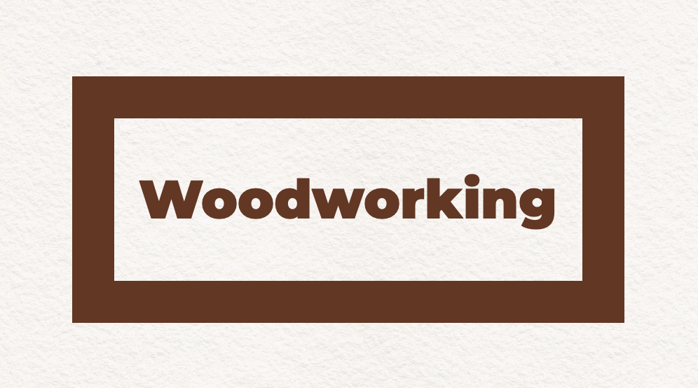
Next, we’ll add a background image to the box.
header {
  background-image: url("wooden-table.jpg");
  background-size: cover;
  background-origin: border-box;
}
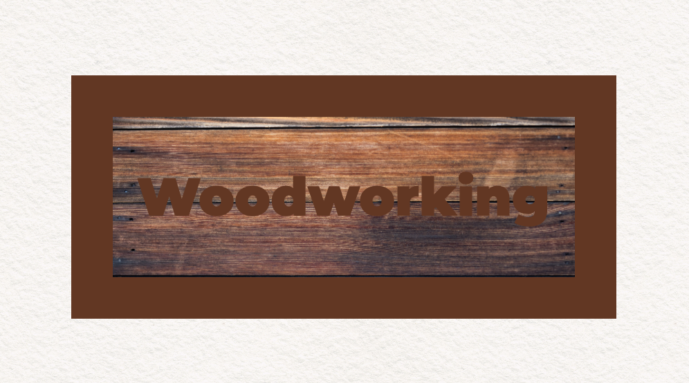
By applying background-size: cover we tell the browser to resize the image so it fills the whole box, while maintaining its natural aspect ratio. It “covers” the box, leaving no empty space, cropping off extra in one direction if necessary.
We also must remember to apply background-origin: border-box to make the background image extend fully to the outer edge of the border, instead of only extending to the edges of the padding box and repeating. If we forget this step, we’ll get unexpected buggy-looking results. (For more about why, see the explanation at the end of this article.)
Now, to get the effect we want, we’ll do two things — 1) make the border transparent so we can see the background image underneath the border, and 2) clip the background to only appear in the area defined by the border, and not inside the padding or content boxes.
header {
  border-color: transparent;
  background-clip: border-area;
}
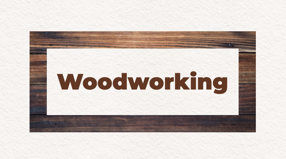
Fantastic! We created a border out of a whole image! Let’s put together all the code for this effect:
header {
  border-width: 30px solid transparent;
  background-image: url("wooden-table.jpg");
  background-size: cover;
  background-origin: border-box;
  background-clip: border-area;
}
Many possibilities
We can further control the background’s size, repeat, and position by using the background properties. And we can create many different kinds of backgrounds using background-image — with image files, linear gradients or radial gradients.
This also works with any kind of border. With border-style we can change the type of border to dotted, dashed, double, or more. Of course, we can change the thickness with border-width and use border-radius to round the corners. We can define borders on just certain sides of the box — anything possible today with borders works with this technique.
Plus, with the ability to add multiple backgrounds to a box, you can also include a background for the content or padding box, clip the background to the text, and more. Let’s dig into the possibilities with more examples.
Gradient border for an illustration
We can put a fancy border on an illustration while using padding to add a bit of extra space between the content and the border.
<figure>
  <img src="illustration.png" alt="[include alt text]">
</figure>
Let’s apply a gradient background to the figure, and remember to use background-origin: border-box to make the background extend behind the border. We’ll add a 30px wide transparent border. And clip the background to the border to create the magic.
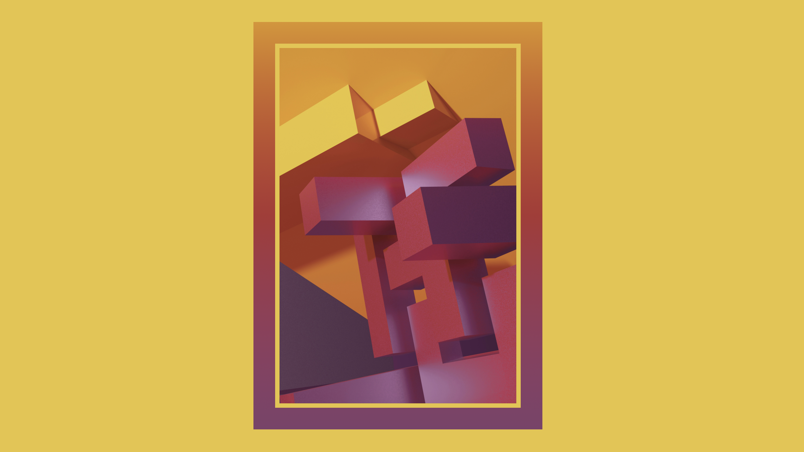
@supports (background-clip: border-area) {
  figure {
    background-image: linear-gradient(in hsl, #dc9323, #7f416a);
    background-origin: border-box;
    border: 30px solid transparent;
    background-clip: border-area;
    padding: 6px;
  }
}
We can put all the styles for the border in a Feature Query to ensure they only apply when background-clip: border-area is supported by the browser. If it’s not supported, there won’t be a border. Or, if we’d like, we can provide a solid-color border for browsers without support.
@supports not (background-clip: border-area) {
  figure {
    border: 30px solid #a8363d;
    padding: 6px;
  }
}
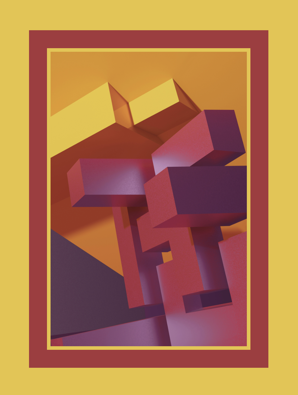
This is the kind of graphic design feature that can easily be applied today as a progressive enhancement — one that takes effect in browsers with support, with a fallback for those that don’t.
Gradient button border and text
So how do we code the demo from the beginning of this article? In the future, it might just be the most-popular use case for background-clip: border-area.

The border is filled with a linear gradient background “image”, using the same technique described above. If that’s all we wanted to do, we would use this code:
button {
  border: 10px solid transparent;
  background-image: linear-gradient(to bottom right in hsl, green, purple);
  background-origin: border-box;
  background-clip: border-area;
}
But the border isn’t the only thing that has a background gradient. The text does as well. To accomplish this, we’ll define the linear-gradient background twice on the button — once to be the background of the border, and again to be the background of the text. And we’ll define two values for background-clip — once to tell the browser to clip the first background to the border-area, and again to clip the second background to the text.
button {
  background-image: linear-gradient(to bottom right in hsl, green, purple),
                    linear-gradient(to bottom right in hsl, green, purple);
  background-clip:  border-area,
                    text;
}
We also need to set our text color to transparent, just like how we set the border color to transparent — making both the text and border “invisible”, so their backgrounds can shine through.
Here’s everything put together:
button {
  color: transparent;
  border: 10px solid transparent;
  border-radius: 100px;
  background-image:  linear-gradient(to bottom right in hsl, green, purple),
                     linear-gradient(to bottom right in hsl, green, purple);
  background-origin: border-box;
  background-clip:   border-area,
                     text;
}
You can also see the full demo to dig into how we used Feature Queries to structure fallbacks for browsers without support.
background-clip: text
Oh, did you not know you can use background-clip to fill text with a background image or gradient? This ability was first invented by the folks at Apple and shipped in Safari 3.2 in 2008 (and later forked into Blink). After it was drafted at the CSS Working Group, it was unprefixed in Safari 5 in 2010, added to Firefox in 2016, unprefixed in Chrome/Edge 120 in December 2023, and unprefixed in Samsung Internet in May 2024.
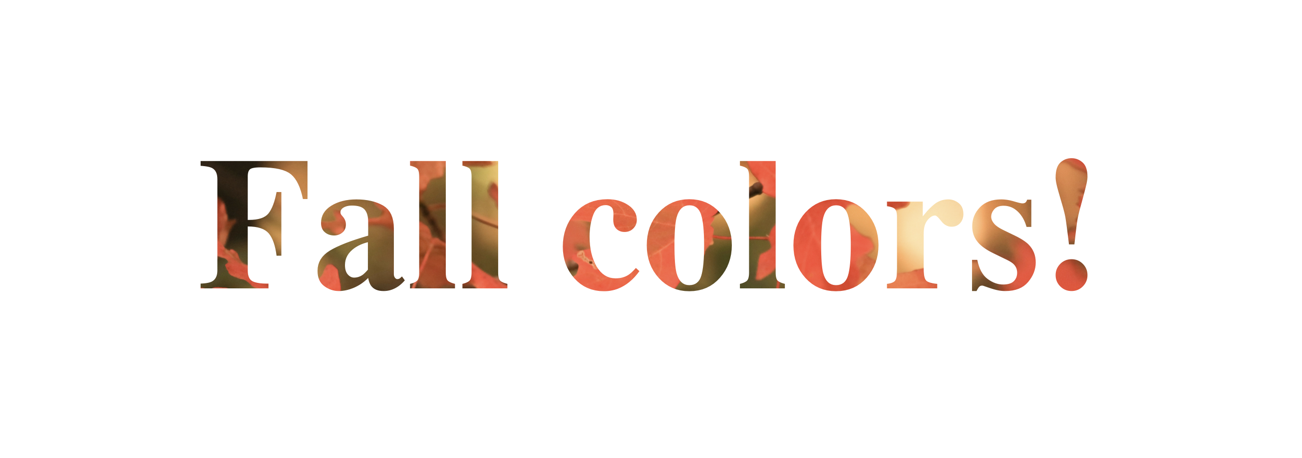
The idea is just the same. Put a background on the box. Clip that background to fill only where the text lives. And make the background visible by making the text itself transparent.
Since there are still browsers without support for the unprefixed version, it’s important to include the prefixed version and/or wrap this code in a feature query — otherwise if background-clip: text is not supported when color: transparent is applied, the text will become completely invisible.
@supports (background-clip: text) or (-webkit-background-clip: text) {
  h1 {
    background-image: url('leaves.png');
    background-size: cover;
    background-position: center;
    -webkit-background-clip: text; /* to support Blink browsers */
    background-clip: text;
    color: transparent;
  }
}
With care, however, there are amazing things that you can do with background-clip: text.
Future changes coming
By the way, the CSS Working Group recently resolved to make it possible to clip a single background layer to both the border and the text at the same time (by specifying both clip values together, e.g. border-area text), so in the future you won’t have to declare their shared background twice.
And last week, the CSS Working Group resolved to automatically default background-origin to border-box anytime background-clip: border-area is used in the background shorthand.
These two changes mean that in the future instead of writing:
button {
  background-image:  linear-gradient(to bottom right in hsl, green, purple),
                     linear-gradient(to bottom right in hsl, green, purple);
  background-origin: border-box;
  background-clip:   border-area,
                     text;
}
You will be able to combine all the background values into a single rule, like this. Notice you don’t have to bother with background-origin.
button {
  background: border-area text linear-gradient(to bottom right in hsl, green, purple);
}
There’s also discussion happening at the CSSWG about possibly changing the initial value of border-color to not always be currentColor, but to instead look for the presence of background-clip: border-area and in that case, automatically set color to transparent instead. That would save you from forgetting to do so.
None of these changes will be make it into Safari 18.2 beta. Keep an eye on the Safari Technology Preview release notes and test it out. Meanwhile, declaring the intended result for both color & background-origin and specifying the same background multiple times for multiple clips is the way to ensure the results you want.
Warning sign
Let’s see what we can make if we just put the border on two sides of a box, not all four. Gradients can have hard stops, allowing us to make stripes…

.stripes {
  border: 0px solid transparent;
  border-block-width: 0.5lh;
  background-clip: border-area, border-box;
  background-image:
    repeating-linear-gradient(
      45deg,
      transparent,
      transparent 15px,
      red 15px,
      red 30px),
      none;
  background-origin: border-box;
}
Photo with photographic double border
Let’s use a photograph for the background of the border — the same image as the content, along with padding and a double border.
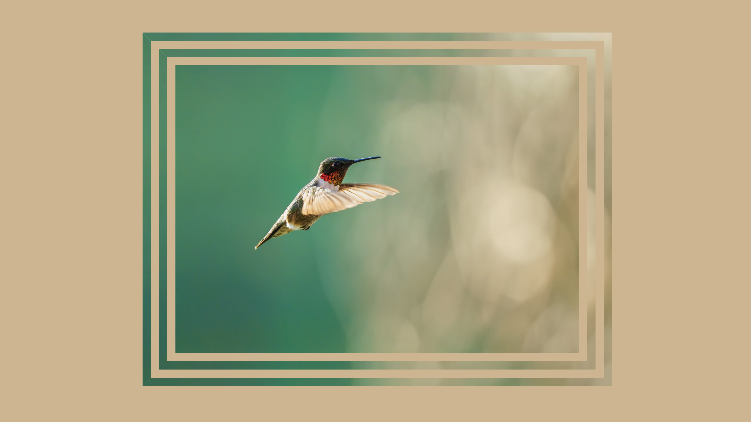
figure {
  border: 21px double transparent;
  background-clip: border-area;
  background-origin: border-box;
  background-size: cover;
  background-image: url('bird.jxl');
}
Using borders as rings to display data
We can also use a border on a round box (also known as a circle) to create a progress ring. A conic gradient with hard stops can illustrate how much progress has been made.
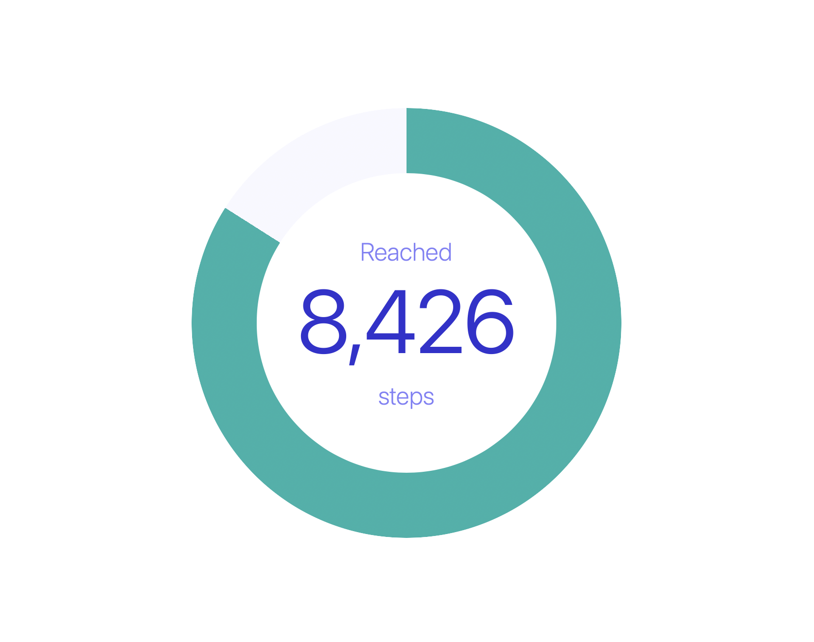
<figure style="--percent:84%">
  Reached <span>8,426</span> steps
</figure>
@property --start {
  syntax: "<angle>";
  inherits: false;
  initial-value: 0deg;
}
figure {
  aspect-ratio: 1;
  border-radius: 50%;
  border: 5rem solid transparent;
  background-image: conic-gradient(from var(--start),
                    lightseagreen 0 var(--percent),
                    ghostwhite var(--percent) 100%);
  background-origin: border-box;
  background-clip: border-area;
}
You can see the full demo on CodePen, along with all of the demos.
And, if you’d like, try animating the circular border to have it load dynamically. Or build something similar, with animation, as a loading graphic.
background-origin: padding-box vs border box
Earlier we described the importance of remembering to include background-origin: border-box. Why? What’s happening?
By default, background-origin: padding-box makes the background extend to cover the content and its padding, not the space where the border exists. It then repeats the background in each direction, under the border. You’ve probably rarely noticed, because when the border is solid, you can’t see the background behind it.
Let’s look at this dynamic when the border is dotted.
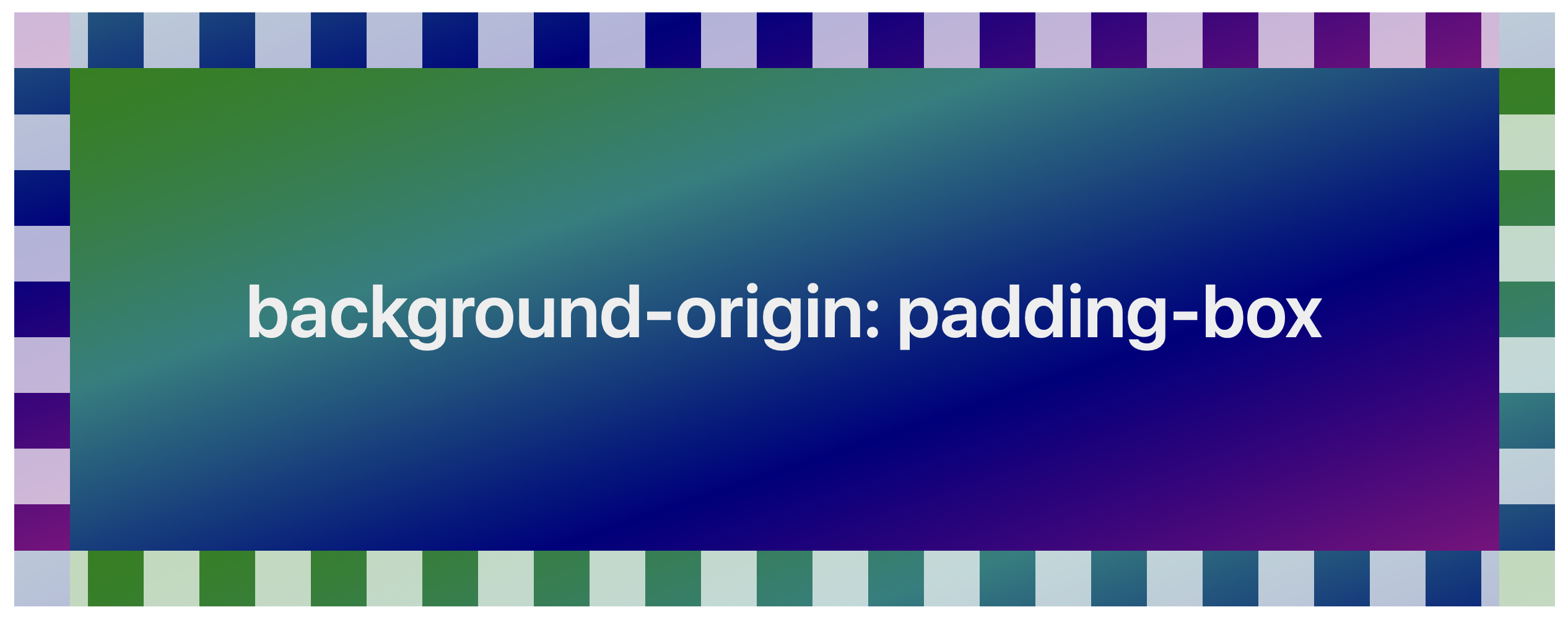
It might seem mysterious why the background is “randomly” completely different colors. But actually, it does make sense. The background is green on the left, and purple on the right. And it’s being repeated. Let’s make the border transparent so it’s clearer how the repeat is working:
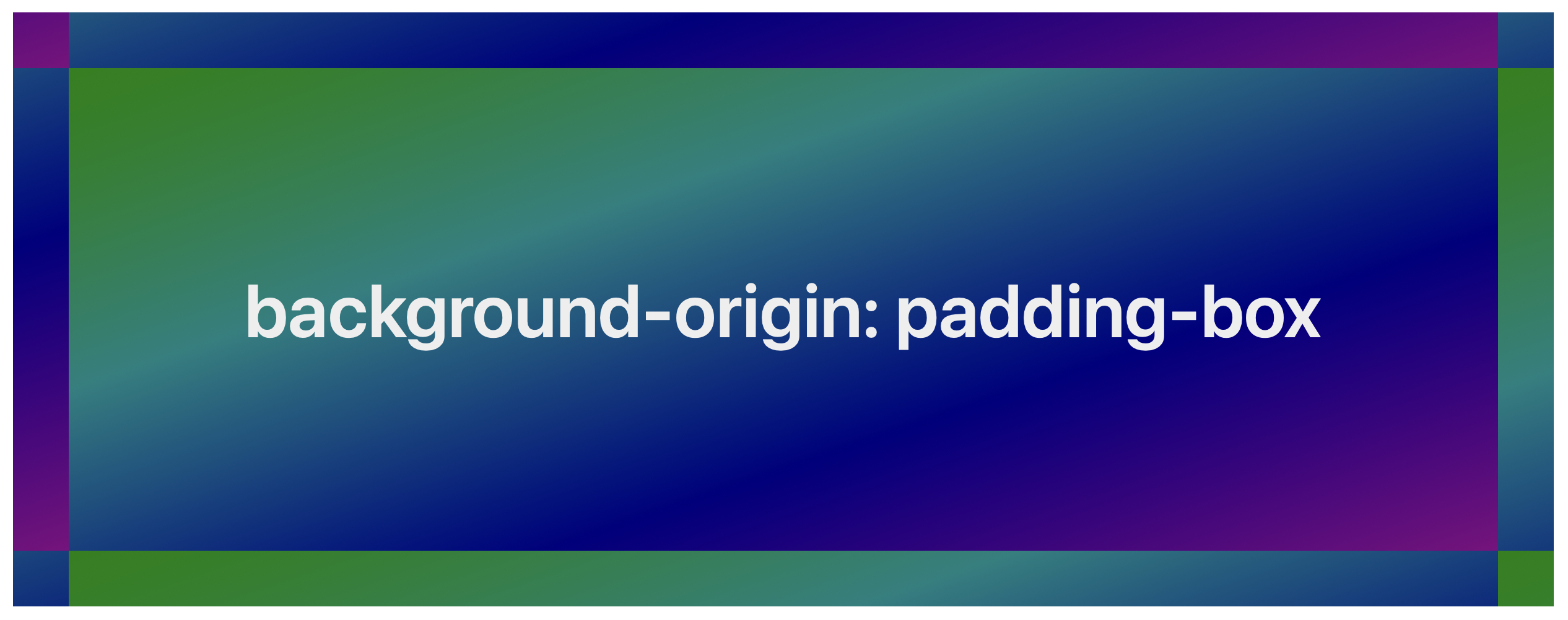
If you like this effect, great! But it’s very likely that’s not what you are looking for. When we change background-origin to border-box the background runs from edge to edge of the border-box. And we can create the effect we want to using background-clip: border-area.
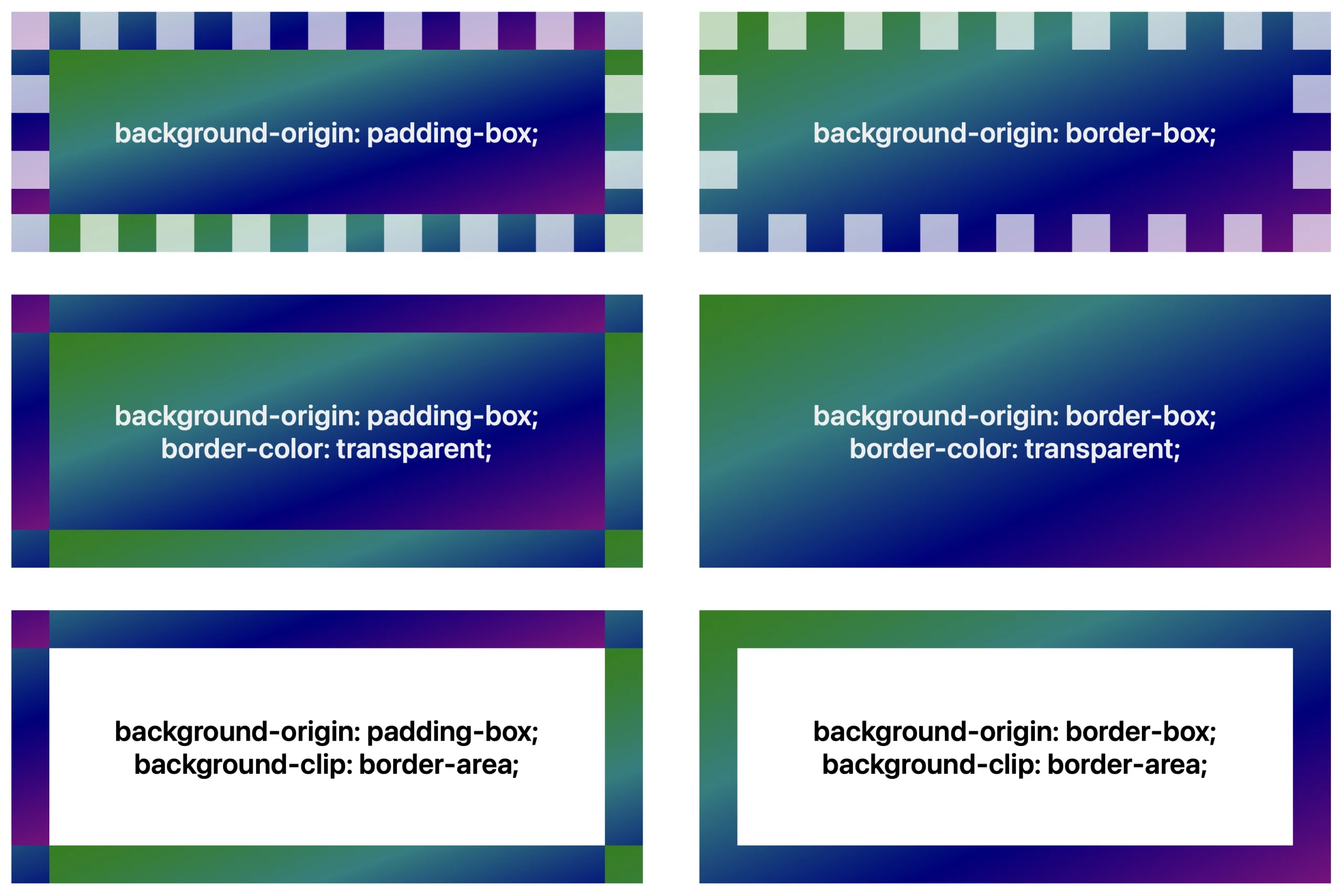
Arguably the default should have always been background-origin: border-box — especially since the default for background-repeat is repeat, which results an unexpected visual pattern when combined with background-origin: padding-box. Perhaps this is something else to add to the CSSWG List of Mistakes. Meanwhile, declaring * { background-origin: border-box } is a change that universal reset stylesheets could offer to every site… although that’s only partially helpful, since anytime you use the background shorthand, background-origin will get reset to its default.
Bottom line — if you are using background-clip: border-area and are surprised and confused about what’s happening, you probably need to apply background-origin: border-box.
Conclusion
Simple effects in CSS, like using background-clip, can really help you make a website that’s unique to the project it represents.
You can see all of the demos in one place on CodePen. Try them in Safari Technology Preview or in the beta for Safari 18.2.
What do you think? What will you use this feature to create? Let us know on Bluesky at @jensimmons.bsky.com or on Mastodon at @jensimmons@front-end.social. We can’t wait to see what you make.