Better typography with text-wrap pretty
Support for text-wrap: pretty just shipped in Safari Technology Preview, bringing an unprecedented level of polish to typography on the web. Let’s take a look at what the WebKit version of pretty does — it’s probably a lot more than you expect. Then, we’ll compare it to balance and the other text-wrap values to better understand when to use which one.
Ideas of what makes for “good” typography are deeply rooted in eras when type was set by hand using metal, wood, or ink. Typesetters took great care when deciding if a word should go on the end of one line, the beginning of the next, or be broken with a hyphen. Their efforts improved comprehension, reduced eye-strain, and simply made the reading experience more pleasant. While beauty can be subjective, with disagreements about what’s “better”, there are also strongly-held typographic traditions around the globe, representing various languages and scripts. These traditions carry people’s culture from one generation to the next, through the centuries.
In digital typography, a computer places all the words, not humans. Often, as a web designer or developer, you are creating a template to be filled with different versions of content. There is no “hand tweaking” typography on the web, especially when the layout is fluid, reflowing to fit different shapes and sizes of screens. So what can we do now to better express the expectations of quality from traditional typography, while still relying on the mechanization brought by today’s computers?
One solution is text-wrap:pretty. It’s intended to bring a new level of polish to type on the web by leveraging paragraph-based algorithms to solve long-standing problems.
Better typography
There are several things certain typographic traditions teach you to do:
- Avoid short last lines. You want to avoid leaving a single word by itself on the end of a paragraph. It can look quite strange, and make space between paragraphs look mistakenly large.
- Avoid “bad rag”. You can look at the ragged edge of the text (the inline-end side) and note whether the general length of lines is kind of consistent, or whether the rag is very jagged. When hand setting, typographers would move words around to minimize visual differences between adjacent lines — to avoid bag rag. “Good rag” increases readability of the text, and makes the entire block of text look more pleasing.
- Avoid poor hyphenation. For languages that can be hyphenated, hyphenation helps create good rag. It also breaks a word into pieces, and places those pieces as far apart as possible in the inline dimension. This adds to the cognitive load when reading. It’s best to minimize the use of hyphenation and to avoid hyphenating two lines in a row.
- Avoid typographic rivers. If you know to look for rivers, you might start to notice that sometimes the spaces between words randomly line up across lines, creating a path of whitespace through the paragraph. Rivers can be distracting.
You can see these four problems in the following example. The text is identical on both the left and the right.
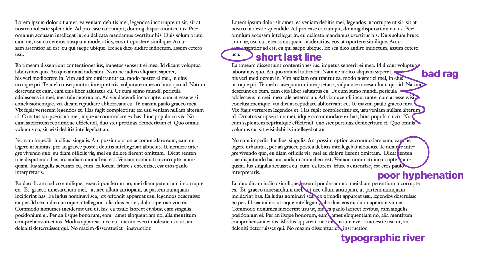
Designers and typographers often use hyphenation and/or justification to help improve rag, but on the web, neither provides satisfying results. Until recently, it’s been impossible to do much of anything about short lines, bad rag, or rivers on the web. We’ve just lived with them.
Web line layout since 1991
For over 30 years, the web had only one technique for determining where to wrap text.
The browser starts with the first line of text, and lays out each word or syllable, one after another until it runs out of room. As soon as it has no more space to fit another word/syllable, it wraps to the next line (if wrapping is allowed). Then it starts on the next line, fitting all the content it can… then when it runs out of room, it wraps… and starts working on the next line.
It’s always thinking about only one line at a time. It wraps whenever it needs, after it’s fit the maximum amount of content on the previous line. If hyphenation is turned on, it will hyphenate whatever word is last on the line, at whatever point leaves as much of the word on the previous line as possible. Nothing else is taken into consideration — which is why text on the web has bad rag, rivers, short last lines, and hyphenation that makes no sense.
This is not required by the fact that text is laid out by a computer. For decades, software like Adobe InDesign and LaTeX has evaluated multiple lines of text at a time as they decide where to end one line and begin the next. It’s just that the web didn’t use a multiline algorithm. Until now.
We are excited to bring this capability to the web for the first time, in Safari Technology Preview 216.
text-wrap: pretty
Now, the web has the ability to evaluate the whole passage of text when figuring out where best to wrap. You can ask browsers to do this by using text-wrap: pretty. WebKit is not the first browser engine to implement, but we are the first browser to use it to evaluate and adjust the entire paragraph. And we are the first browser to use it to improve rag. We chose to take a more comprehensive approach in our implementation because we want you to be able to use this CSS to make your text easier to read and softer on the eyes, to provide your users with better readability and accessibility. And simply, to make something beautiful.
Safari Technology Preview 216 prevents short lines, improves the rag, and reduces the need for hyphenation — across all of the text, no matter how long it is. We are not yet making adjustments to prevent rivers, although we’d love to in the future.
While support for pretty shipped in Chrome 117, Edge 177, and Opera 103 in Fall 2023, and Samsung Internet 24 in 2024, the Chromium version is more limited in what it accomplishes. According to an article by the Chrome team, Chromium only makes adjustments to the last four lines of a paragraph. It’s focused on preventing short last lines. It also adjusts hyphenation if consecutive hyphenated lines appear at the end of a paragraph.
The purpose of pretty, as designed by the CSS Working Group, is for each browser to do what it can to improve how text wraps. The CSS Text Level 4 specification currently defines it like this, (where “user agent” means the web browser, emphasis added):
The user agent may among other things attempt to avoid excessively short last lines… but it should also improve the layout in additional ways. The precise set of improvements is user agent dependent, and may include things such as: reducing the variation in length between lines; avoiding typographic rivers; prioritizing different classes of soft wrap opportunities, hyphenation opportunities, or justification opportunities; avoiding hyphenation on too many consecutive lines.
The use of the word “may” is very meaningful here. It’s a clear statement that each browser gets to decide for itself exactly what pretty should do. There is no mandate for every browser to make the same choices. In fact, a browser team might decide in 2025 to handle some aspects of improving these qualities, and then change what their implementation does in the future.
Because of the way Chrome’s implementation of pretty has been taught, a lot of web developers expect this value is only supposed to prevent short last lines. But that was never the intention. In fact, the CSS Working Group defined a different value for such a purpose. It was just renamed last week to text-wrap: avoid-short-last-lines.
Take a look
You can try out text-wrap: pretty today in Safari Technology Preview 216. Check out this demo where you can toggle pretty on and off to see its effects. You can also toggle hyphenation or justification to try out any combination. Show guides and show ghosts will help you understand what’s happening. Or try out text-wrap: balance to see the difference. The demo has content in English, Arabic, German, Chinese and Japanese so you can see the effects in different writing systems.
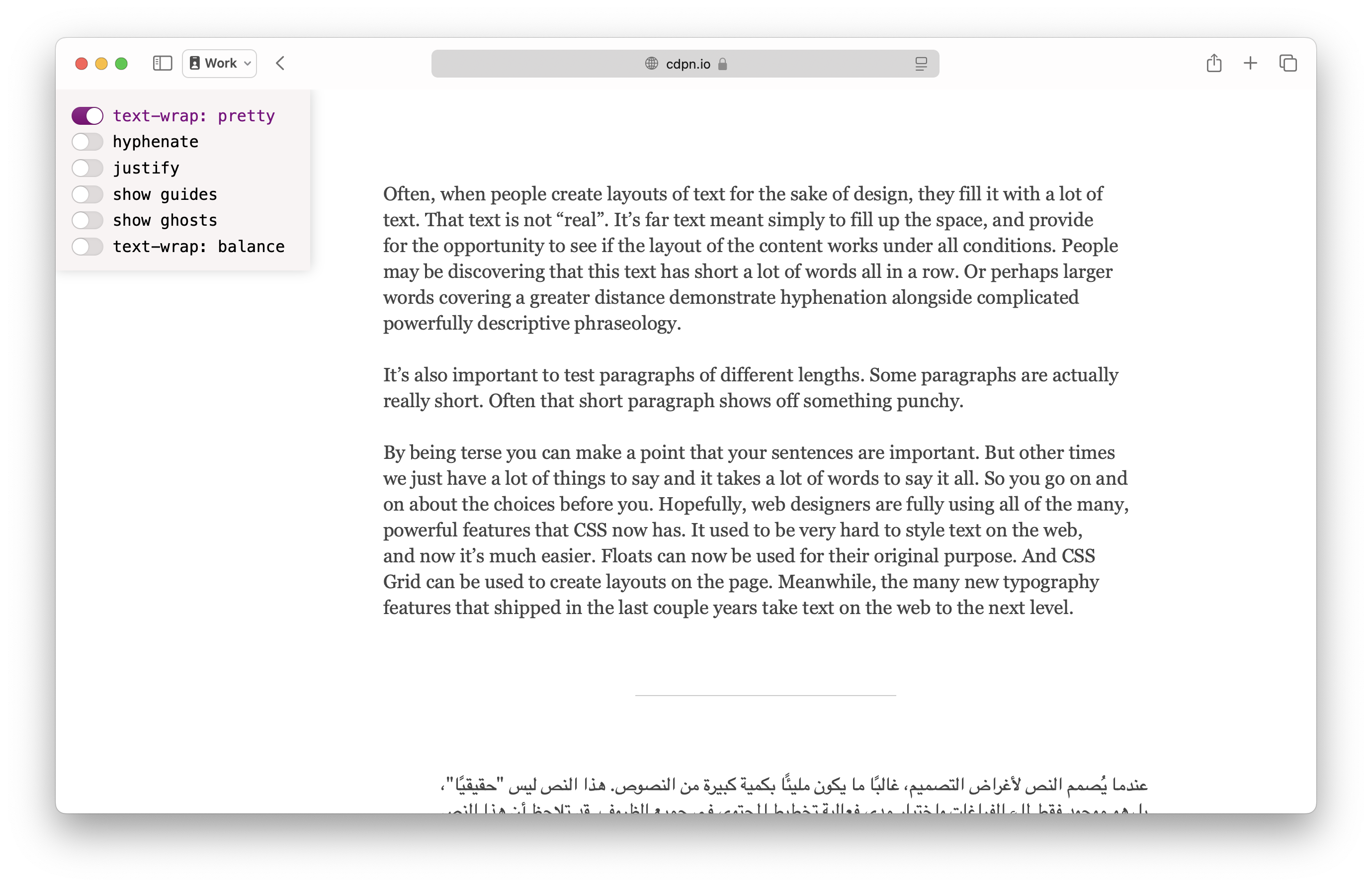
Here’s a sample of text in English, without applying text-wrap. This is the default wrapping algorithm the web has had for years. I’ve turned on “show guides” to mark the edges of the text box. The green line marks the inline-end edge of the box — where the line layout algorithm is aiming for each line to reach. The browser wraps when the text reaches this green line.
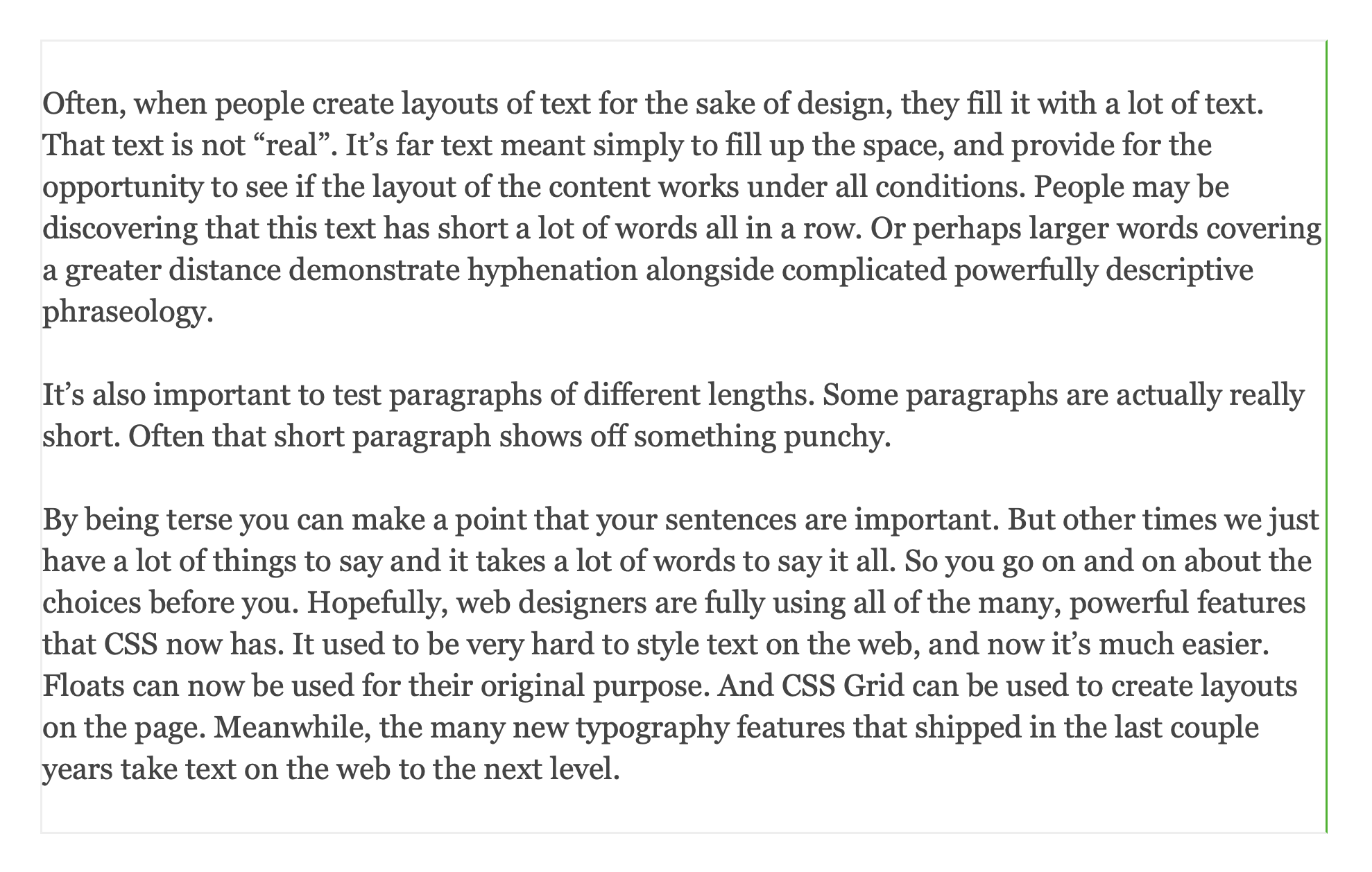
And here’s how the same text looks instead with text-wrap: pretty applied. The green line has moved. Now, the browser instead aims to wrap each line sooner than the maximum limit of the text box. It wraps within the range, definitely after the magenta line, and definitely before the red line. This improves the rag.
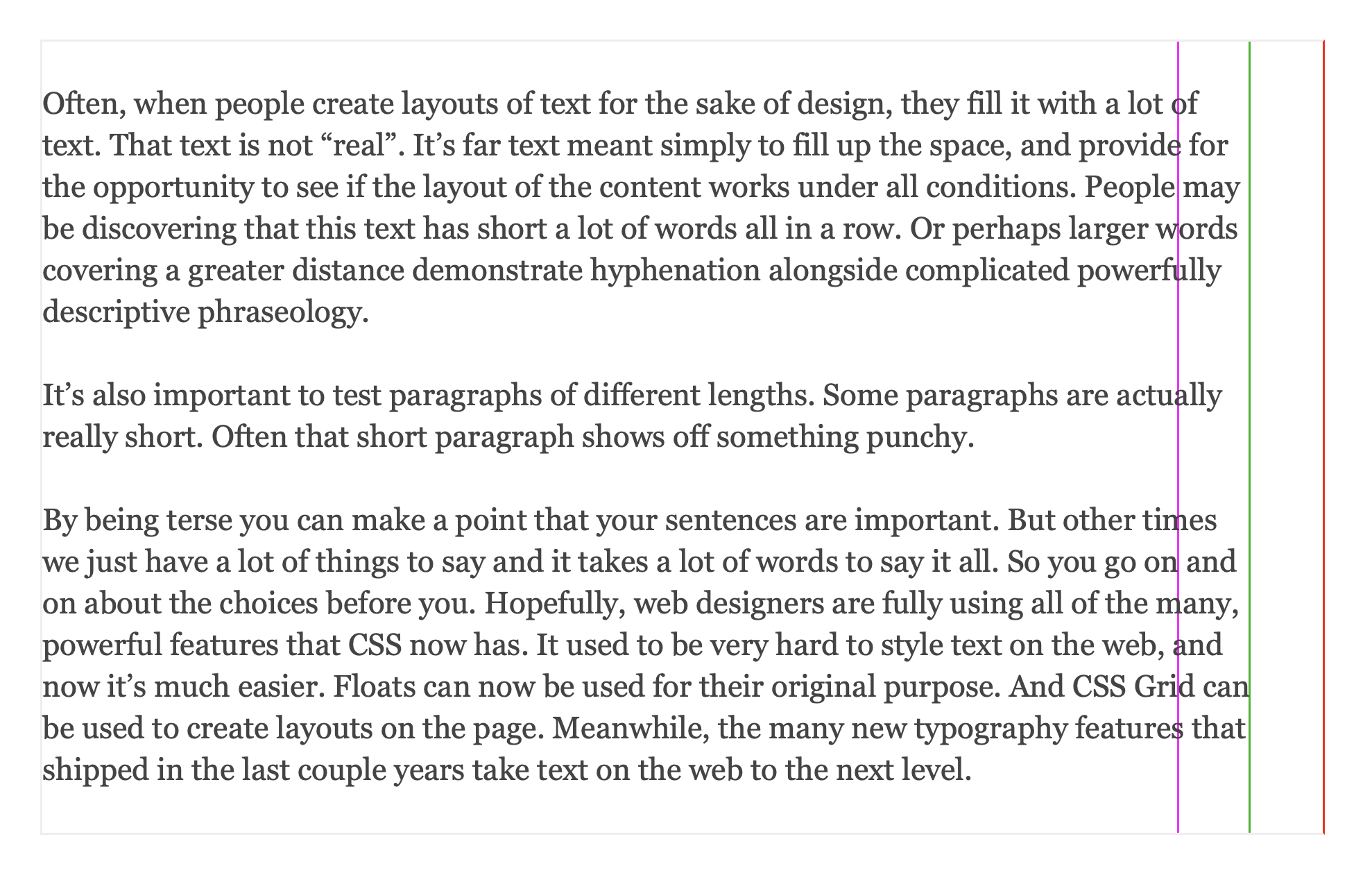
You can also “show ghosts” to view the unprettified version as a ghost in the background.
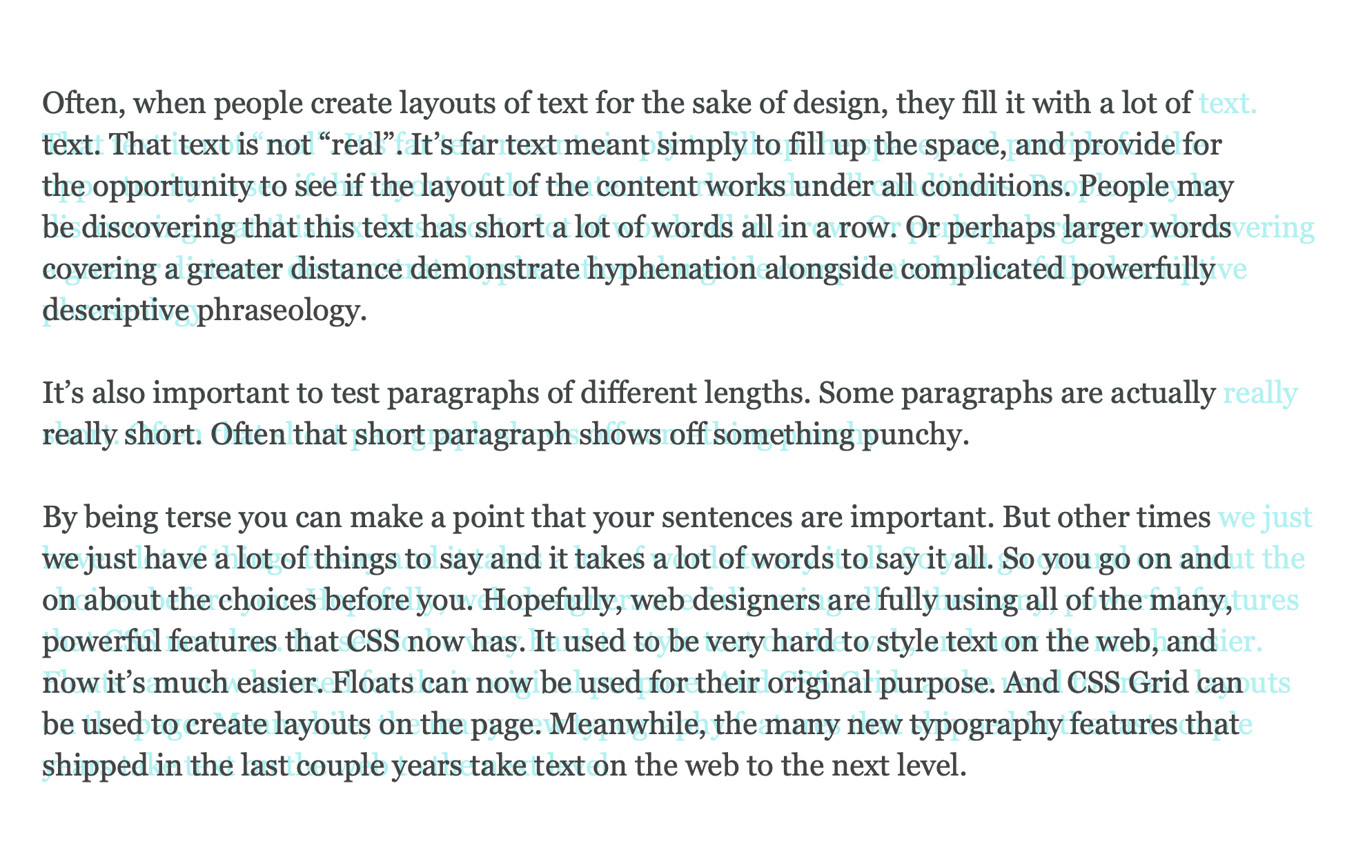
You can also toggle hyphenation and justification on and off to compare different combinations. Resize the browser window, and see what happens at different widths of text.
You might notice that since Safari Technology Preview applies pretty to every line of text, not just the last four lines, it has a more significant impact on the text. The block of text becomes more of a solid rectangle.
You really have to typeset body text with text-wrap: pretty to see just how much of a difference it makes. It’s subtle, but remarkable. Combine this with paragraph margins of 1lh, and the text starts looking fantastic.
So why doesn’t every browser do everything it can to make the text look better? Because of performance.
Performance
Many developers are understandably concerned about the performance of text-wrap: pretty. While better typography is visually pleasing — it cannot come at the expense of a slower page. Each browser engineering team must think about the hardware and chips their users have when deciding how to set limits.
We are thrilled with the work we’ve done to ensure Safari users don’t experience a negative performance impact, even when web developers apply text-wrap: pretty to a lot of content on the web page.
One thing to know as a developer, the performance of text-wrap is not affected by how many elements on the page it’s applied to. Perf concerns emerge as the pretty algorithm takes more and more lines into consideration as it calculates what to do. In WebKit-based browsers or apps, your text element would need to be many hundreds or thousands of lines long to see a performance hit — and that kind of content is unusual on the web. If your content is broken up into typical-length paragraphs, then you have no reason to worry. Use text-wrap: pretty as much as you want, and rely on our browser engineers to ensure your users will not experience any downsides.
We might decide to add a mechanism to take really long paragraphs and break them up into more reasonable chunks, where WebKit evaluates each chunk separately. If we do so, then even 1,000-line paragraphs won’t affect performance. That’s the approach Adobe InDesign takes. It improves the layout of all lines of text, but it doesn’t evaluate an infinite number of lines inside each paragraph all at once, in one pass. There also might be other ways the WebKit team discovers to balance beauty and speed, ensuring pretty does the most to improve all of your text without affecting the users experience of our incredibly fast browser.
Test out text-wrap: pretty in Safari Technology Preview 216 today, and let us know if you can trigger a performance impact. File an issue at bugs.webkit.org, so we can consider such feedback as we polish this feature before shipping in Safari itself.
When to use pretty vs balance?
Clearly, text-wrap: pretty is designed to make body text more beautifully typeset. But is that the only use case for it? What about text-wrap: balance? When should we use pretty or balance?
There are people who will give you an overly simple answer like “pretty is for paragraphs and balance is for headlines” — but that’s likely bad advice. Let’s look at what balance does in contrast to pretty and how to decide which one to use on headlines, captions, teasers, and other kinds of shorter, wrapped text.
text-wrap: balance
Basically, the text-wrap: balance rule tells the browser to wrap in such places to make every line be about the same length as the others. I think of it like folding a piece of paper into halves, or thirds, or quarters.
For example, here’s a headline with the default of text-wrap: auto. You can see that the word “enough” ends up as the first word of the second line, simply because there wasn’t enough space for it on the first line after “with”. Each line is laid out one-by-one, with no regard for the others. This causes this headline to end up with the word “itself” alone on the last line.

Here’s a similar headline with text-wrap: balance applied. There’s no longer a single word by itself on the last line. That’s great! But that’s not all. The last line is now the about same length as the other two. The first line is made significantly shorter so that its length is “balanced” with the length of the others. All three lines basically have the same length.
You’ll notice that as a result, the visual imprint of the headline / the chunk of “ink” on the page is now significantly narrower than the overall space available in its container (marked here with a cyan line).

This can be fantastic for your design. You can apply balance to headlines, captions, teasers, any shorter types of copy and it will have the same effect. It will stack the lines of text so they’re all about the same length — they are balanced. And once the text has been wrapped, it will likely not fill the box anymore. It will be narrower than the available space.
Sometimes, that’s not a desirable effect. Perhaps your headline sits under a teaser image, and the design calls for the text to be the same width as the image. You’ll notice that in this example, the first line ends up shorter than the rest. Balancing the text might come at too high a cost. Perhaps all you wanted to do is avoid a short last line.
You can instead use text-wrap: pretty on such headlines. This will avoid the short last line, while also still filling the container in the inline direction.

You can try out these examples yourself in Safari Technology Preview 126+ and Chrome/Edge 130+ to dive more into the effect of text-wrap on long, medium, and short headlines. Drag the corner of the boxes to see just how differently they handle wrapping.
What are the performance considerations for text-wrap: balance? Again, the CSS web standard leaves it to the browser engine to decide what kind of limits should be in place to ensure the users experience is not negatively impacted. Browsers do not have to make the same choices as each other.
The Chromium implementation limits the number of lines that are balanced to four to ensure Chrome, Edge and other Chromium browsers will still be fast. The WebKit implementation doesn’t need to limit the number of lines. Every line will be balanced with all of the others.
So if “pretty is for body text and balance is for headlines” is too simplistic a recommendation to be good advice, what might be a better way to think about the choice?
I think about it like this:
prettycan be applied to anything on the page — body text, headlines, captions, teasers, etc. Look to see what it does and if you like the effect. If you have incredibly long paragraphs (or better said: long body text without any paragraphs breaking it up, think in the hundreds or thousands of lines of text), test performance first. Also, if you are animating text in such a way that it rewraps as it animates, test to see if that’s a good idea.balanceshould be used for anything where you want all the lines to be the same length — especially headlines and captions, etc. And where you do not mind if the overall group of lines is narrower than its container. Don’t use it on long passages of text; that doesn’t make sense.autois the default, which currently considers just one line at a time as layout is calculated, like the web has since 1991 (see below).stableshould be used for editable text and more (see below).
Unconvinced that text-wrap: balance won’t usually make sense on long passages of text? Well, you can try it out in this same demo.
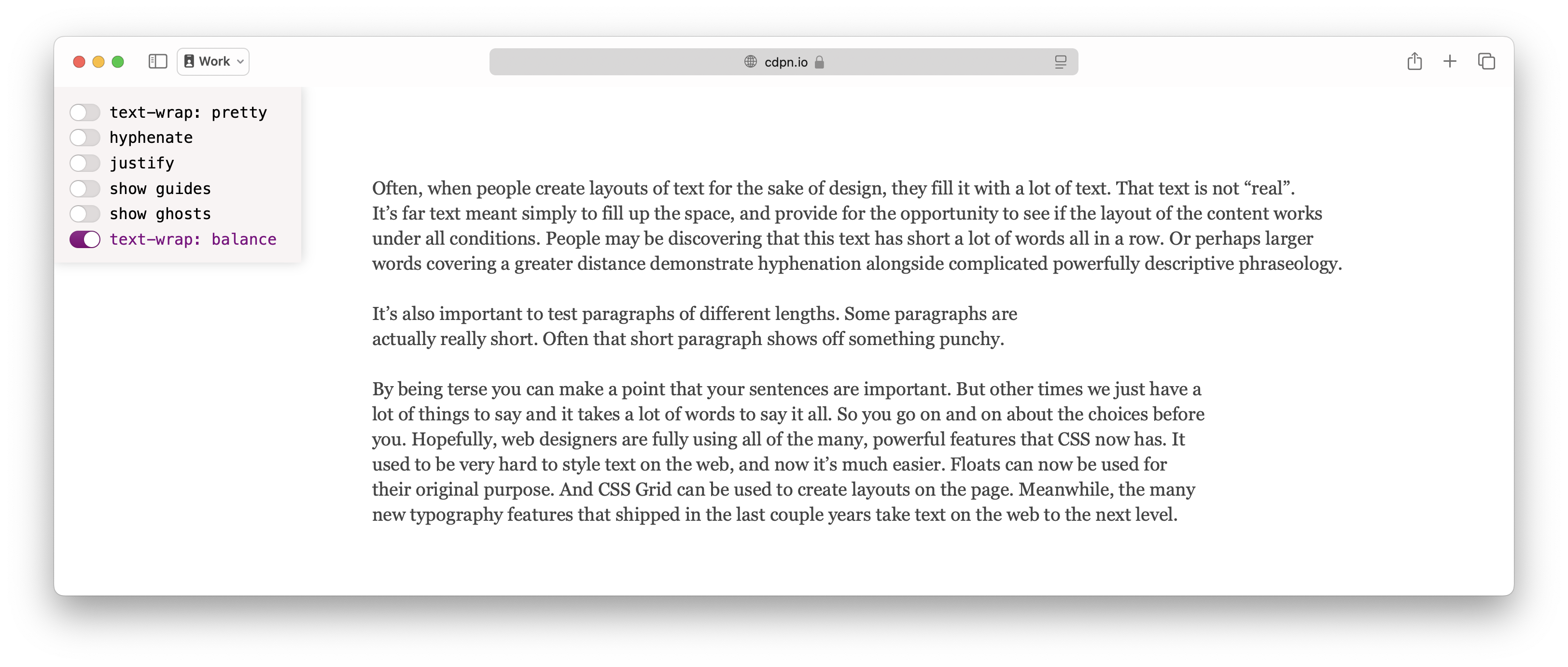
See how the overall width of each paragraph is adjusted so that all the lines of text are about the same length, with no regard for how wide they are overall compared to their container? That’s what balancing does. And in the above example, that means each paragraph is a radically different width than the others. Which is odd. Only use it when you want that effect. Otherwise, you probably want to use another option.
What do the other values for text-wrap do? Let’s go through them.
text-wrap: avoid-short-last-lines
The avoid-short-last-lines value is the newest one in the CSS Text Module Level 4 specification. It’s not yet been implemented in any browser. It will focus on just avoiding short last lines, leaving pretty to do so much more.
text-wrap: auto
The default value of text-wrap currently does what the web has done since 1991, where each line of text is laid out by itself, with no consideration for multiple lines. (This is often called a “first-fit” or “greedy” algorithm.)
This, however, could change in the future! There may come a day when browsers decide to change the default, and apply some kind of multiline line-layout algorithm to all existing content on the web. This would improve all content, even old websites, even websites where the developer didn’t know about text-wrap: pretty.
text-wrap: stable
If you’ve tried text-wrap: stable, you might think “it doesn’t do anything! What is this?” Basically, right now, stable does the same thing as auto. It uses the original first-fit wrapping algorithm, where each line is laid out to fully fill that line with content, and only wrap where necessary.
This is an especially good choice of wrapping algorithms when the content itself is editable. If your user is writing text, you don’t want words/syllables jumping around, changing the wrapping as they type. To ensure your content won’t shift due to edits on subsequent lines, or in any case where you want OG line wrapping, apply text-wrap: stable.
This is also a good choice if you are animating text in such a way that it keeps re-wrapping. It will ensure the fastest wrapping algorithm is used at all times — important if the calculations are going to be done over and over in rapid succession.
By explicitly choosing text-wrap: stable you are ensuring this content will continue to wrap using the original algorithm, even if browsers redefine what auto does.
The stable value is already well supported.
text-wrap-mode and text-wrap-style
The text-wrap property is actually a short-hand for two longhands. The text-wrap-style property is for choosing the wrapping algorithm that’s used, while text-wrap-mode lets you turn wrapping on and off.
text-wrap-style: auto | stable | balance | pretty | avoid-short-last-lines
text-wrap-mode: wrap | nowrap
By having both the text-wrap-mode and text-wrap-style properties, you have the flexibility to change the style of wrapping independently from whether or not content wraps, and let these choices cascade independently.
This means you can also use the shorthand to simply turn off wrapping with text-wrap: nowrap. Or, use text-wrap: wrap to turn wrapping back on. Test out how it works in this demo.
Support for the text-wrap-mode and text-wrap-style longhands, along with the nowrap and wrap values, became “Baseline Newly Available” (aka, available in all major browsers) in October 2024, when Chromium added support in Chrome/Edge 130. To ensure full support for wrapping for people with older browsers, you can always provide a fallback to the older white-space: nowrap | normal. (Although when you do, take care to also check your white space collapsing behavior, since it’s affected by white-space.)
What do you think?
Try out text-wrap: pretty in Safari Technology Preview 216 today. We’d love to hear what you think. Find me, Jen Simmons, on Bluesky or Mastodon to share your feedback. If you find a bug or problem, please file a WebKit bug report.