Item Flow, Part 1:
A new unified concept for layout
CSS Grid and Flexbox brought incredible layout tools to the web, but they don’t yet do everything a designer might want. One of those things is a popular layout pattern called “masonry” or “waterfall,” which currently still requires a Javascript library to accomplish.
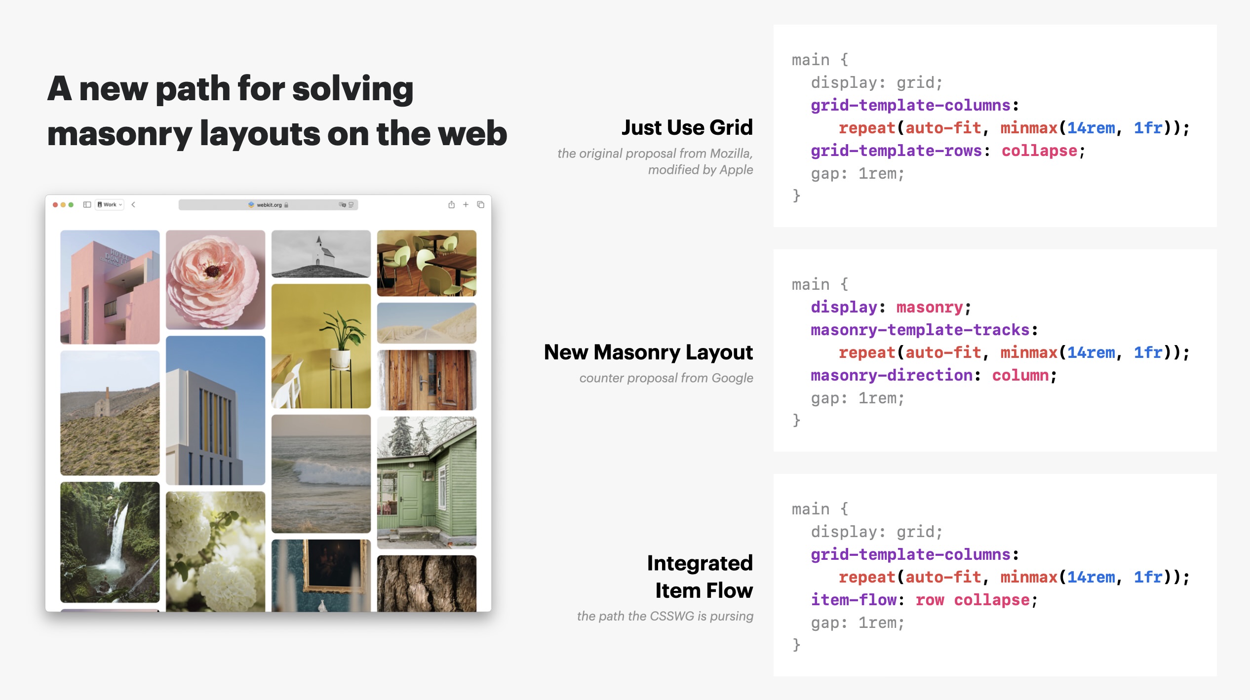
Masonry layouts in CSS feature was first proposed by Mozilla and implemented in Firefox behind a flag in 2020. From the beginning, there’s been a hot debate about this mechanism. The WebKit team at Apple picked up where Mozilla left off, implemented the drafted spec, and landed it in Safari Technology Preview 163. This reinvigorated the conversation. By October 2024, there were two competing ideas being debated — to “Just Use Grid” or to create a whole “New Masonry Layout”. We wrote extensively about these ideas in a previous article on this website.
A lot has happened since October. Now, a third path forward is emerging — a path that would mean the CSS Working Group doesn’t choose either “Just Use Grid” or “New Masonry Layout”. It merges ideas from both with a completely-new idea to create a unified system of Item Flow properties. This article explains what Item Flow is, and its impact on both Flexbox and Grid. In Part 2, another article will more fully explain the implications for the future of masonry-style layouts.
But first, why is a third possibility called Item Flow emerging at all? Why not just pick between the “Just Use Grid” and “New Masonry Layout” options? Well, back in October, the folks working on masonry asked the W3C Technical Architecture Group (TAG) to weigh in on the debate. The TAG had a lengthy response, but one of the most interesting parts was this:
Overall, we think masonry, grid, and wrapping-flexbox should be incorporated into a unified set of properties. Chrome’s [New Masonry Layout] proposal splits apart property sets too eagerly, but even the WebKit [originally Mozilla | Just Use Grid] proposal seems to miss a chance to develop more-general properties.
Wow. Incorporate Flexbox, Grid and Masonry into a unified set of properties? What would that even look like?
The suggestion isn’t to combine all of Flexbox with all of Grid — but rather to create a new set of properties and values to “replace” specifically the flex-flow and grid-auto-flow properties. (You will always be able to use the older syntax if you prefer.) Think how originally the Alignment properties and thegap property were defined to work only in one layout system, and then later got modified and extended to work in multiple layout contexts.
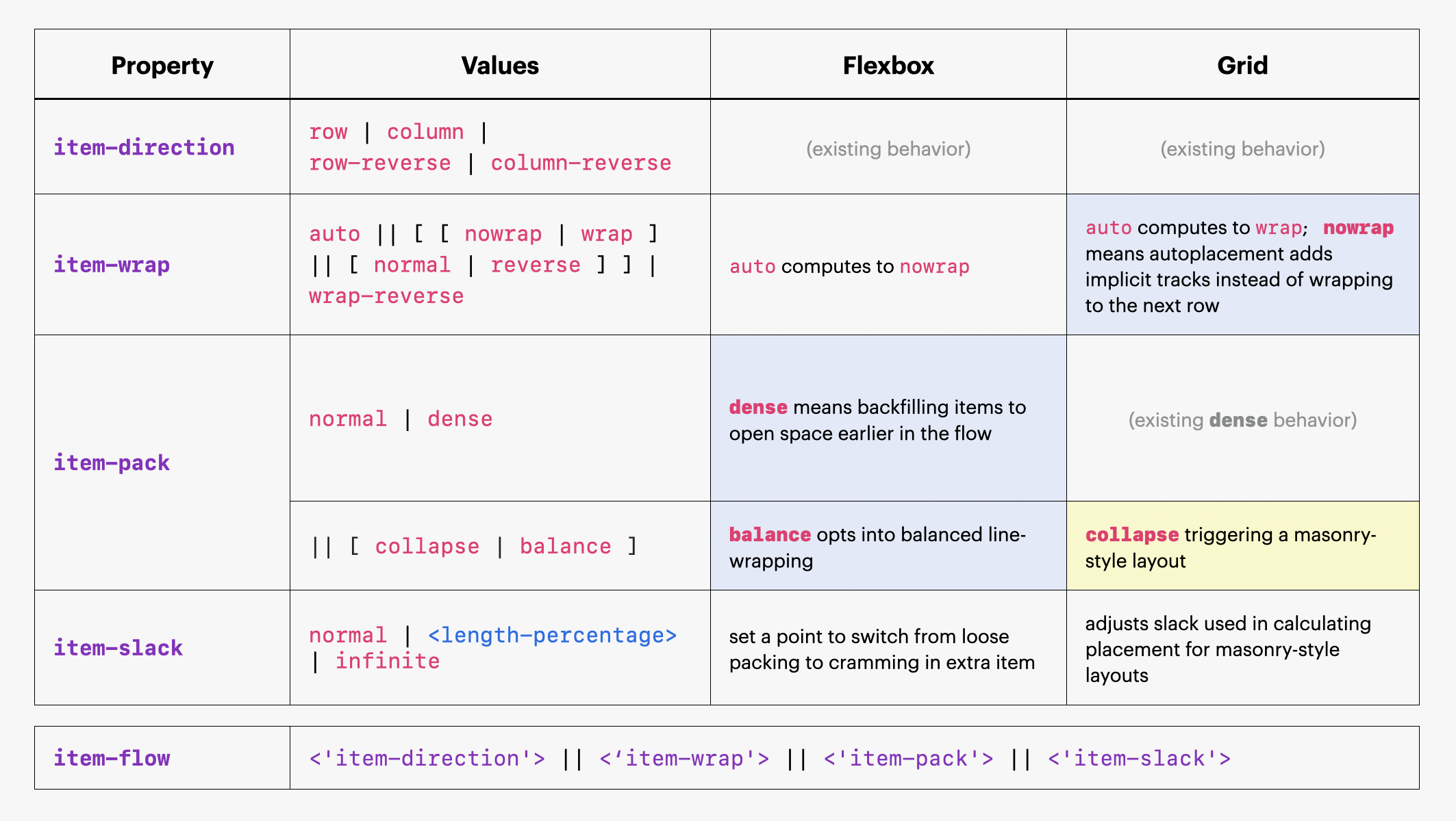
Several of us here at Apple got together and started figuring out how a such unified system for layout *-flow could work. We decided to tentatively name the shorthand item-flow. It’d be the main property from which the longhands and values follow. Together, the new rules would all control the direction of flow, how items wrap, how items pack, whether or not there’s “slack” in the layout, and more.
As we worked through the details, we started to get excited. Suddenly new features for Flexbox and Grid that people have wanted for years had an obvious home. Things seemed to click together elegantly. New capabilities emerged:
- Flexbox could gain a way to do dense packing
- Grid could gain the ability to turn off wrapping
- Masonry layouts could now be triggered with a value for
item-flow - and more…
In this article, we want to describe Item Flow to you, the people who make websites and web apps, to see what you think. So, let’s go on a journey to imagine what this future would be like…
Combining Flexbox and Grid
Flexbox has flex-flow. It’s a shorthand for these two longhands:
flex-direction: row | row-reverse | column | column-reverse;flex-wrap: nowrap | wrap | wrap-reverse;
Flex-direction determines which direction the content flows, while flex-wrap determines whether or not to wrap content.
CSS Grid has grid-auto-flow.
grid-auto-flow: row | column | dense;
It determines the direction in which the content flows, and whether or not dense packing is used, all in one property. It has no longhands.
So how shall we unify these capabilities? We proposed calling the new shorthand item-flow, with four new longhands:
item-directionitem-wrapitem-packitem-slack
(It’s important to note all of these are brand new, baby fresh ideas. They will get discussed at length and changed before they become reality in browsers. To make this article readable, we are glossing over the current debates and presenting just one name for each property/value, not listing the all the variations proposed at the CSSWG.)
Item Direction
The item-direction property would determine how content flows. Should content flow in rows or columns? In the normal direction or reversed? This would work just like flex-direction and the corresponding part of grid-auto-flow.
item-direction: row | column | row-reverse | column-reverse
This is pretty straightforward to understand because it works just like we expect from years of working with Flexbox and Grid. There is a debate about what “row” and “column” mean for masonry-style layouts — we’ll get into that in our next article, Item Flow – Part 2: next steps for Masonry.
Item Wrap
The item-wrap property would determine whether or not content will wrap, and if so, in which direction. The new default would be auto — which resolves to nowrap in Flexbox and wrap in Grid, matching the current initial values.
This is familiar territory, but creating a new property gives us the opportunity to clean up the values and make them more sensical. We could add a new reverse keyword, so that [ nowrap | wrap ] is one choice, while [ normal | reverse ] is a second, separate choice, improving on how this currently works in Flexbox. (We could also keep wrap-reverse around for the sake of supporting legacy habits.) This would give us:
item-wrap: auto | nowrap | wrap | normal | reverse
But CSS Grid hasn’t had a concept of nowrap before! So what would that be?!? Here’s one idea…
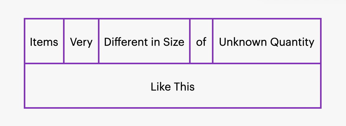
With Flexbox, there are many use cases for laying out your items in one line, one row, without any wrapping. Perhaps it’s a navigation bar, where each item is a phrase of a different length. The amount of space for each item is determined by the size of that item — you get flexible boxes.
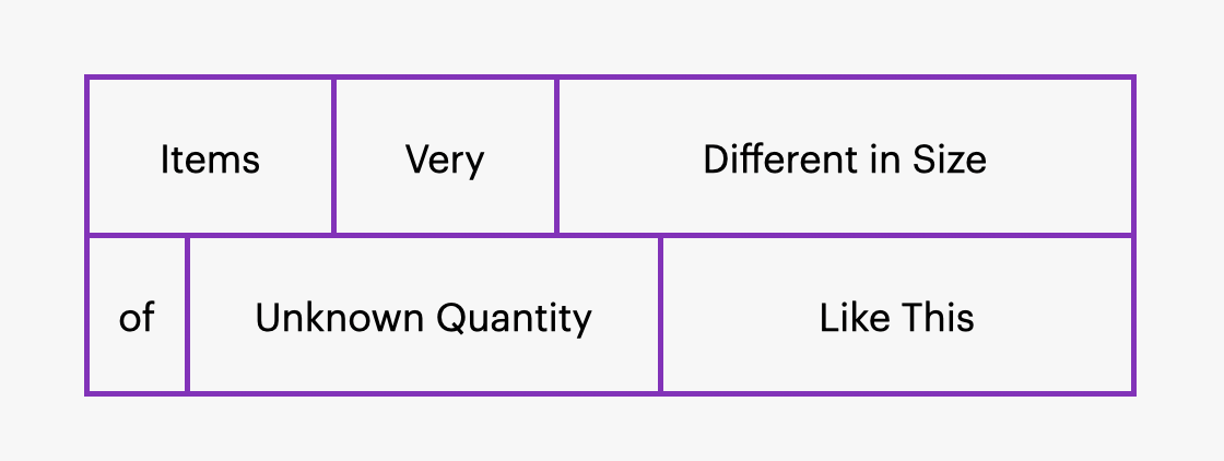
What if you want to lay out all your content in one row, but, instead, for each item to get the same amount of space — for every item to be 1fr wide? Since the size of the columns is extrinsically determined, CSS Grid is the right tool for this job. But because Grid wraps by default, developers often hack Flexbox instead, not realizing they can get the desired effect today with grid-auto-flow: column.
In a future with Item Flow, it’d be very obvious how to use nowrap to tell Grid to fit everything on one line.
.container {
  display: grid;
  grid-auto-columns: 1fr;
  item-wrap: nowrap;
}
Now, if there are nine items, we get nine columns. If there are five items, we get five columns, like this:
Item Pack
The item-pack property would let us switch between different kinds of packing.
Dense packing
In Grid, we currently have the ability to switch to a mode of dense packing, with grid-auto-flow: dense. In the new integrated system, this same capability would be available with item-pack: normal | dense — adding an explicit value for switching back to not-dense for the first time.
Flexbox currently has no concept of dense packing. So what feature could we add to it here?
.container {
  display: flex;
  item-pack: dense;
}
Two ideas have been debated so far:
- Dense packing could mean Flexbox will attempt to cram one more item on the row (or column) before starting a new row. It would shrink the items on the row just enough, instead of leaving extra space and growing them.
- Or, to behave like Grid, dense packing could mean Flexbox will look back to previous spots in the layout and place smaller items in any available space.
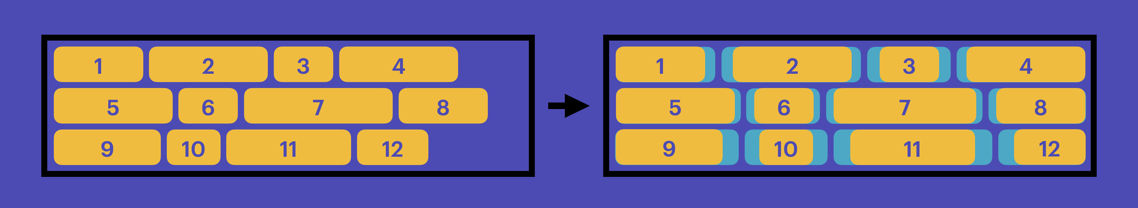
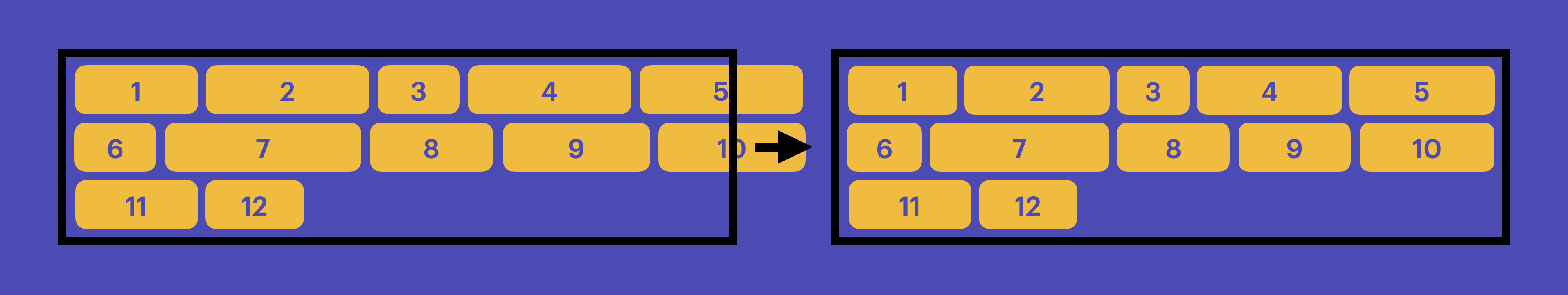
To understand what these option means, let’s review how Flexbox currently works, and then take a look at what dense could do.
Today, when Flexbox starts to lay out content, fills up a row with the items that fit in the available space. When it runs out of space, it wraps (if wrapping is allowed), and fills up the next row… until all the items have a home. And then, it distributes all the extra space according to the flex and Alignment properties. (See these two steps on the left & right of the illustration.)
With the first idea listed above, dense packing in Flexbox could instead shrink items just enough to be able to fit one more item on the row, shrinking each item instead of distributing extra space.
With the second idea, to behave more like Grid dense packing, Flexbox could instead rearrange the order of items and back-fill smaller spaces with smaller items. In this case, item 6 and 10 end up out of the normal order, placed on previous rows.
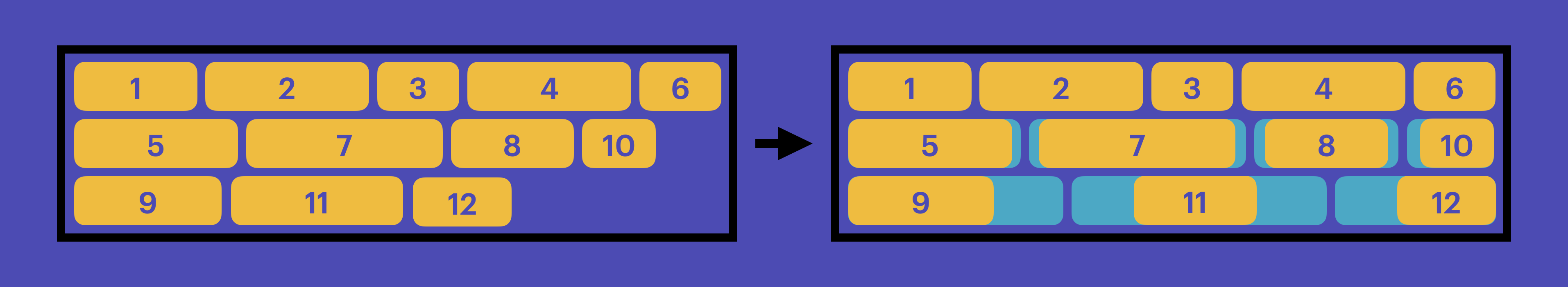
This second idea would cause smaller items to pile up on the right (on the end edge). Because of this, some folks have wondered if this would be at all useful in practice.
What do you want “dense” to mean for Flexbox? Do you like the first or second idea more — or do you have a third?
Balanced packing
The item-pack property could also allow for new kinds of packing that don’t yet exist. For example, we could invent item-pack: balance.
Currently, Flexbox places items on each line without any regard to what’s happening on the other lines. This can often end up with a very few number of items on the last line.
A new balance value could tell the browser to instead balance the items in some fashion, similar to text-wrap: balance, ensuring the last line doesn’t stand out as weird.
.container {
  display: flex;
  item-pack: balance;
}
This could be incredibly useful and solve a long-standing frustration with Flexbox.
Collapsed packing
The item-pack property could also give us a new home for the trigger for masonry-style layouts. This is a change from the previous Masonry proposals:
| Proposal | Trigger for masonry layouts |
|---|---|
| Just Use Grid | grid-template-rows: collapse |
| New Masonry Layout | display: masonry |
| Item Pack | item-pack: collapse |
Going in this direction means we might not use either of the triggers for masonry layouts from Just Use Grid or New Masonry Layouts. We could abandon both in favor of this new trigger.
We’ll write more about how collapsed item packing could work for masonry layouts in our next article, Item Flow – Part 2: next steps for Masonry.
Item Slack
The item-slack property would allow you to control just how picky the layout engine is when determining where to put the next item.
For masonry-style layouts, this would be the new name for the property previously discussed as grid-slack or masonry-slack. A default slack of 1em means, “hey, when you are looking to see which column has an empty space closest to the top (as you decide where to put the next item), don’t worry about it if the difference is 1em or less. Just consider those tied.”
For Flexbox, this could set a point to switch from loose packing to cramming in extra item — which is currently set to zero. A value of 1em would mean, if it’s within 1em of fitting, cram it in, otherwise wrap to the next line. This idea could integrate with the first idea for Flexbox dense packing (described above), or replace it entirely.
Maybe -slack is not the best name. You can suggest other words in the CSSWG issue. Perhaps item-tolerance would be better, for example — or threshold, strictness, adjust, sensitivity.
The Overall Plan
Put all of these ideas together, and you get this matrix.
In case it’s not clear, web developers will be able to use the longhands or the shorthand as desired. You could, for example, define a Flexbox context with:
.container {
  display: flex;
  item-direction: column;
  item-wrap: nowrap;
}
Or get the exact same result with:
.container {
  display: flex;
  item-flow: column nowrap;
}
Of course, this whole idea for Item Flow is still a work in progress. Big changes can still be made. The names are temporary. This article’s description of how works is just the first draft. There are many conversations and many decisions to be had.
What do you think?
We would love to hear what you think about Item Flow.
- Is this a good idea to combine
flex-flowandgrid-auto-flowinto a unified system? - As a developer would you use the new syntax to accomplish the things you do today with
flex-flowandgrid-auto-flow?item-direction: row | column | row-reverse | column-reverseitem-wrap: auto | nowrap | wrap | normal | reverseitem-pack: normal | dense
- What other ideas might you have for combining existing functionality in Flexbox and Grid into a unified system?
- Are you excited about the possibilities of adding new capabilities to Grid and Flexbox? Which ones have the most potential to help you do your work, and unlock new designs?
- No wrapping for Grid with:
item-wrap: nowrap - Dense packing for Flexbox with:
item-pack: dense - Balanced wrapping for Flexbox with:
item-pack: balance - Adjusting when content is crammed/not in Flexbox with:
item-slack: <length-percentage>
- No wrapping for Grid with:
- What other new ideas might you want to add in this unified system?
We’d love to hear what you think. Find Jen Simmons on Bluesky or Mastodon to share your feedback. Or even better, publish your thoughts in a blog post and share the link. Explore examples. Explain ideas. And let us know if you like this direction. While the CSS Working Group has resolved to pursue Item Flow, there’s still plenty of time to go in another direction if need be once we hear from web developers.
Stay tuned for Item Flow – Part 2: next steps for Masonry to learn more about how all this affects the plans for masonry layouts, and to learn more about the specific debates about how item-flow syntax could work.