The CSS shape() function
Shapes are an important aspect of graphic design. The shape() function provides a new way to author shapes that can adapt and scale with mixed proportions based on the size of the element.
For many years now, CSS has given web developers the ability to use shapes for clipping and animation. The most common usage of shapes is in theclip-path property. This applies a clip after the element has been laid out, which allows you, as a web developer, to do things like trim the edge to a decorative wavy shape. This can give a similar effect to masking, but is more efficient to render than a mask. Another use case for shapes is in theoffset-path property, which allows you to animate something along a path. Finally,shape-outside provides a way to wrap text around a non-rectangular shape (but currently only supports a subset of the shape types).
CSS provides a set of shapes that can be used with each of these properties. (In the web standards, these are fully defined in Basic Shapes.) There are various ways to describe rectangles, as well as circle() and ellipse(), polygon() (a set of straight-line segments) and the path() function, which takes an SVG-style path.
For example, consider this simple arrow shape:
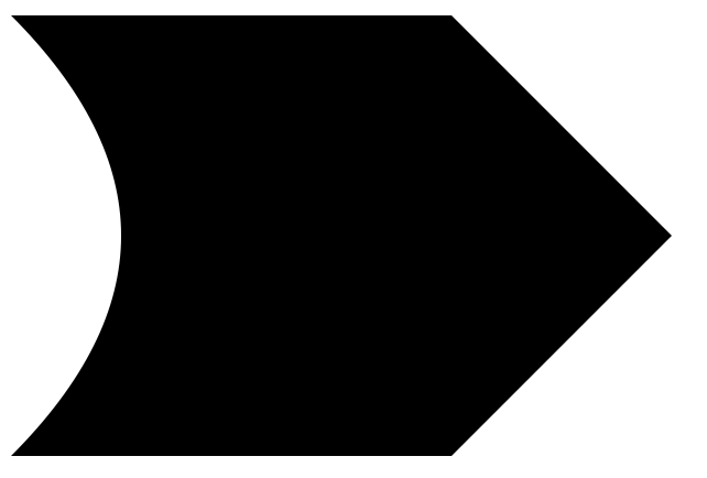
The SVG that produces this shape is:
<svg viewBox="0 0 150 100" xmlns="http://www.w3.org/2000/svg">
  <path fill="black" d="M0 0 L 100 0 L 150 50 L 100 100 L 0 100 Q 50 50 0 0 z " />
</svg>
We’ll break down this path later. For now, let’s take that path and apply it to an HTML element in clip-path:
.clipped {
    width: 150px;
    height: 100px;
    box-sizing: border-box;
    background-color: blue;
    border: 10px solid orange;
    clip-path: path("M0 0 L 100 0 L 150 50 L 100 100 L 0 100 Q 50 50 0 0 z");
}
Which produces this:
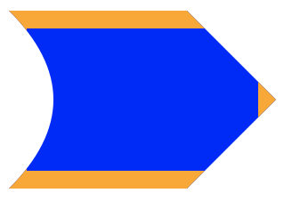
Note how I’ve added a border so that you can see how clip-path is clipping out parts of the element.
But what happens now if we change the dimensions of the element? For example, what if we wanted a longer arrow?
.clipped {
    width: 200px;
    ...
}
Alas, we get the same shape, only we no longer see the border at the tip of the arrow.
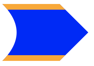
This means that using path() in clip-path can’t be responsive; you can’t write CSS rules so that the path adapts to the size of the element. This is where the new shape() function comes in.
shape()
The new shape() function addresses this responsiveness problem head-on by allowing you to specify the path in terms of CSS keywords and units that you’re already familiar with, including the full power of calc() and CSS variables, and it’s much more readable.
Let’s go back and break down that SVG path which looks like an incomprehensible list of letters and numbers: “M0 0 L 100 0 L 150 50 L 100 100 L 0 100 Q 50 50 0 0 z”. We can break this down into a sequence of “commands”, which describe each section of the path:
| M 0 0 | move to 0, 0 |
|---|---|
| L 100 0 | line to 100, 0 |
| L 150 50 | line to 150, 50 |
| L 100 100 | line to 100, 100 |
| L 0 100 | line to 0, 100 |
| Q 50 50 0 0 | quadratic curve with control point at 50, 50, ending at 0, 0 |
| z | close path |
We can transcribe this path into a shape using the names specified in the CSS spec; note how the first “move” command becomes the “from” in the shape:
clip-path: shape(from top left,
    line to 100px top,
    line to 150px 50%,
    line to 100px bottom,
    line to bottom left,
    curve to top left with 50px 50%,
    close);
Note that we can use keywords like “top” and “bottom left” when the point is in absolute coordinates, and we can use percentages.
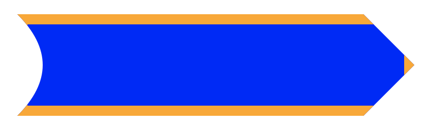
That gives us the same result as above, but we haven’t made it fully responsive yet. Our next step is to make the shape stretch horizontally with the element’s width, but keep the height fixed to 100px. Let’s use a bit of math to achieve that. To simplify things a little, lets put the desired height of the element into a variable:
.responsive-clip {
    --height: 100px;
    height: var(--height);
    ...
}
We’ll also define the half-height value to compute the arrow shape on the right side, and for the control point of the quadratic curve.
--half-height: calc(var(--height) / 2);
The responsive parts of the shape can be written in terms of percentages. Percentages used in x coordinates are relative to the element’s width, while the ones used in y coordinates are relative to the element’s height:
clip-path: shape(from top left,
    line to calc(100% - var(--half-height)) 0%,
    line to 100% var(--half-height),
    line to calc(100% - var(--half-height)) 100%,
    line to left bottom,
    curve to left top with var(--half-height) var(--half-height),
    close);
Now we have a clip that can be as long as the element!
Making this shape adapt to the height of the element is trickier, because we need to be able to refer to the height in values on the horizontal axis. This is something we can do using Container Queries. First, let’s create a container in the HTML markup:
<div class="responsive-clip-container">
  <div class="responsive-clip"></div>
</div>
Once we’ve defined the container and moved the element’s dimensions there, we can now replace var(--half-height) with 50cqh :
.responsive-clip-container {
  width: 100%;
  aspect-ratio: 5 / 1;
  container-type: size;
}

.responsive-clip {
  height: 100%;
  background: blue;
  border: 10px solid orange;
  box-sizing: border-box;
  clip-path: shape(from top left,
    line to calc(100% - 50cqh) 0%,
    line to 100% 50cqh,
    line to calc(100% - 50cqh) 100%,
    line to bottom left,
    curve to top left with 50cqh 50cqh,
    close);
}
Let’s add a resizer to the container so you can play around with the responsiveness!
.responsive-clip-container {
  resize: both;
  overflow: clip;
}
Try this demo in Safari 18.4 or another browser with support.
shape() – demo 3 by Jen Simmons (@jensimmons)
on CodePen.
Resizing the arrow helps to truly demonstrate what shape() can do. Notice how the curve and the 90 degree angle are preserved, which is not something you would get if you stretched an SVG.
There are more features of the shape() function that we haven’t touched on here, like relative instead of absolute commands (e.g. move by 10px, 2em), other commands like arc, and various ways of describing curve control points. Dive into the web standard to learn more about these. And, of course, you can animate between shapes, as long as they contain the same list of commands, which can make for some very cool effects.
Shape animation by Simon Fraser (@smfr)
on CodePen.
Let us know what you think of shape(). We’d love to see what you make!