Polishing your typography with line height units
It’s been possible to create gorgeous typography on the web for decades, but often refining the details to perfection can take a lot of effort. Arguably too much effort, and developers just don’t have the time. Happily, the last few years of CSS have seen a lot of new tools, sometimes very simple tools, that when used in a smart fashion suddenly make polishing such graphic design details incredibly easy. One such tool is the lh unit.
Line height units
It might have seemed like no big deal when the web gained two new units, lh and rlh, to reference line heights. Support shipped in every browser in 2023 without much fanfare. But wow, are they powerful.
Basically, 1lh equals the height of one line of text, for the current font at the current line height. “LH” stands for Line Height. The accompanying 1rlh unit is the equivalent of one line height at the root, just like how rem is the em at the root. “RLH” stands for Root Line Height.
My favorite thing to do with the lh unit is to set margins on content. Let’s set a new universal margin on paragraphs with:
p { margin-block: 1lh; }
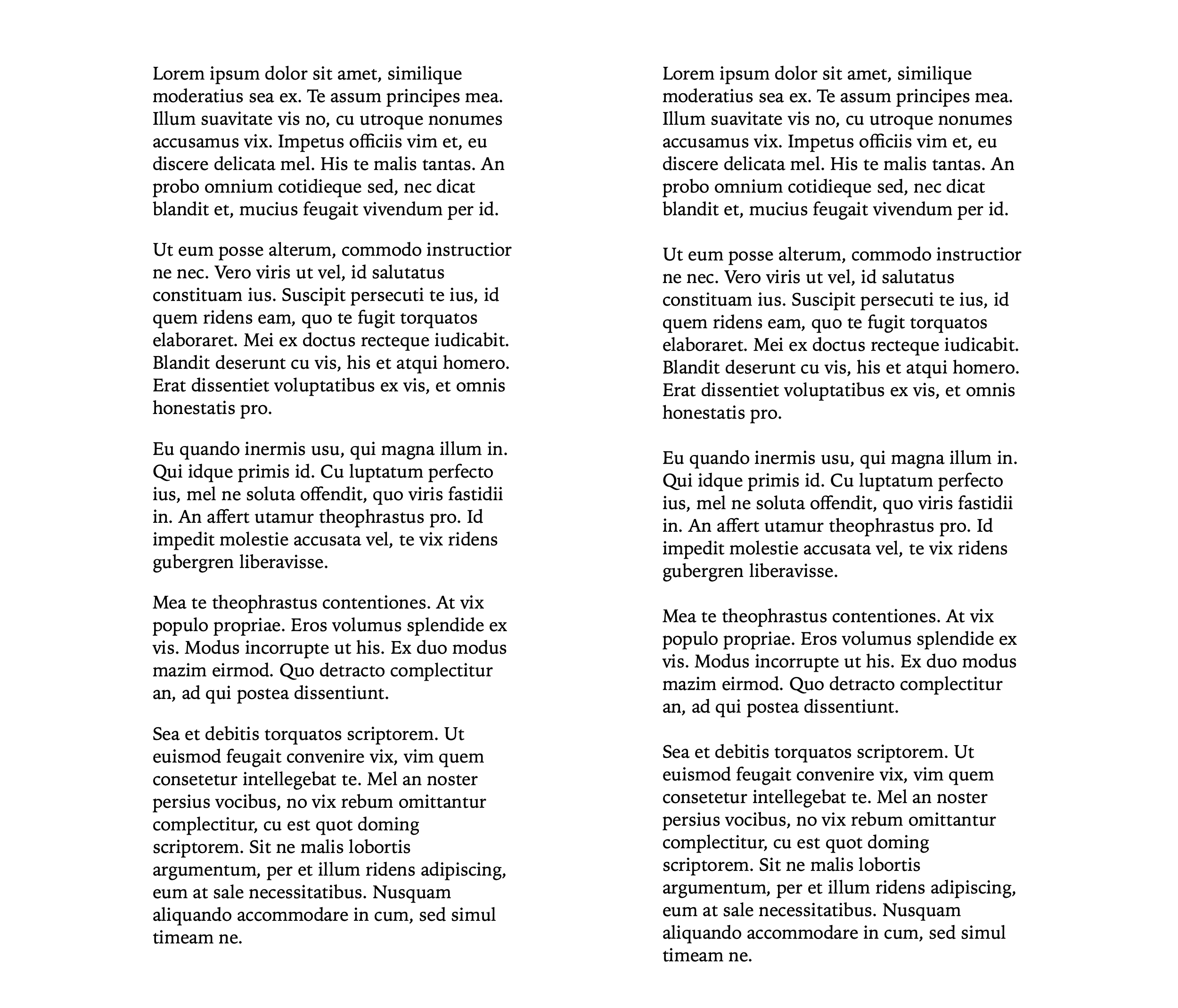
You can see the results in the following screenshots. On the left, the margin in the block direction is set to 1em, the default in UA stylesheets since the 90s. On the right it’s changed to 1lh.

Many people who have an eye for layout and spacing can immediately see the difference. You might agree that the version on the right just looks more polished. It looks refined. While the version on the left looks a bit clunky. It looks, well, like everything on the web has looked for decades. Slightly awkward.
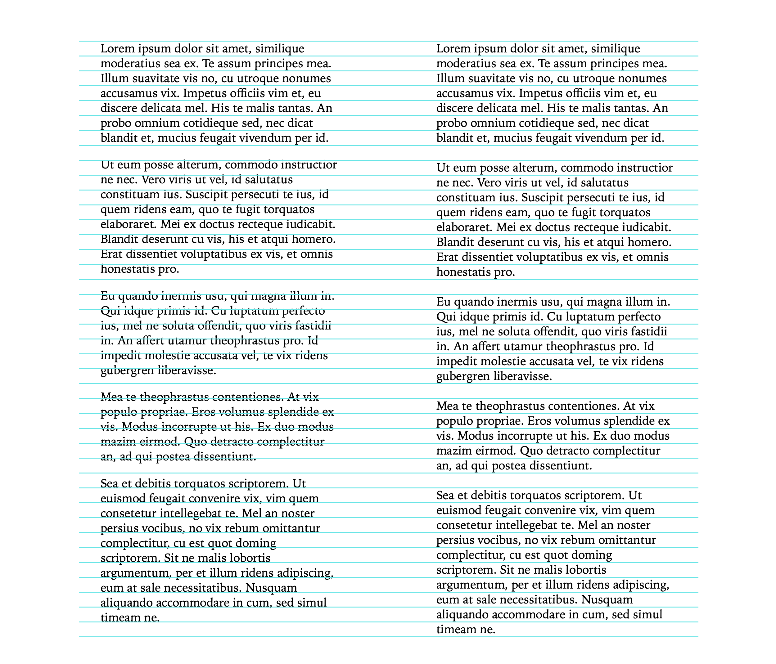
Many other people will look at this comparison and think “I don’t see it” or “what’s the big deal”? Let’s draw a line grid over the text to make the difference more clear. Hopefully now it’s more obvious that the blank space between paragraphs is equivalent to a line of text when it’s defined in lh units.

Line height units give us a direct way to tie any size in our layout to the vertical rhythm of the text. Margins are just one possibility — padding is another, gaps, width and height, or any other measurement in the layout.
Try it yourself
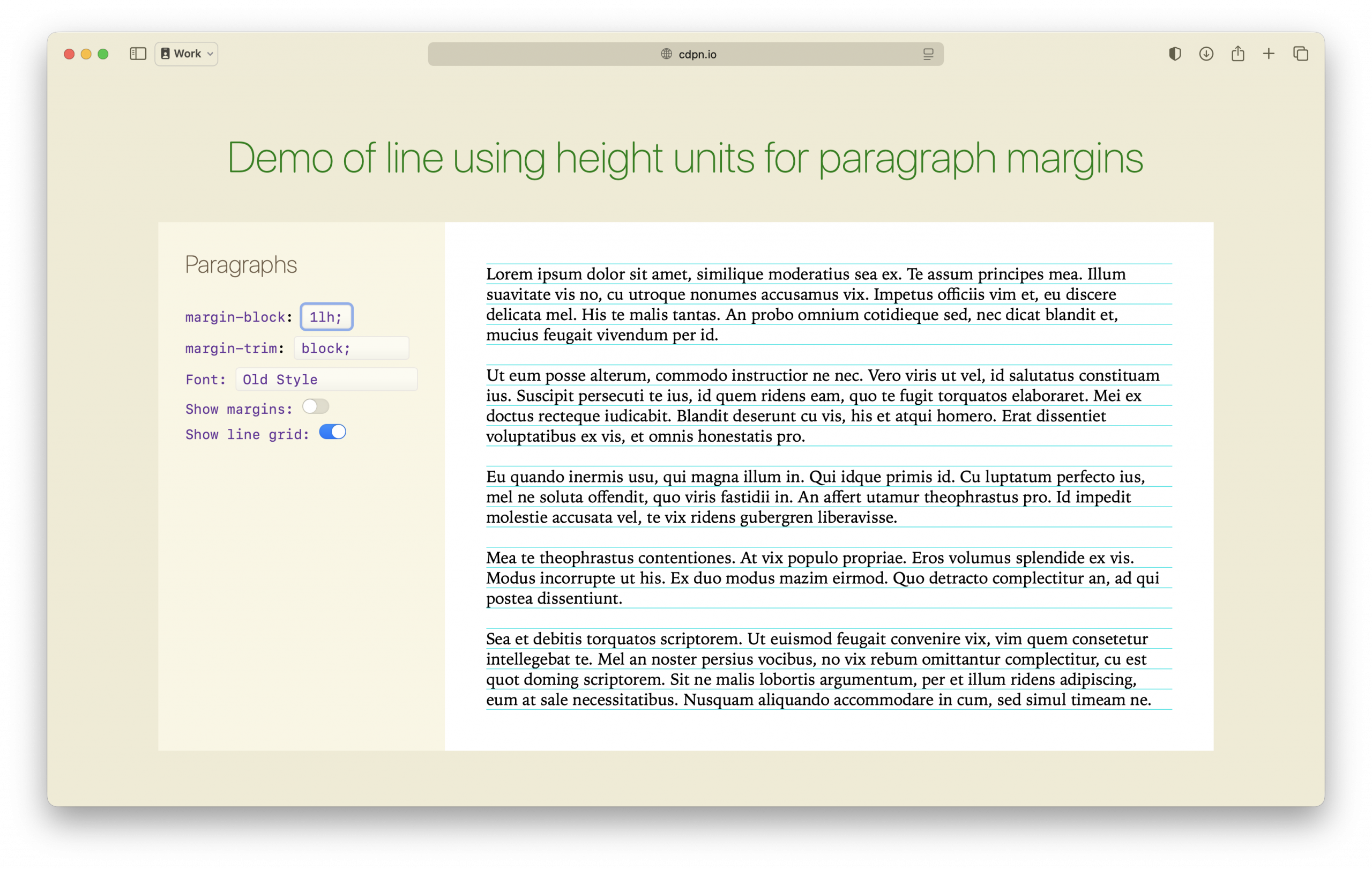
You can try out combinations of options to see the effects of using lh for paragraph margins in this demo.

Browser support
Line height units are supported in over 94% of the browsers people use today. For that last 6%, you can use progressive enhancement to ensure they get a good experience. For example:
article {
  padding: 1em; /* fallback for browsers lh without support */
  padding: 1lh;
}
Using this technique causes browsers without support to render 1em of padding, while the browsers with support render 1lh of padding.
Take your typography to the next level
It really is a great time for typography on the web. There’re over a dozen small features that shipped in the last few years that empower web designers & developers to polish typographic details to a far better result, especially with the kind of easy robustness that makes it practical to accomplish. It’s my hope you use them!
Let me know what you think on Bluesky or Mastodon. I’d love to hear your stories, plans and questions.