Grid:
how grid-template-areas offer a visual solution for your code
Using grid lines is a flexible and powerful way to place your elements on a grid, but, when looking at the code, it might be a bit hard to visualize. So Grid gives you another way to place your elements that might be easier to see called grid areas. There’s a bit more upfront work involved, but the pay off might be worth it.
The idea behind grid areas is that we name each element we want to place on our grid and then use a certain syntax to place them visually where we want them to go. To illustrate, let’s start with my product page.
Here’s the html I’m starting with:
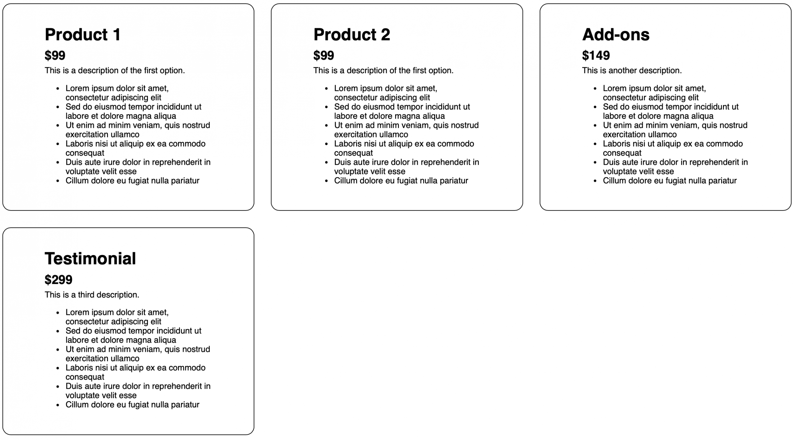
<div class="card">
  <h1>Product 1</h1>
  <h2>$99</h2>
  <p>This is a description of the first option.</p>
  <ul><!-- product details here --></ul>
</div>

<div class="card">
  <h1>Product 2</h1>
  <h2>$99</h2>
  <p>This is a description of the first option.</p>
  <ul><!-- product details here --></ul>
</div>

<div class="card">
  <h1>Add-ons</h1>
  <h2>$149</h2>
  <p>This is another description.</p>
  <ul><!-- product details here --></ul>
</div>

<div class="card">
  <h1>Testimonial</h1>
  <h2>$299</h2>
  <p>This is a third description.</p>
  <ul><!-- product details here --></ul>
</div>
And here’s the CSS I’m starting with:
.pricing-options {
  display: grid;
  grid-template-columns: repeat(3, minmax(0, 1fr));
  gap: 2em;
}
.card {
  border: 1px solid black;
  padding: 2em 5em;
  font-family: sans-serif;
  border-radius: 1em;
}
That will give me this result:
We want our page to follow this design:
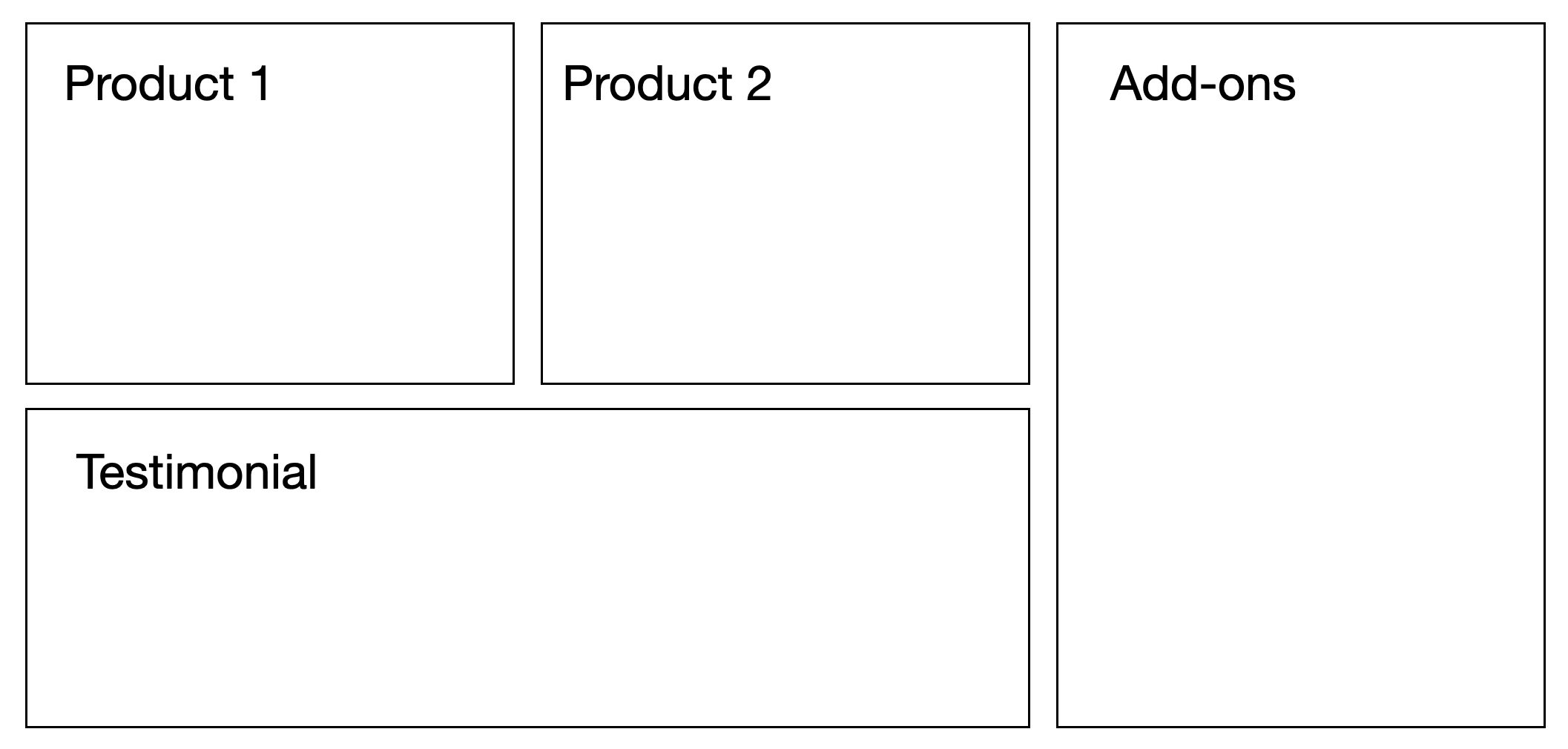
This means we want our Add-ons to span two rows and our Testimonial to span two columns. Here’s how we can accomplish that with grid-template-areas.
First, we need to label each element by assigning a value to the grid-area property. To do that, let’s give our elements classes to reference in our CSS.
<div class="card product-1">
  <h1>Product 1</h1>
  <!-- product details here -->
</div>

<div class="card product-2">
  <h1>Product 2</h1>
  <!-- product details here -->
</div>

<div class="card add-ons">
  <h1>Add-ons</h1>
  <!-- product details here -->
</div>

<div class="card testimonial">
  <h1>Testimonial</h1>
  <!-- product details here -->
</div>
Now let’s add those grid-area property values. You can name them anything you want, but since my class names are pretty descriptive, I’m going to name the grid-areas the same as my class names.
.product-1 {
  grid-area: product-1;
}
.product-2 {
  grid-area: product-2;
}
.add-ons {
  grid-area: add-ons;
}
.testimonial {
  grid-area: testimonial;
}
Now comes the visual part. In our CSS, we’re going to go back up to where our grid is defined and we’re going to assign a new property called grid-template-areas. I’m now going to visually assign each cell of my grid to an element in my html.
My grid is three columns across and an unspecified number of rows, which means it’ll be as many rows as needed. I’m going to assign product-1 to that first top cell and product-2 in my second top cell. Then my third top cell is going to be taken up by my add-ons element. And because my add-ons element is going to span two rows, the cell right beneath that is going to be assigned to add-ons too. And finally, we have the bottom left cell assigned to testimonial and because that element is taking up two columns across, the cell right next to it will be assigned to testimonial as well.
Here’s what the final code looks like:
.pricing-options {
  display: grid;
  grid-template-columns: repeat(3, minmax(0, 1fr));
  gap: 2em;
  grid-template-areas:
    "product-1 product-2 add-ons"
    "testimonial testimonial add-ons";
}
The beauty of grid-template-areas is that all of the decisions about where to place what element happen in a single property. You still have to do the upfront work of naming your elements, but once you’ve done that, you can visually see where everything is in relation to each other in a single place. Changing it is simpler too — just move the element name to a different “cell” and you’re done.
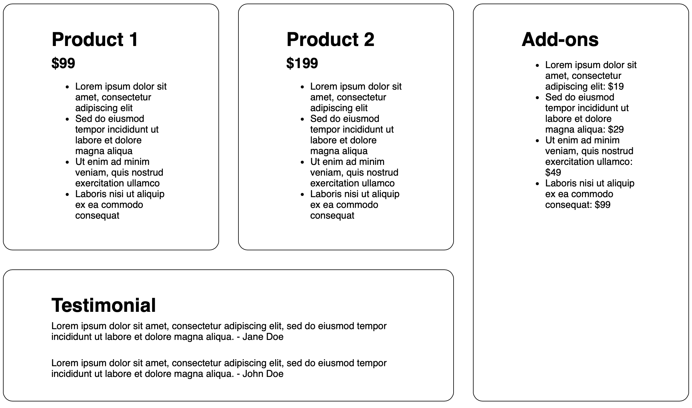
Using grid-template-areas , we get our desired layout.
If you have any other questions about Grid and would like to see more content on this topic, let us know. You can share your feedback with me, Saron Yitbarek, on BlueSky, or reach out to our other evangelists — Jon Davis, on Bluesky / Mastodon, and Jen Simmons, on Bluesky / Mastodon. You can also follow WebKit on LinkedIn. If you find a bug or problem, please file a WebKit bug report.