Designing Websites for iPhone X
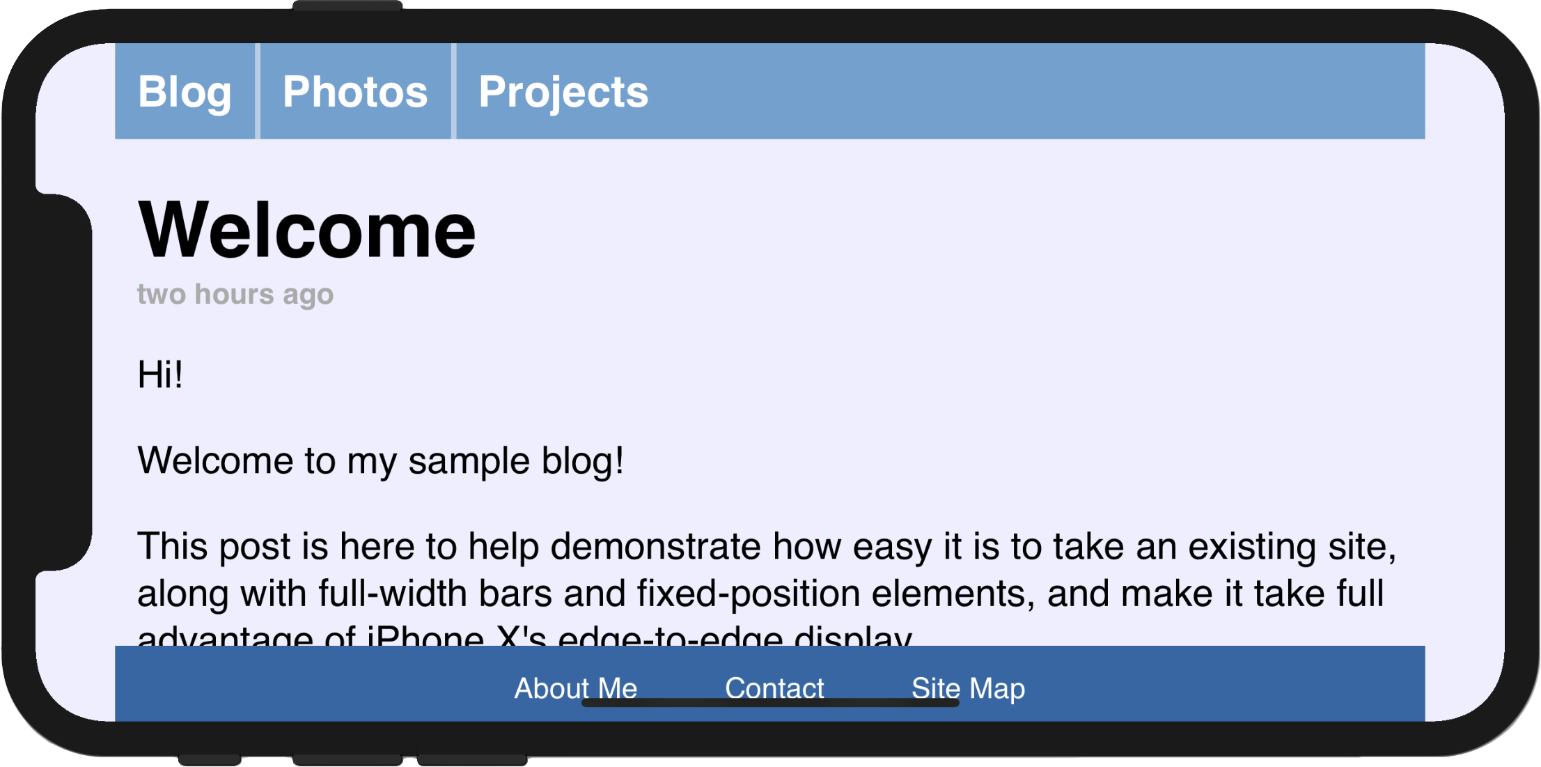
Out of the box, Safari displays your existing websites beautifully on the edge-to-edge display of the new iPhone X. Content is automatically inset within the display’s safe area so it is not obscured by the rounded corners, or the device’s sensor housing.
The inset area is filled with the page’s background-color (as specified on the <body> or <html> elements) to blend in with the rest of the page. For many websites, this is enough. If your page has only text and images above a solid background color, the default insets will look great.
Other pages — especially those designed with full-width horizontal navigation bars, like the page below — can optionally go a little further to take full advantage of the features of the new display. The iPhone X Human Interface Guidelines detail a few of the general design principles to keep in mind, and the UIKit documentation discusses specific mechanisms native apps can adopt to ensure that they look good. Your website can make use of a few similar new pieces of WebKit API introduced in iOS 11 to take full advantage of the edge-to-edge nature of the display.
While reading this post you can tap on any of the images to visit a corresponding live demo page and take a peek at the source code.
Using the Whole Screen
The first new feature is an extension to the existing viewport meta tag called viewport-fit, which provides control over the insetting behavior. viewport-fit is available in iOS 11.
The default value of viewport-fit is auto, which results in the automatic insetting behavior seen above. In order to disable that behavior and cause the page to lay out to the full size of the screen, you can set viewport-fit to cover. After doing so, our viewport meta tag now looks like this:
<meta name='viewport' content='initial-scale=1, viewport-fit=cover'>
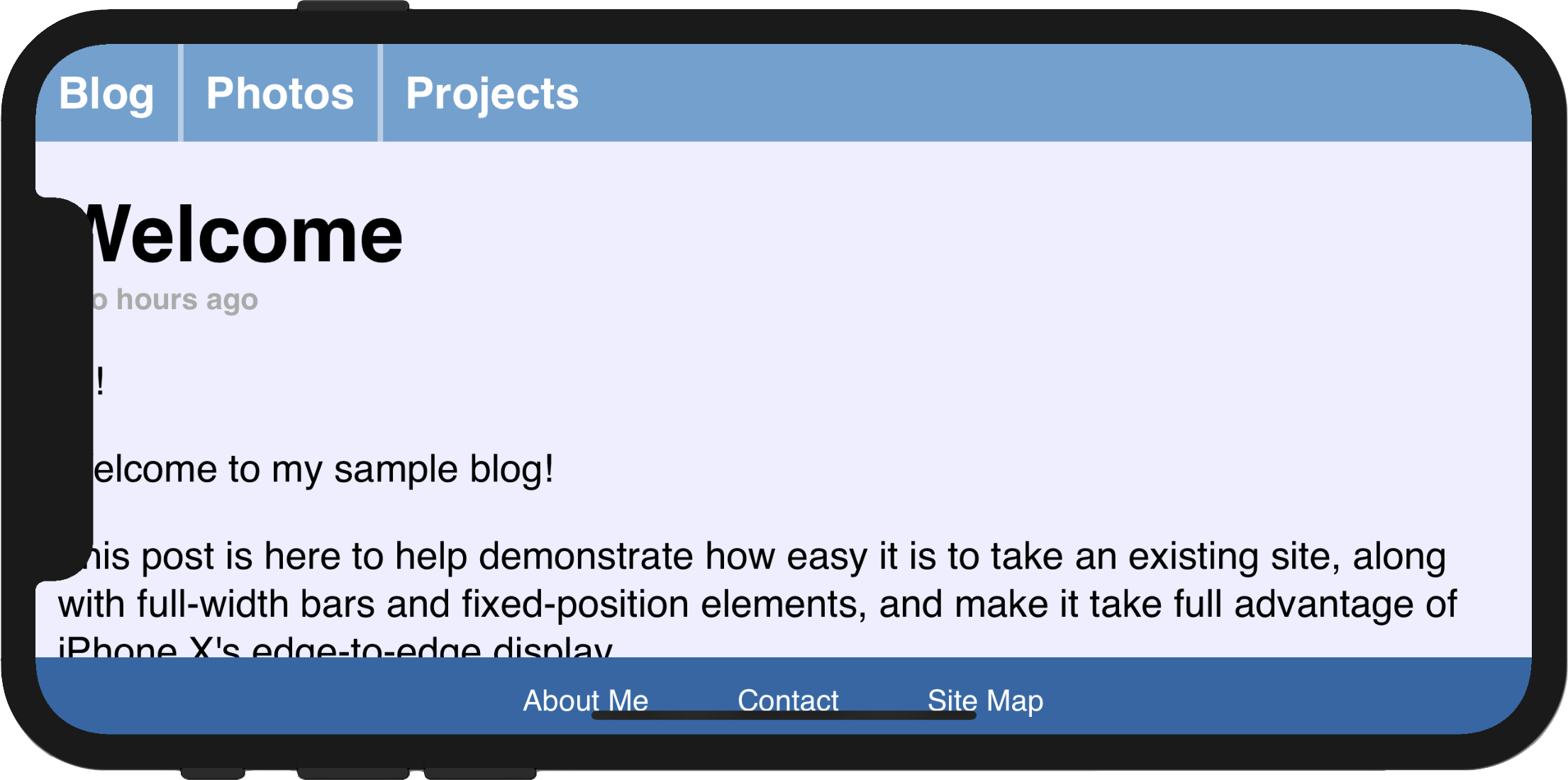
After reloading, the navigation bar looks much better, running from edge to edge. However, it is immediately clear why it is important to respect the system’s safe area insets: some of the page’s content is obscured by the device’s sensor housing, and the bottom navigation bar is very hard to use.
Respecting the Safe Areas
The next step towards making our page usable again after adopting viewport-fit=cover is to selectively apply padding to elements that contain important content, in order to ensure that they are not obscured by the shape of the screen. This will result in a page that takes full advantage of the increased screen real estate on iPhone X while adjusting dynamically to avoid the corners, sensor housing, and indicator for accessing the Home screen.
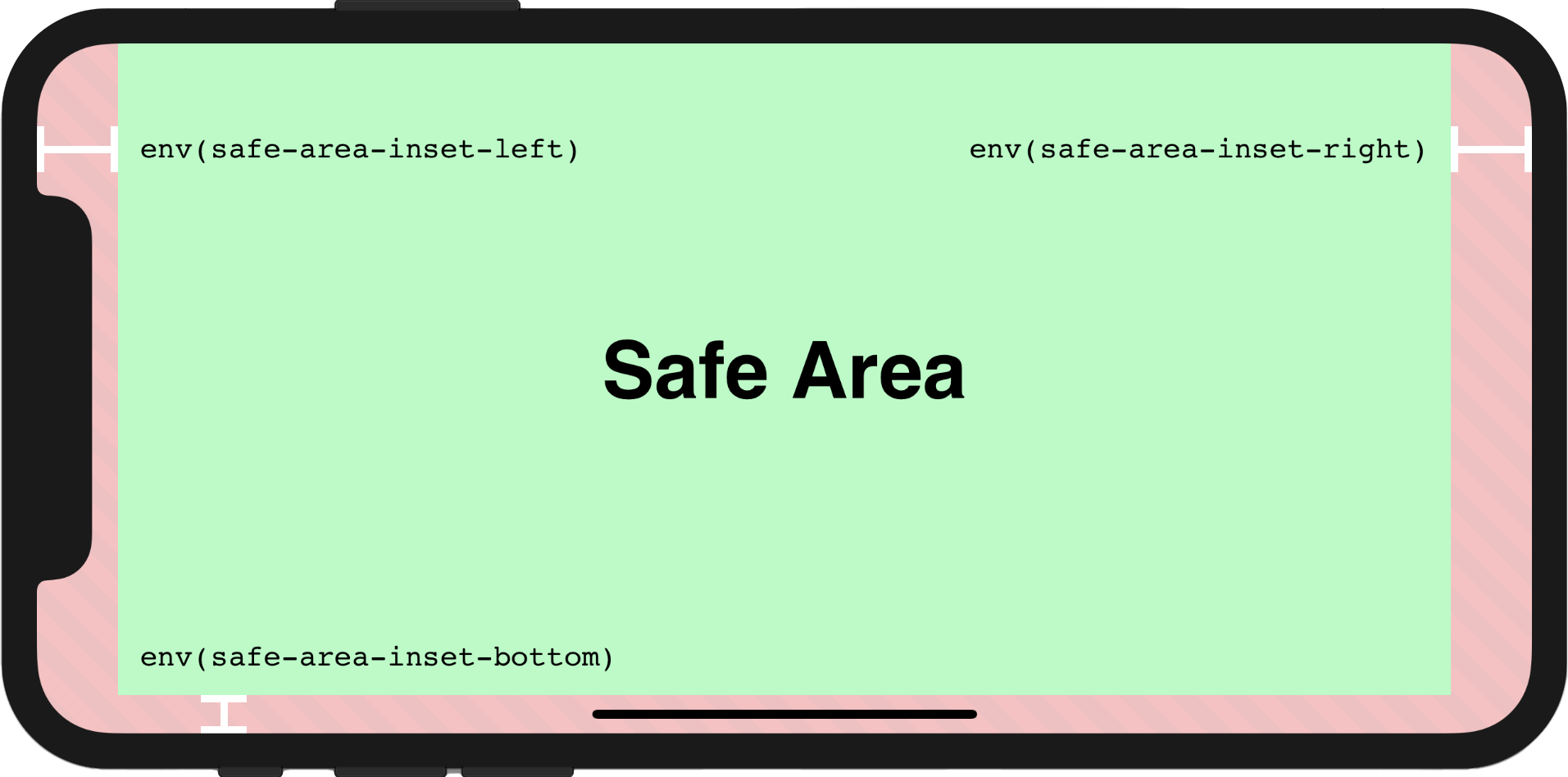
To achieve this, WebKit in iOS 11 includes a new CSS function, env(), and a set of four pre-defined environment variables, safe-area-inset-left, safe-area-inset-right, safe-area-inset-top, and safe-area-inset-bottom. When combined, these allow style declarations to reference the current size of the safe area insets on each side.
env() works anywhere var() does — for example, inside the padding properties:
.post {
    padding: 12px;
    padding-left: env(safe-area-inset-left);
    padding-right: env(safe-area-inset-right);
}
For browsers that do not support env(), the style rule that includes it will be ignored; for this reason, it is important to continue to separately specify fallback rules for any declarations using env().
Bringing It All Together, With min() and max()
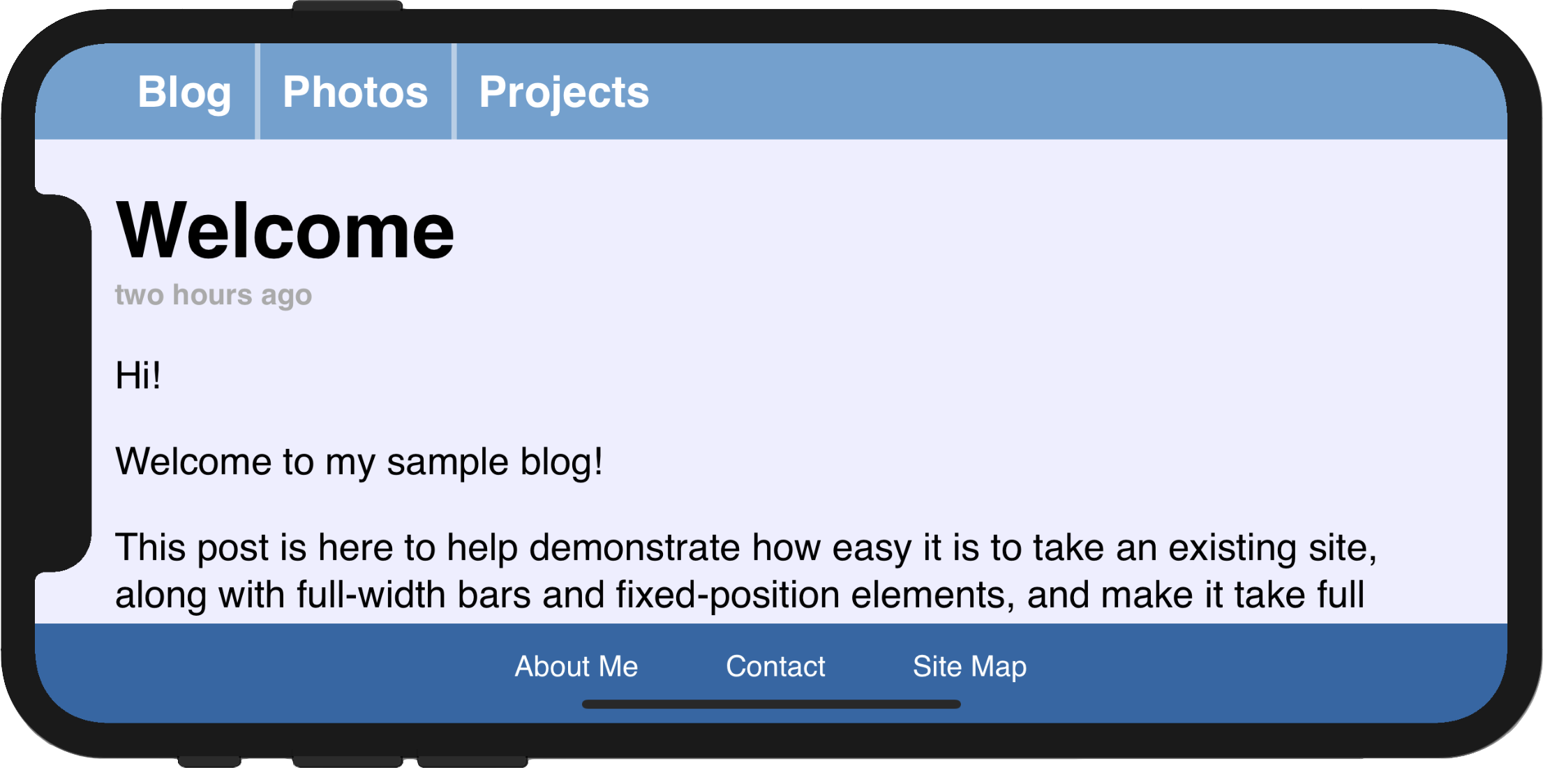
If you adopt safe area insets in your website design, you might notice that it is somewhat difficult to specify that you want a minimum padding in addition to the safe area inset. In the page above, where we replaced our 12px left padding with env(safe-area-inset-left), when we rotate back to portrait, the left safe area inset becomes 0px, and the text sits immediately adjacent to the screen edge.
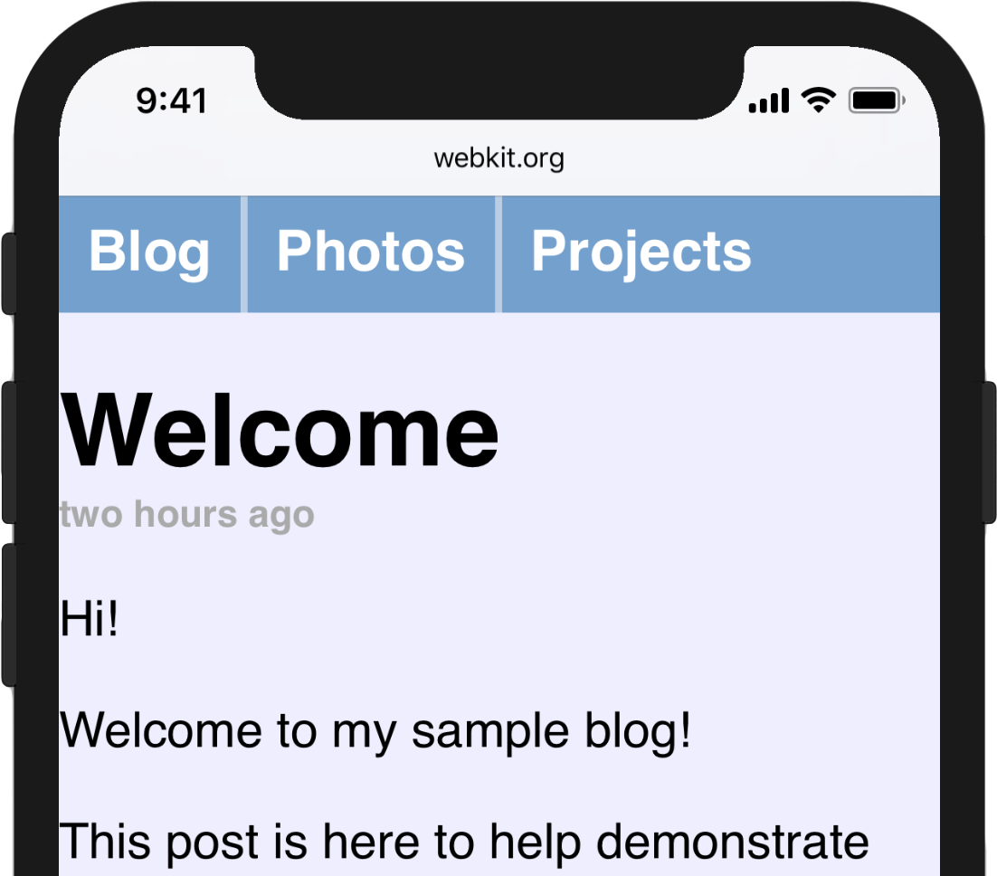
To solve this, we want to specify that our padding should be the default padding or the safe area inset, whichever is greater. This can be achieved with the brand-new CSS functions min() and max() which will be available in a future Safari Technology Preview release. Both functions take an arbitrary number of arguments and return the minimum or maximum. They can be used inside of calc(), or nested inside each other, and both functions allow calc()-like math inside of them.
For this case, we want to use max():
@supports(padding: max(0px)) {
    .post {
        padding-left: max(12px, env(safe-area-inset-left));
        padding-right: max(12px, env(safe-area-inset-right));
    }
}
In our example page, in portrait orientation, env(safe-area-inset-left) resolves to 0px, so the max() function resolves to 12px. In landscape, when env(safe-area-inset-left) is larger due to the sensor housing, the max() function will resolve to that size instead, ensuring that the important content within is always visible.
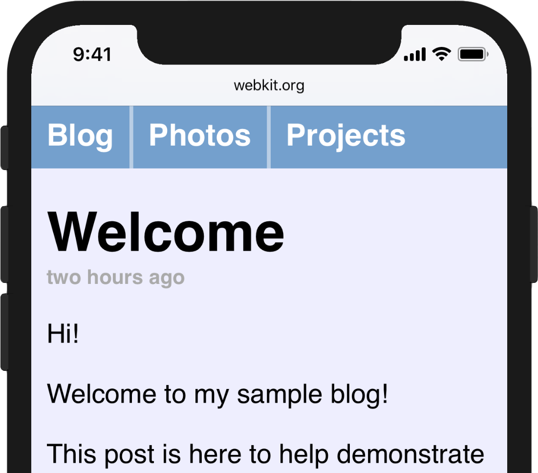
Experienced web developers might have previously encountered the “CSS locks” mechanism, commonly used to clamp CSS properties to a particular range of values. Using min() and max() together makes this much easier, and will be very helpful in implementing effective responsive designs in the future.
Feedback and Questions
You can start adopting viewport-fit and safe area insets today, by using Safari in the iPhone X Simulator included with Xcode 9. We’d love to hear how your adoption of all of these features goes, so please feel free to send feedback and questions to web-evangelist@apple.com or @webkit on Twitter, and to file any bugs that you run into on WebKit’s bug tracker.