CSS Reflections
WebKit now supports reflections in CSS. Continuing the trend of using adorable baby photos to make features appear more impressive, let me introduce Kate again. 🙂
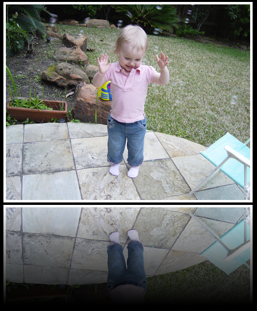
A reflection is a replica of the original object with its own specific transform and mask. The box-reflect property can be used to specify the specialized transform and mask that should be used for the replica.
-webkit-box-reflect: <direction> <offset> <mask-box-image>
<direction> can be one of above, below, left or right.
<offset> is a length or percentage that specifies the distance of the reflection from the edge of the original border box (using the direction specified). It can be omitted, in which case it defaults to 0.
<mask-box-image> is a mask-box-image that can be used to overlay the reflection. If omitted, the reflection has no mask.
Reflections will update automatically as the source changes. If you hover over links, you’ll see the hover effect happen in the reflection. If you reflect the <video> element, you will see the video playing in the reflection.
Giving an element a reflection has the effect of creating a stacking context (so it joins opacity, masks and transforms). The reflection is non-interactive, so from the point of view of hit testing, it’s like it isn’t there. The reflection will have no effect on layout (other than being part of a container’s overflow), and can be thought of as similar to box-shadow in this respect.
The example above uses a gradient mask. Here is the sample code:
<img src="bubbles.jpg" style="border:5px solid white;-webkit-box-reflect:below 5px -webkit-gradient(linear, left top, left bottom, from(transparent), color-stop(0.5, transparent), to(white));">