CSS Masks
WebKit now supports alpha masks in CSS. Masks allow you to overlay the content of a box with a pattern that can be used to knock out portions of that box in the final display. In other words, you can clip to complex shapes based off the alpha of an image.
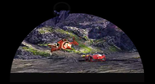
Here is a snapshot of the Speed Racer movie trailer clipped to the Safari compass icon. This is in fact a mask applied to the <video> element.
We have introduced new properties to provide Web designers with a lot of control over these masks and how they are applied. The new properties are analogous to the background and border-image properties that already exist.
-webkit-mask (background)
-webkit-mask-attachment (background-attachment)
-webkit-mask-clip (background-clip)
-webkit-mask-origin (background-origin)
-webkit-mask-image (background-image)
-webkit-mask-repeat (background-repeat)
-webkit-mask-composite (background-composite)
-webkit-mask-box-image (border-image)
Use of a mask results in a stacking context being created (similar to how opacity and transforms work). The mask will therefore overlay the child and all of its descendants, and at a minimum will knock out everything outside the border box of the object.
From a Web designer’s perspective, think of the mask as being constructed the way the backgrounds and border-image of a box are constructed. Multiple backgrounds are stacking on top of one another (possibly overlapping) with their own tiling and clipping rules. A border-image can then potentially be stretched or tiled over the backgrounds.
The final resultant image built from putting all of the mask images together, tiling them, stretching them, etc., then becomes the mask used to clip the content. Alpha values of 0 in the mask mean that nothing should be drawn. Alpha values of 1 mean the content should display normally. Anything in between ends up partially transparent.
One key difference between mask-box-image and its border-image counterpart is that it doesn’t attempt to fit itself to border widths. It will just render the corners unscaled and tile/stretch itself into the border box without regard for the border itself. This lets you easily use nine-piece-image effects as masks on elements without borders (often image or video elements).
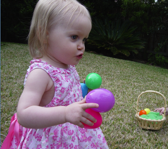
Here are two sample images. The source image that we want to mask and then the image that we will use as the mask.

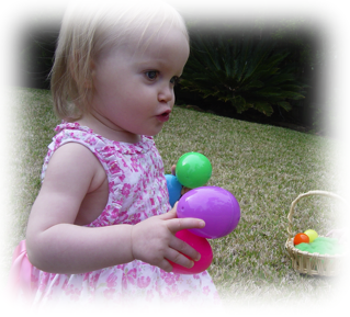
We can place a mask on the image element simply by doing this:
<img src="kate.png" style="-webkit-mask-box-image: url(mask.png) 75 stretch;">
The result looks like this:
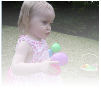
CSS gradients can be used as the mask image source as well. In the following example a linear gradient is used to achieve a fade effect. For example:
<img src="kate.png" style="-webkit-mask-image: -webkit-gradient(linear, left top, left bottom, from(rgba(0,0,0,1)), to(rgba(0,0,0,0)))">
Masks respect the border-radius curves of an object. We can add a border-radius to the previous example, and have both the gradient fade effect with rounded corners.
<img src="kate.png" style="-webkit-border-radius: 10px; -webkit-mask-image: -webkit-gradient(linear, left top, left bottom, from(rgba(0,0,0,1)), to(rgba(0,0,0,0)))">
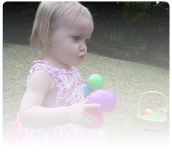
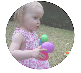
SVG images can be used as masks. For example, a partially transparent circle:

can be applied as a mask like so:
<img src="kate.png" style="-webkit-mask-image: url(circle.svg)">
The end result is shown below:
All of the power of the multiple background and border-image syntax is at your disposal when building masks!
As usual leave feedback in the comments and file bugs on any problems you notice at http://bugs.webkit.org/.