Help us invent CSS Grid Level 3, aka “Masonry” layout
If you’ve been making websites for years, you know how frustrating it was to lay out a web page with CSS floats. Managing sizes and placement was tedious and time consuming. Being creative was often impossible. CSS Grid greatly eased that pain with Grid Level 1 in 2017, and now with Grid Level 2, aka Subgrid. But even with the powerful CSS of today, not every layout imaged by designers is possible. In fact, when CSS Grid shipped, one of the most commonly asked questions was: “how do I write CSS to accomplish a masonry layout?” Sadly, for the last seven years the answer has been — you can’t.
What is masonry layout?
What do we mean by the term “masonry layout”? Basically it’s the pattern seen in the following image — where content packs together like a brick or stone wall. That’s where it gets the name “masonry”. It’s also frequently called “waterfall layout”, as a metaphor for how content flows down the page like a waterfall.

This layout is popular because it solves a few problems that other layouts do not.
- It allows for content of different aspect ratios, and avoids the need to crop or truncate content in order to turn everything into uniform rectangles.
- It distributes content across the page (instead of flowing down each column, one by one). This follows the natural reading order as you scroll the page. And it lets the website lazy-load additional content at the bottom without moving existing content around.
This layout creates uniformly-sized columns, without any rows. It’s quite possible that because this layout has required JavaScript, anything more creative or complex has been too hard to pull off — and we’ve been left with an expectation that masonry layout should only ever be a simple pattern with uniformly-sized columns. Let’s see what’s possible if we build it into CSS instead.
Inventing masonry
A mechanism in CSS for “masonry layout” was first proposed by Mozilla in January 2020 as an extension of CSS Grid, and implemented as an experiment behind a flag in Firefox Nightly. In 2022, Apple started implementing this CSS Grid Level 3 proposal in Safari Technology Preview (where it’s currently on by default), and we’ve been helping to move the web standard along to reach maturity.
However, there are big questions still being asked about how CSS should handle masonry-style layouts. Some people remain skeptical that this capability should be part of CSS Grid, and want it to instead be its own separate display type. Others are questioning whether or not this kind of layout is needed on the web at all — they aren’t sure that well-known websites will use it. With such fundamental disagreements at play, no browser can ship. We must first come to consensus in the CSS Working Group.
This is where we need your help. We’d like real-world web designers and developers to weigh into the discussion, and express what it is that you want. Your input really can make a difference.
In this article, we’ll walk through how the CSS Grid Level 3 proposal works, and how you can use its new capabilities. We’ll show you why we believe these features should be part of CSS Grid, and explain what the alternative would be if the CSS Working Group creates display: masonry instead. And then, we’ll ask you to join the debate to help move us forward. Please do read to the end.
Four demos
To show why we at Apple believe this capability should be part of CSS Grid, we created four demonstrations. If you’d like, try them yourself at webkit.org/demos/grid3. View these demos in a browser that supports Grid Level 3 — currently Safari Technology Preview or Firefox after you’ve turned on the feature flag.
Note there’s a control panel for each demo, with the relevant layout code printed to the page. Turn on “Number items” to see the relationship between the HTML order of content and the layout placement of that content.
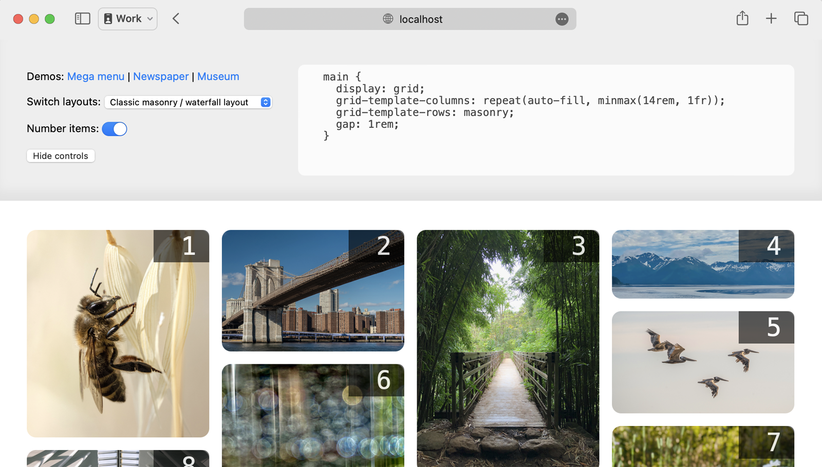
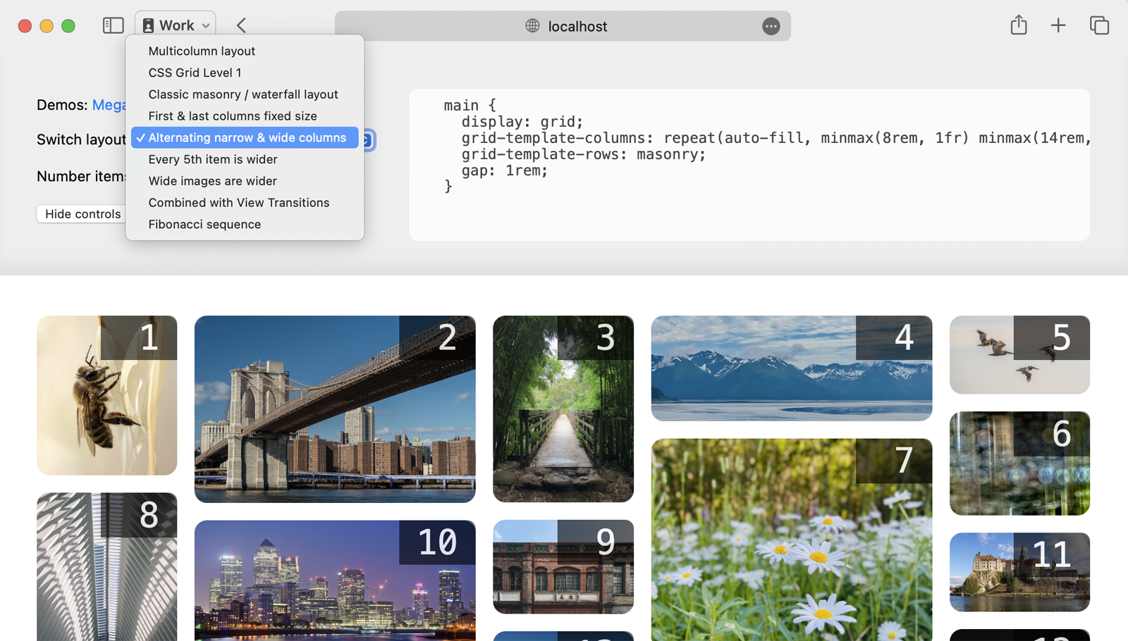
Each demo has a multitude of variations. Switch between variations from the dropdown menu, which changes only the CSS. The HTML stays the same.
Creating a classic masonry / waterfall layout
First, let’s take a look at how to build a classic masonry/waterfall layout. In this gallery of photos, each image is wrapped with a figure element, and the figures are direct children of a main element.
<main>
  <figure><img src="photo-1.jpg"></figure>
  <figure><img src="photo-2.jpg"></figure>
  <figure><img src="photo-3.jpg"></figure>
</main>
We start by applying display: grid to the main element to create the Grid container. Then we can define grid-template-columns however we’d like.
In this case, let’s use grid-template-columns: repeat(auto-fill, minmax(14rem, 1fr)) to ask the browser to repeat a looped definition to create a set of flexible columns that are each of a minimum of 14rem. This results in uniformly-sized columns, typical of the classic masonry/waterfall layout. The gap: 1rem; rule creates a 1rem-wide space between the items — both between the columns, and horizontally between items.
And then, we’ll define the “rows” with the masonry value. (It’s likely the name of this value will change before this ships in browsers — more on that at the end of this article. For now, masonry is what works.)
main {
  display: grid;
  grid-template-columns: repeat(auto-fill, minmax(14rem, 1fr));
  gap: 1rem;
  grid-template-rows: masonry;
}
The grid-template-rows: masonry rule tells the browser: “Please do not create rows. Instead pack the content into a masonry/waterfall-like pattern.”
That’s it! In four lines of CSS, with zero media queries or container queries, we’ve created a flexible layout that works on screens of all sizes. And there’s no need to crop content to force everything into same-sized boxes.
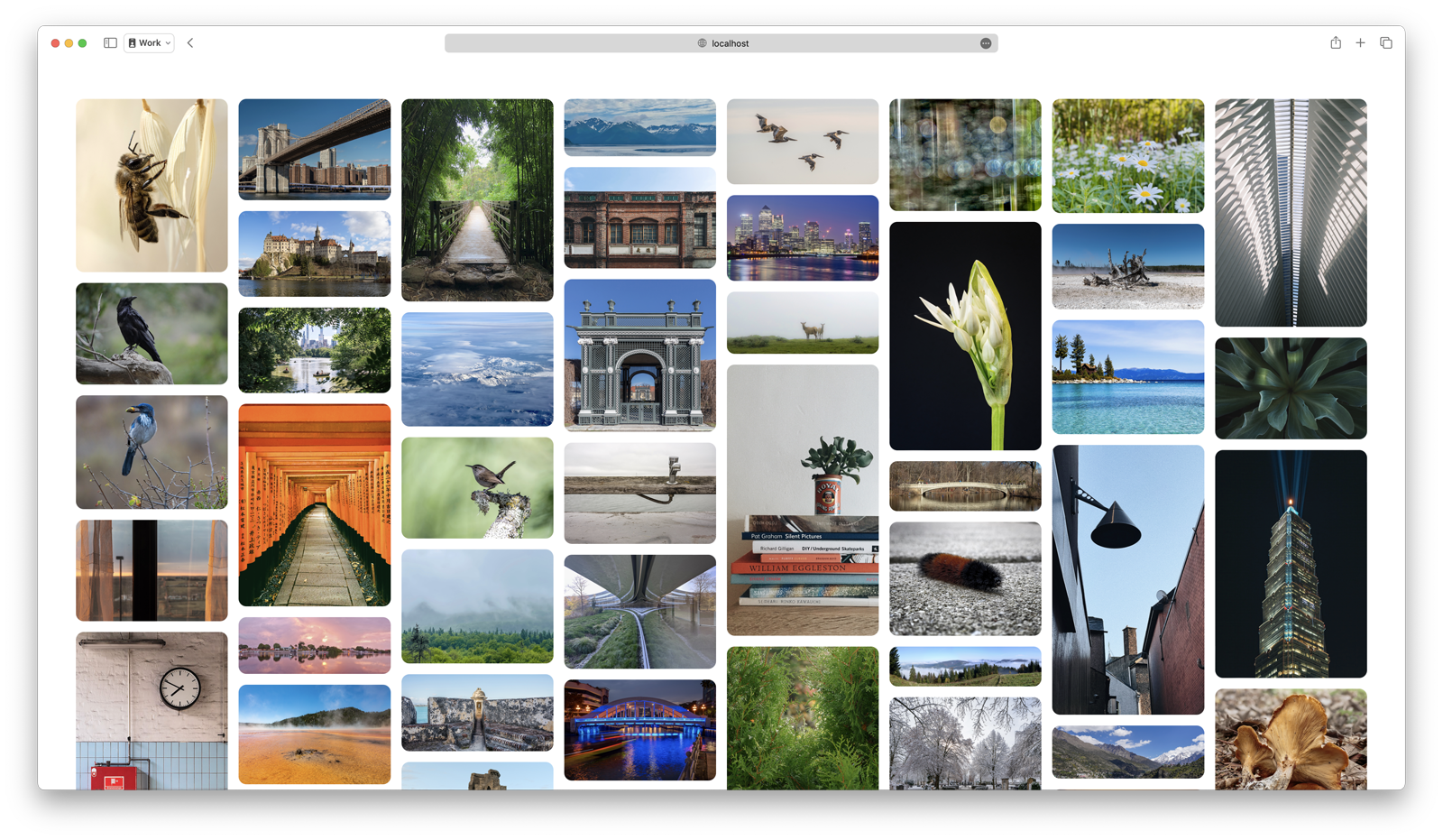
In graphic design, a layout that has uniformly-sized columns and no rows is often called a “symmetrical columnar grid”. For centuries, columnar grids were the dominant type of grid used in page design.
Leveraging Grid’s full power to define columns
Now let’s dive into the advantages of combining the full power of CSS Grid with masonry/waterfall packing. CSS Grid provides many options for defining grid our columns. Using fr units to create a symmetrical grid is only one option of many.
How could these possibilities be used for a masonry/waterfall-style layout? Let’s try mixing fixed-sized columns with flexible columns. We could make the first and last column fixed-sized, while the middle columns are flexible, changing in both size and number.
Specifically, the first and last columns are exactly 14 characters wide, while the middle columns are flexible (at least 28 characters wide) and change in number to fill the available space.
main {
  display: grid;
  grid-template-columns: 14ch repeat(auto-fill, minmax(28ch, 1fr)) 14ch;
  grid-template-rows: masonry;
  gap: 1rem;
}
This is just one of many, many possibilities.
CSS Grid allows for a lot of creativity with its options for defining grid tracks:
- fixed sizes defined in any unit (px, em, rem, cqi, lh, ch, ic, cap, vw, svh, and many more)
max-contentandmin-content- the full power of
frunits minmax()functions%-sized- auto
These options in CSS Grid allow you to create something much more dynamic and flexible in interesting ways. You can create two stages of flexibility, because the fr-unit sized columns grow and shrink in a separate stage from the minmax()-sized columns. The max-content and min-content values let you size the columns based on the content size, rather than sizing the content based on the column size. The fr units can easily be used to create compound or asymmetrical grids, where the columns are different sizes. The options are endless.
By adding the ability to pack content in a masonry/waterfall pattern to CSS Grid, we maintain the full power of Grid for defining our columns in whichever manner we like.
For example, let’s use grid-template-columns: repeat(auto-fill, minmax(8rem, 1fr) minmax(16rem, 2fr)) minmax(8rem, 1fr) to create a pattern of alternating narrow and wider columns, where all the columns are flexible. More columns are added when there’s space. And there’s always an odd number of columns, ending with a narrow one.
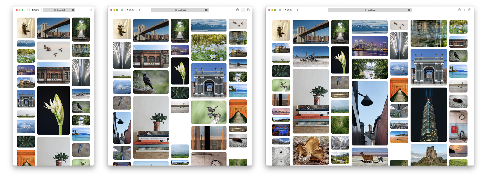
Even when we define columns using only the simple fr unit, the full power provided in CSS Grid means different columns can be set to different sizes. For fun, let’s use fr units to define a set of columns sized to inject the vibes of the golden ratio by using the Fibonacci sequence in grid-template-columns: 1fr 1fr 2fr 3fr 5fr 8fr;

In a more practical example, let’s use max-content when defining our columns. Content-based sizing is an incredibly power feature of CSS Grid. This demo of a mega menu layout uses grid-template-columns: repeat(auto-fill, minmax(max-content, 30ch)); to ensure that every column is big enough to fit every link without wrapping text.
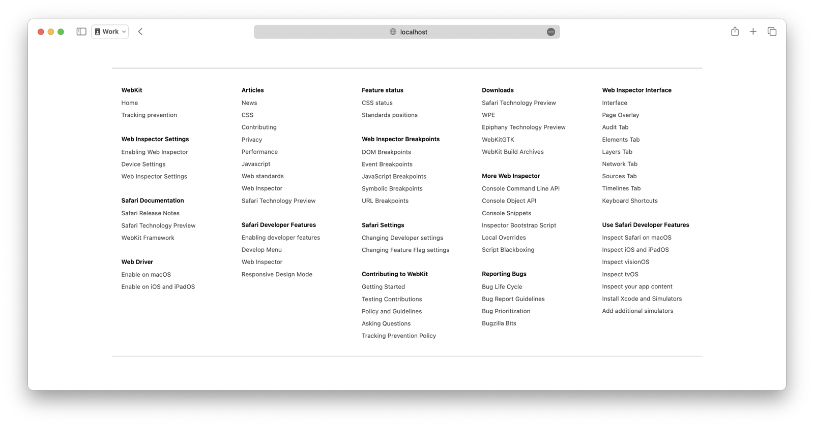
Mega menus have been hard to code, especially across multiple screen sizes. With CSS Grid Level 3, it becomes incredibly easy. A few lines of code creates a dynamic layout which adds and removes columns one at a time as space allows — without any media/container queries, and with wrapping prevention.
Many of these examples could never be created with masonry as a separate display type. The discussion of display: masonry is to only allow symmetrical columns (columns that are the same size as each other), much like multicolumn layout does today.
Leveraging Grid’s ability to let content span columns
CSS Grid also lets us span items across multiple columns. Let’s use that capability to see what interesting options might emerge. How about making every 5th image span two grid columns, while the rest of the images are span one column.

What if instead, we put a wider class on specifically on images that have a wider aspect-ratio, to make those images span multiple columns. We can also change the styling a bit, making the corners square instead of round, and reducing the grid gap to zero. This gives us a different way to pack photos of different aspect ratios together.

We also experimented with combining the classic masonry/waterfall layout of photos with View Transitions. When a user clicks/taps on any photo, it grows to span multiple columns. The browser automagically animates the transition. (This demo requires Safari Technology Preview 192 or later.)
These variations of the Photos and Mega Menu demos are just a small taste of all of the many possibilities you get when leveraging the full power of CSS Grid in the column direction, while simultaneously turning off rows.
Columnar vs. Modular Grids
What happens when we keep experimenting? Let’s let go of thinking about “masonry”, and start imagining Grid Level 3 purely as an expansion of Grid. At its core, CSS Grid Level 3 provides a mechanism for turning off rows. It lets us create a columnar grid — a grid that’s made up of columns alone.
By contrast, a modular grid is a grid where everything is lined up in both columns and rows. They became popular in the 20th century during the dominance of modernism in graphic design. CSS Grid Level 1 is really good at making modular grids… that’s what it wants to do. In fact, float-based layouts also encouraged the creation of modular grids on the web, since you had to make all your content the same height to get your floats to clear. Images need to be the same aspect ratio. Text has to be the same length. This is often accomplished on the back-end with policies enforced by the content management system, or on the front-end by CSS that truncates/crops the content.
It’s incredible common for websites to do some variation of this sort of modular grid, laid out here with CSS Grid Level 1.

Of course, this example is overly simplistic. The article ledes look bare with no teaser images. The uniformity is so strict and formal, the design lacks life. Real websites find other ways to breathe life back into the design.
But what if the layout itself could also provide some vitality and interest? What will happen if we use CSS Grid to create a columnar grid as easily as it creates a modular grid? What if we don’t truncate content, and instead let it be the size that it wants to be — and get the layout to work for the content, rather than forcing the content to work for the layout?
A classic masonry/waterfall layout with various lengths of text looks like this, which is already more engaging since a user can read more about each article:
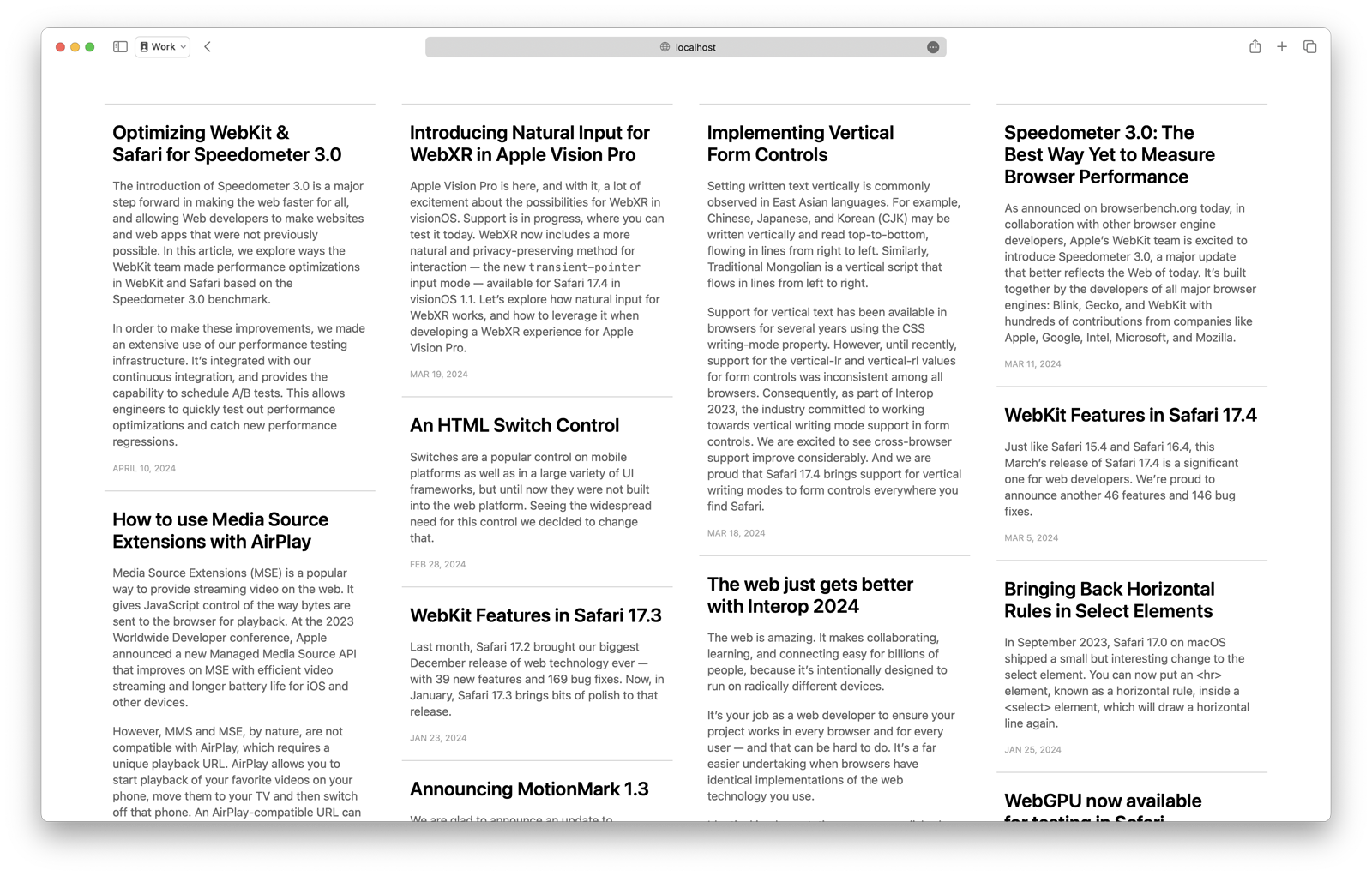
Although, that’s still a bit visually repetitive. Symmetrical columnar grids often are. We need the rest of the power of CSS Grid to do something more interesting. Let’s make the latest article much bigger, and have it span four columns. A handful of other recent articles can be medium-sized and span two columns. While the older content is smaller, spanning one column.
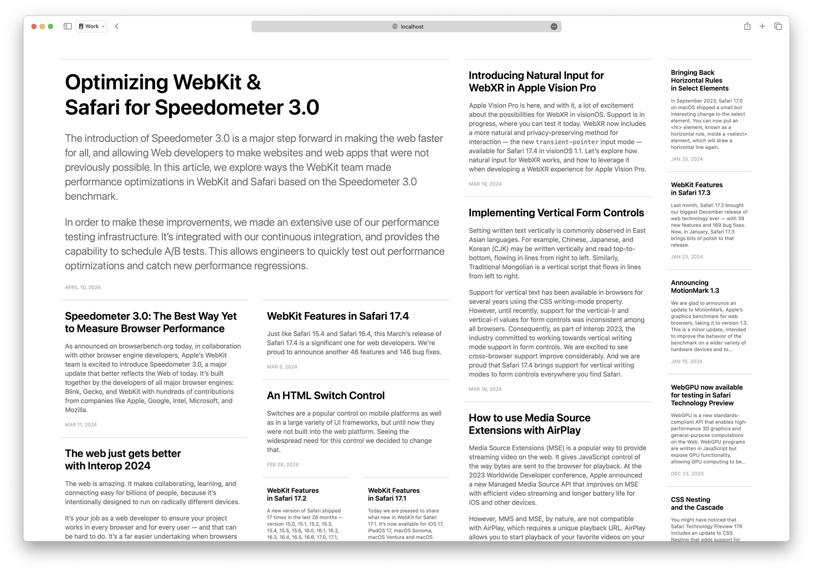
Now this otherwise visually boring text is starting to look fairly lively. If we were to add images to each of these articles, it would be it even more dynamic.
Let’s experiment with mixing images and text together on a webpage for a museum. The first grid item is a header that introduces the museum, and provides navigation to other resources. The rest of the content consists of pieces of artwork and their information: title, artist, year, medium, catalog number and location.
Because the paintings are gorgeous, the content looks pretty great in a classic masonry/waterfall layout.

Let’s see what else we can do by utilizing two more powerful features of CSS Grid — subgrid and explicit placement.
Using subgrid and explicit placement
The functionality provided by subgrid in CSS Grid Level 2 is incredible, and it’s finally supported in most browsers.
Instead of listing the painting’s metadata in a single left-aligned column, let’s see how we might better use the available space. By using subgrid, we can put the year and catalog number on the right of each card — and line up this data for one painting with the same data for the other paintings.
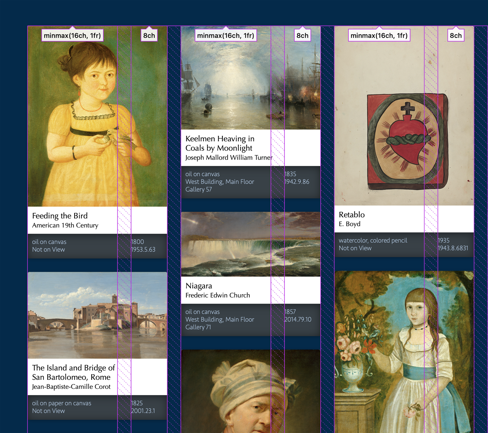
By adding this new functionality to CSS Grid Level 3, we get the benefit of existing developer tools. You can use the Grid Inspector in Safari Technology Preview today as you try out grid-template-rows: masonry.
If masonry is its own display type, and not part of CSS Grid, it will not get the benefit of subgrid.
We can also use the power of CSS Grid Level 1 to explicitly place the header into the last two columns, moving it to the top right corner of the page with grid-column: -3 / -1.
In just a few lines of layout code, we are using the full power of CSS Grid Levels 1, 2, and 3 to create flexible columns that change in number to accommodate the available size — without using any media queries or container queries.
Hopefully you can see the advantages of fully combining a mechanism for masonry/waterfall layouts with CSS Grid — providing many more creative possibilities than masonry alone.
The Debate
So let’s get into the debate that’s been blocking the CSS Working Group from moving forward. Our hope is that web designers and developers chime in (post to social media, write blog posts) with your thoughts about which direction CSS should take.
Some people, including those of us at Apple, like having “Masonry” be part of CSS Grid. We believe this functionality is a mechanism to expand CSS Grid — allowing it to finally create columnar grids as well as modular grids. And we want this functionality to be mixed with all the other features of Grid, including the powerful options for defining a columns, track spanning, explicit placement, and subgrid.
Other people instead believe Masonry should be its own separate display type. At first glance, defining Masonry with a new display type might make a lot of sense. You do get a tidy separation between layout types.
display: block;
display: inline;
display: flexbox;
display: grid;
display: masonry;
The CSS Working Group has not discussed how the syntax for a separate Masonry display type would work, but perhaps it would be patterned after Multicolumn layout.
main {
  display: masonry;
  columns: 28ch;
}
Or perhaps the syntax would be patterned after Grid, but with significant limitations:
main {
  display: masonry;
  masonry-columns: repeat(5, minmax(28ch, 1fr));
                   /* where only one repeating width is allowed */
}
Either way, it’s clear that advocates of this option want Masonry to be limited to a symmetrical grid — where all the columns are the same size as each other. None of the rest of CSS Grid’s track sizing capabilities would be allowed.
Making masonry a simple and separate layout type would avoid the work necessary to keep Grid and Masonry working together in combination — both now and in the long term. Doing this would simplify the layout model, make it easier to implement in browsers, reduce the potential for performance traps, and allow the feature sets of Grid and Masonry to diverge.
Conversely, we believe the effort needed to add this capability to CSS Grid is worth the many benefits to be had. The CSS Grid Level 3 specification has already been written, and implemented in two browser engines. And yes, while making CSS Grid more complex will make it harder to extend in the future, we believe there’s an advantage to having these two types of grid layouts intertwined. This way the CSS Working Group will always define all new additions for both modular and columnar grids. There won’t be something added to display: grid that will be left out of display: masonry, or vice versa. For example, many developers want CSS Grid Level 4 to provide a mechanism for styling grid areas and grid lines — perhaps a way to add a background color to a track, or create a rule line in a gap. It’d be great to ensure that will work for both modular and columnar grids from Day 1.
Another argument made by advocates of display: masonry is that that masonry is conceptually a fundamentally different layout type from CSS Grid, and therefore should have its own display type. They often describe CSS Grid as inherently being about “lining things up in two-dimensions”, and since masonry only lines things up in one dimension, “it’s not a grid”. (In fact, some have advocated that Masonry is more like Flexbox, since “both line things up in one direction”.)
In many ways, your perspective on this question might depends on what you imagine a grid is.
What is a grid?
Grids are an incredibly important aspect of graphic design. Grids are used to line up text, images and other content in a regular pattern. They help readability and usability by making things predictable.
You can trace their use through thousands of years of history.
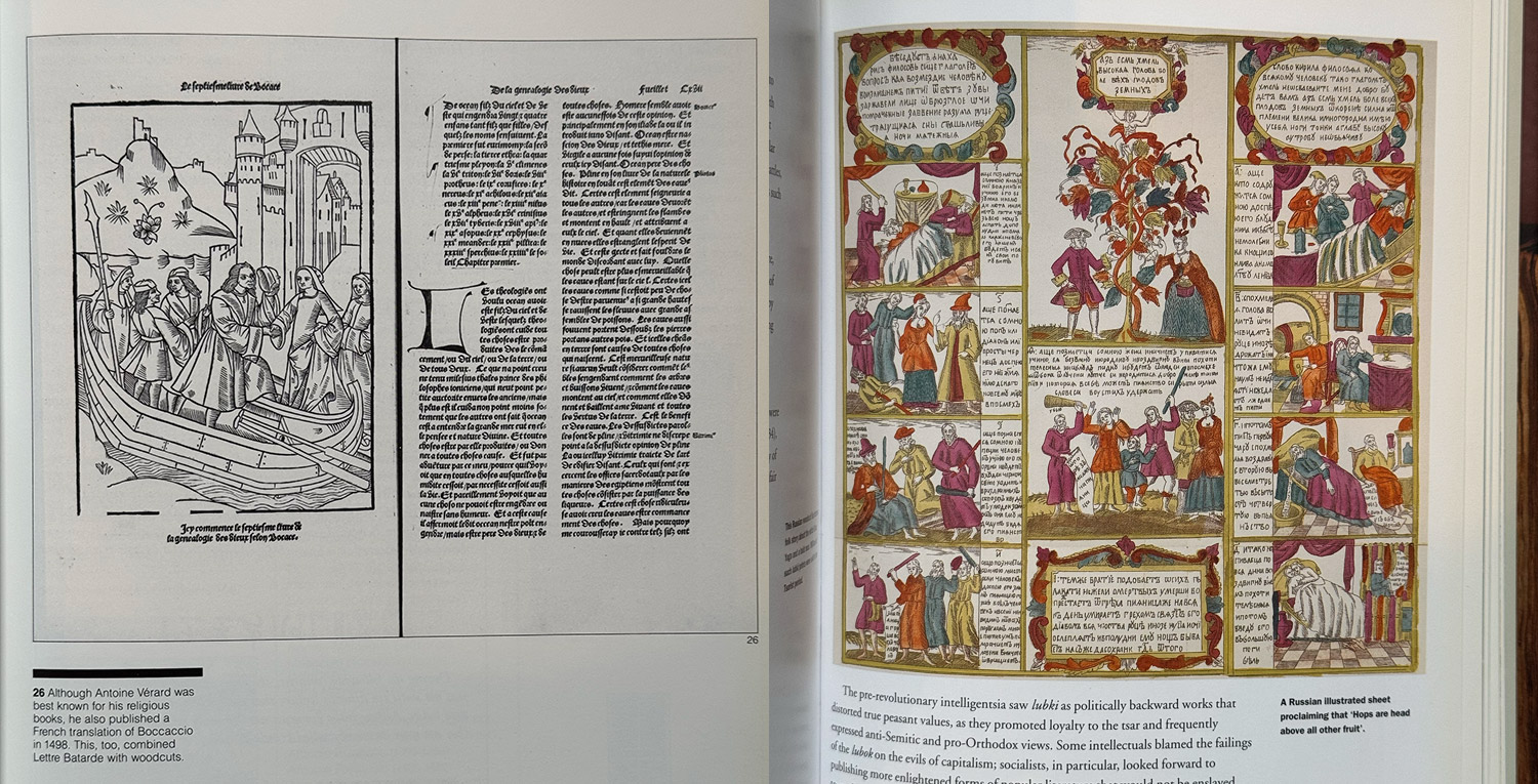
It wasn’t until the 20th century that European and American modernists started promoting the idea that “proper” graphic design grids should line content up in both directions — in rows as well as columns.
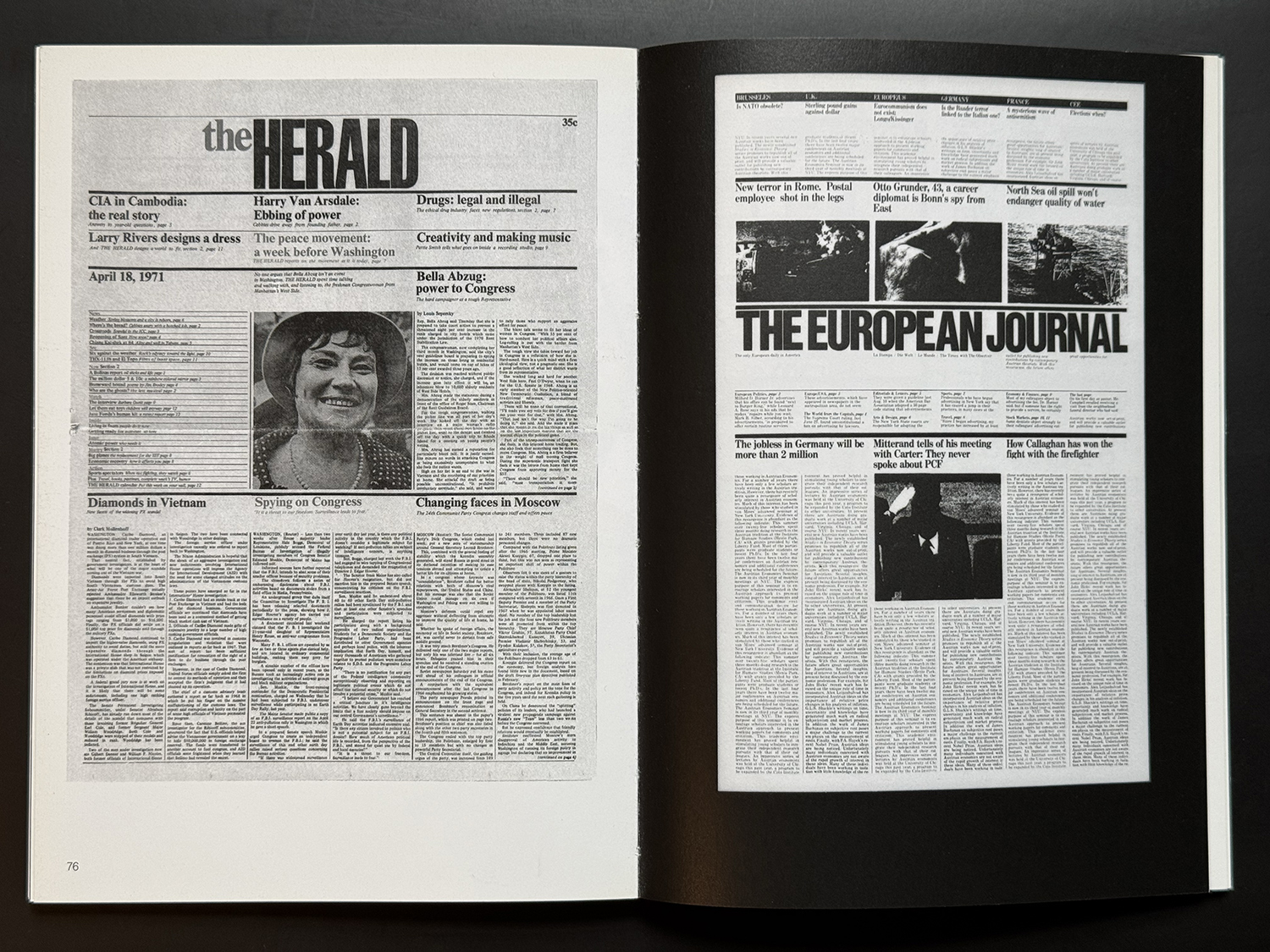
Even today, there is a lot of debate about which type of grid is the best grid or the only legitimate grid. Many designers claim a 12 column grid is the only correct way to design a web page — or 12 columns for “desktop”, 8 columns for “tablet”, and 4 columns for “phones”. At times designers have gotten quite religious about their ideas of what a “proper grid” looks like.
Mark Boulton argued for years that symmetrical columnar grids are incredibly formulaic and boring. He promoted the use of asymmetrical compound grids in design for the web. Today, luckily CSS Grid Level 1 makes it incredibly easy to create both asymmetrical grids and compound grids, giving designers the freedom to create what they want. But only if they also want all their grids to be a modular grids.
Both modular and columnar grids are in fact grids. And CSS Grid deserves the ability to also create columnar grids.
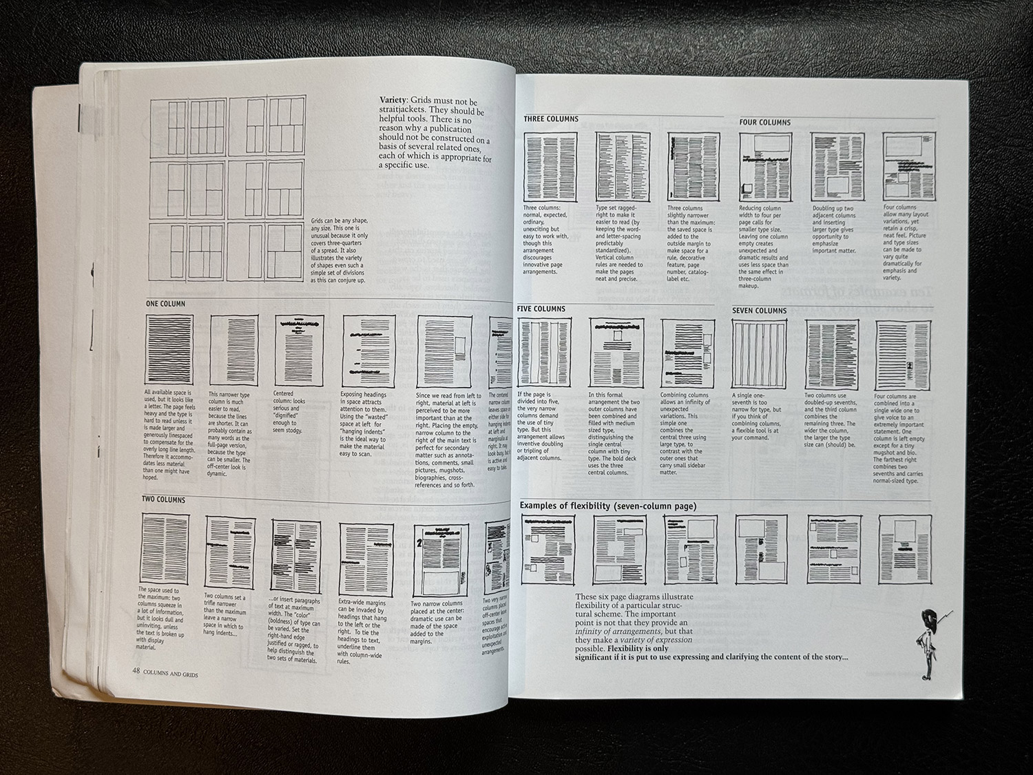
We believe there’s an opportunity for CSS to enable a rich history of design grids to come to the web — and would be greatly disappointed to see the new masonry feature limited to only allowing symmetrical columnar grids.
But what do you think?
We want to hear from you
This is where you come in. Try some demos of your own. Write about your thoughts on your own blog. Comment at the CSS Working Group in this issue.
- Should “masonry”/“waterfall” be part of CSS Grid?
- Do you want the capabilities to define a columnar grid with CSS Grid — to use subgrid, spanning, explicit placement, and all the many options for track sizing? Or do you only want the ability to define a classic masonry layout with equal-sized columns?
- Will you use this? What might you create with it?
- Do you have links to demos you’ve made? We want to see your ideas and use cases.
- Are there things you want to do that you can’t do with this model?
Often, thinking about something theoretically and actually seeing it in use can be very different. To make sure the CSSWG gets the design of this feature correct, we need developers to gain some hands-on experience, and articulate your thoughts about what it’s like.
The WebKit team has been working on Masonry for a year and a half. It was first enabled by default in Safari Technology Preview 163 in February 2023. There’s a bit more polish needed, and details to work out (naming being one). But we would like to ship this feature soon. To do so, these fundamental questions need to be resolved.
Thank you for your help!
P.S. About the name
It’s likely masonry is not the best name for this new value. Names in CSS are usually simple words that directly describe the result they create — like center, under, contain, clip, revert, ltr, always, break-word, hidden, allow-end, scale-down, wrap, smooth.
The word “masonry” is more of a metaphor, where the meaning has to be explained with a backstory. Such a term is harder to remember for developers who do not speak English. And arguably, the syntax could just as easily be grid-template-rows: waterfall instead, since that’s the dominant word for this layout used in certain regions, not masonry.
Plus, once you start to write a lot of code using this feature, it’s likely you’ll come to the realization that we did — this really isn’t about the layout used by Pinterest or other similar sites. This is a mechanism for telling the browser, “please create a grid, but without any rows.”
Perhaps the best syntax could be grid-template-rows: none; to convey “please do not give me any rows”. Sadly, it’s too late to use this name, because none is the default value for grid-template-* and means “please give me only implicit rows, no explicit ones”.
Instead we could use the name off to convey “please turn off the grid in the row direction, and give me only columns”.
main {
  display: grid;
  grid-template-columns: repeat(auto-fill, minmax(14rem, 1fr));
  grid-template-rows: off;
}
The CSSWG is debating this name in this issue. If you have ideas or preferences for a name, please join that discussion.
Meanwhile, masonry is the value that is currently implemented in Safari Technology Preview, since that’s what the Editor’s Draft currently uses. And so that’s what we used in our demos above, and what you should use in yours. But do expect the name of this value to change in the future. And perhaps prepare for a future where we call this “columnar grid” or “Grid Level 3” instead of “Masonry”.