Easier layout with margin-trim
If you write a lot of CSS, you are familiar with those moments when you aren’t quite sure how to accomplish what you want to accomplish. Usually, you’ll turn to tutorials or documentation, and learn more about CSS to get your work done. But every once in a while, you realize there is no “proper” way to do what you want to do. So you come up with (or borrow) a solution that feels hacky. Maybe it requires a lot of complex selectors. Or maybe it works for the content you have at the moment, but you worry that someday, someone might throw different HTML at the site, and the solution you wrote will break.
CSS has matured a lot over the last decade. Many robust solutions filled in gaps that previously required fragile hacks. And now, there’s one more — margin-trim.
Margin trim
The margin-trim property lets you tell a container to trim the margins off its children — any margins that push up against the container. In one fell swoop, all of the margin space between the children and the container is eliminated.
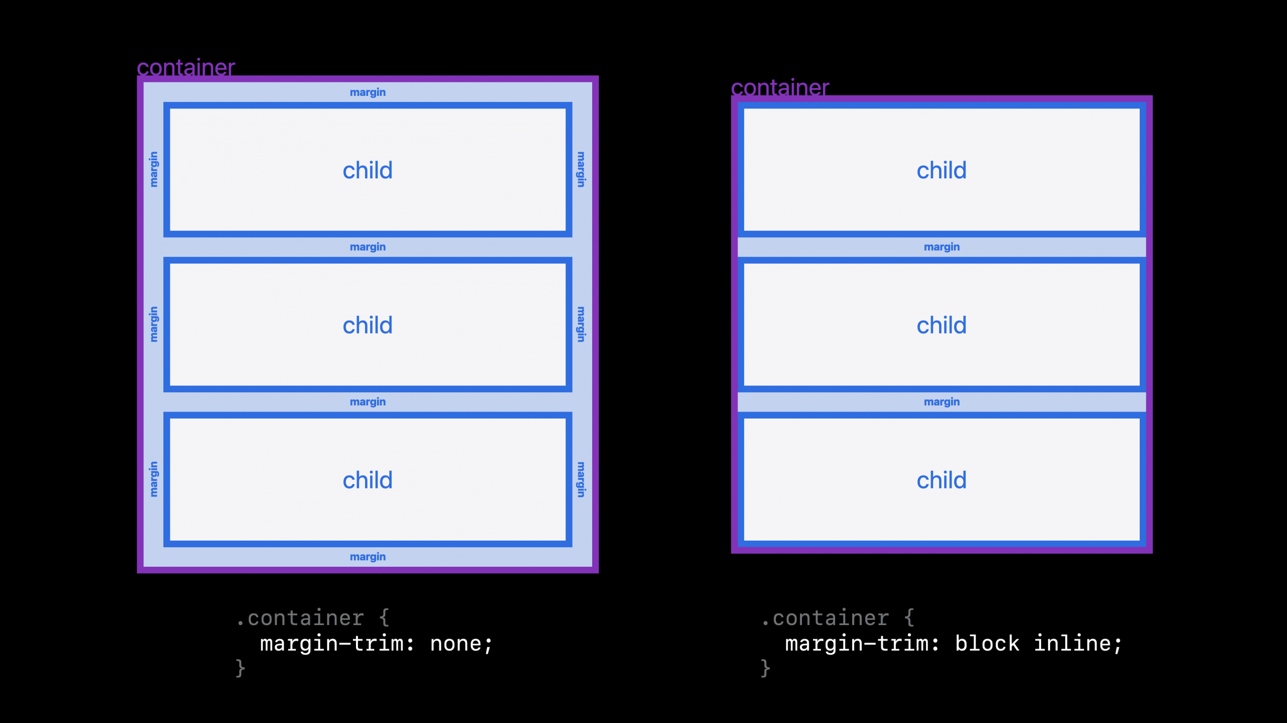
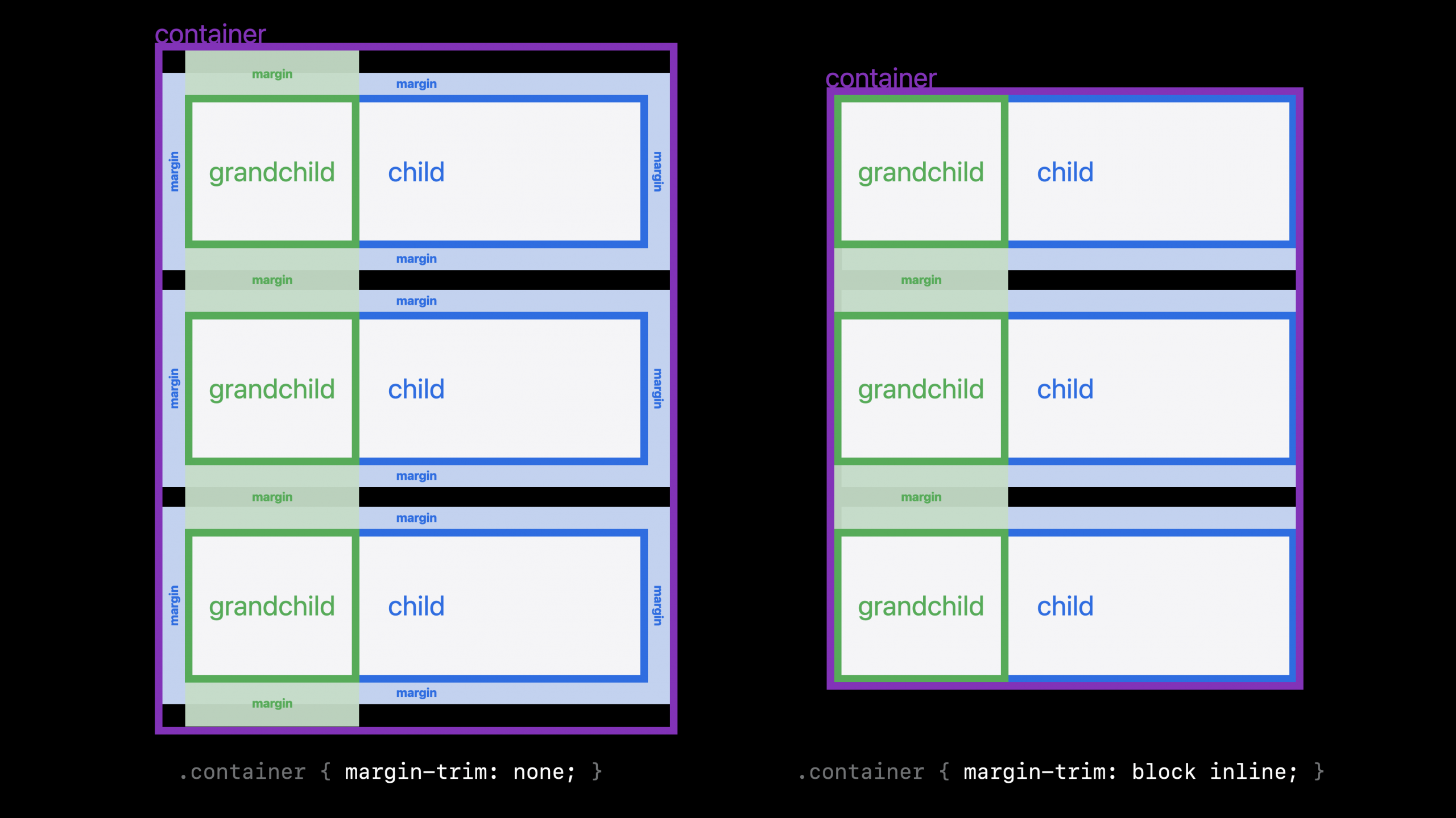
This also works when the margins are on the grandchildren or great grand-children, or great great great great grand-children. If there is space created with margins on any of the content inside the container, and that space buts up against the container, it’s trimmed away when margin-trim is applied to the container.
Let’s imagine a practical example. Let’s say we have multiple paragraphs inside an article element, and those paragraphs have margins. Also at the same time, the container has padding on it.
article {
  padding: 2lh;
  background: white;
  p {
    margin-block: 1lh;
  }
}
This is very typical code. The padding on the container is supposed to create an even amount of space all the way around the box, but instead there’s extra white space above and below the content. Like this:

By using 1lh for the margins between the paragraphs, and 2lh for the padding on the article box, we’re attempting to create a beautiful typographic layout. Let’s turn on some guides to better see where the extra space is coming from. The padding on the article box and the margins on the paragraphs are each marked in separate colors.

The margins on the first and last paragraphs (1lh) are being added to the padding (2lh) to create a space in the block direction that measures 3lh.
It will be better for the design if we get rid of the margin above the first paragraph and the margin below the last paragraph. Before we had margin-trim, we would attempt to remove the margins from the first and last paragraphs, or lessen the padding in the block direction… but any approach we take will be dependent on the content inside. Perhaps another instance of this article will start with a headline that has a different amount for a top margin. Or start with an image that has no margin.
Without being 100% sure of what kind of content will be in the box, it’s hard to guarantee the spacing will come out as desired. Until now.
The new margin-trim property gives us an easy way to ask directly for what we want. We can tell the box to eliminate any margins that are butting up against that box.
For example:
article {
  margin-trim: block;
  padding: 2lh;
  background: white;
  p {
    margin-block: 1lh;
  }
}
Now the browser automatically chops off any margins that touch the edge of the article box in the block direction — in this case the top and bottom of the box.

Note that while the margins are defined on the <p> element, you declare margin-trim on the <article> element. You always apply margin-trim to the container, not the element that has the margin in the first place.
Here’s the end result.

Try it yourself
You can try out margin-trim in this live demo, in Safari 16.4 or greater.

Browser Support
Support formargin-trim shipped in Safari over two years ago. But so far, Safari is the only browser with support. So what should you do for browsers without support? For our demo, you could write fallback code inside of feature queries, like this:
article {
  margin-trim: block;
  font-size: 1.2rem;
  line-height: 1.3;
  padding: 2lh;
  p {
    margin-block: 1lh;
  }
}
@support not (margin-trim: block) {
  article {
    :first-child {
      margin-block-start: 0;
    }
    :last-child {
      margin-block-end: 0;
    }
  }
}
This helps to clarify the difference between margin-trim and the older techniques we’ve been using.
When using :first-child and :last-child any element that’s the first or last direct child of the container will have its margins trimmed. But any content that either isn’t wrapped in an element, or that is nested further down in the DOM structure will not.
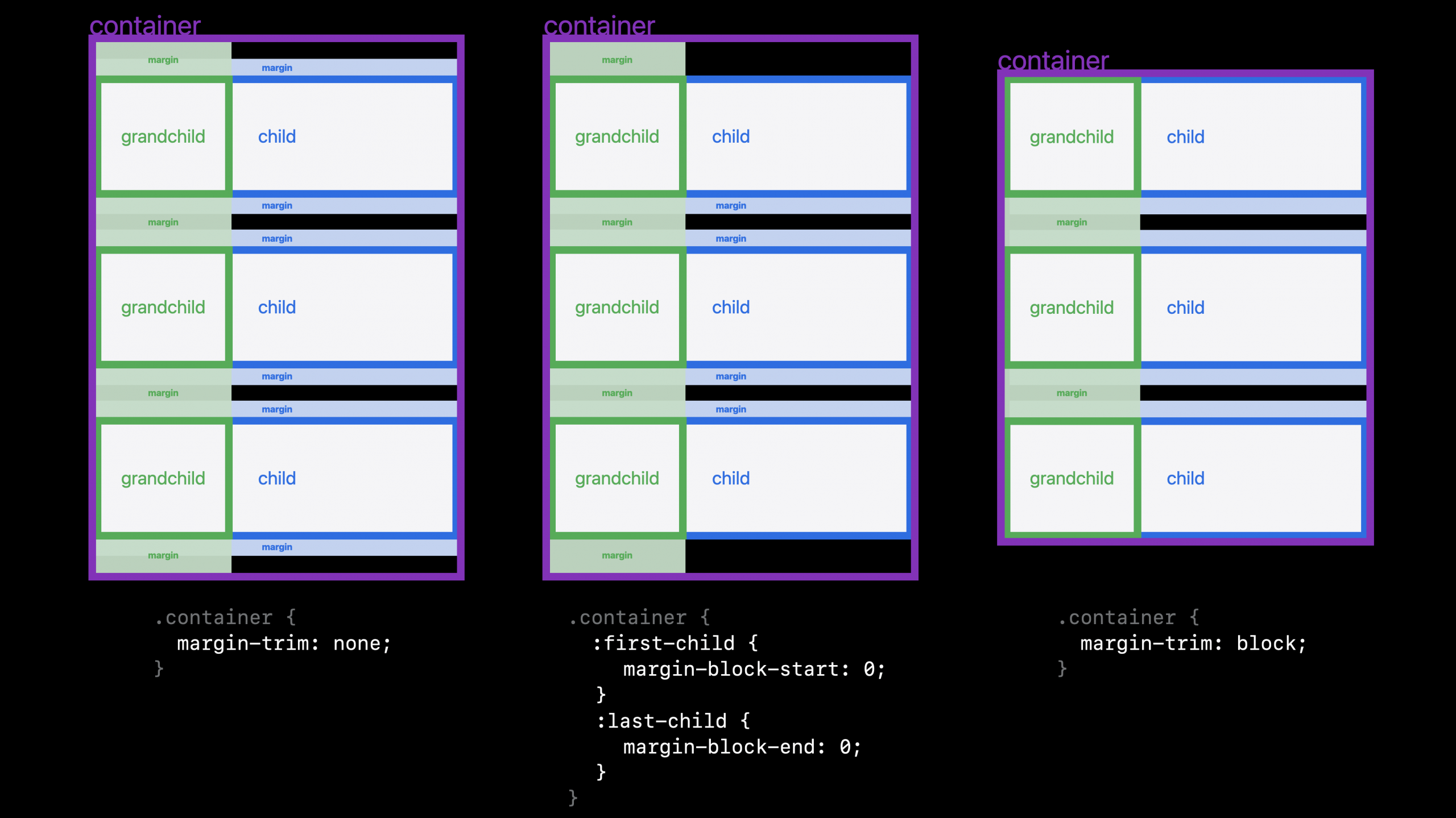
For example, if the first element is a figure with a top margin, and the figure contains an image that also has a top margin, both of those margins will be trimmed by margin-trim, while only the figure margin will be trimmed by :first-child.
<article>
  <figure style="margin-top: 1em">
    <img  style="margin-top: 1em" src="photo.jxl" alt="[alt]">
    <figcaption>[caption]</figcaption>
  </figure>
</article>
The margin-trim property makes trimming such margins easier and more robust than older techniques.
Even though Safari is the only browser with support at the moment, it makes sense to use it today. Put the hackier layout code in a feature query for the browsers without support ( like@support not (margin-trim: block) { }), while using margin-trim for the browsers that do have it. Hopefully the less robust code will work. It’s the code you are going to have to write anyway. But meanwhile, browsers with support get a more robust solution. And as more and more browsers add support, more and more users will be guaranteed to have a layout that never breaks, no matter what’s thrown at it.
Options for Margin Trim
The values for margin-trim are all logical values, referring to the block and inline directions.
margin-trim: nonemargin-trim: blockmargin-trim: inlinemargin-trim: block-startmargin-trim: block-endmargin-trim: inline-startmargin-trim: inline-end
If you want to trim in both directions at the same time, you can do so by combining long-hand values. For example:
margin-trim: block-start block-end inline-start inline-end;
In December 2024, the CSSWG resolved to also allow the shorter block and inline keywords in combination, allowing for syntax like this:
margin-trim: block inline;
The work has been done in WebKit to support this last option. Look for it in Safari Technology Preview soon. Follow this issue for more updates.
Let us know
CSS has never been better. It’s my hope you learn about small improvements like this one, and use it to write more robust code. Let me know what you think on Bluesky or Mastodon. I’d love to hear your stories, feature requests, and questions.