How to have the browser pick a contrasting color in CSS
Have you ever wished you could write simple CSS to declare a color, and then have the browser figure out whether black or white should be paired with that color? Well, now you can, with contrast-color(). Here’s how it works.
Imagine we’re building a website or a web app, and the design calls for a bunch of buttons with different background colors. We can create a variable named --button-color to handle the background color. And then assign that variable different values from our design system in different situations.
Sometimes the button background will be a dark color, and the button text should be white to provide contrast. Other times, the background will be a lighter color, and the text should be black. Like this:

Now, of course, we could use a second variable for the text color and carefully define the values for --button-color and --button-text-color at the same time, in pairs, to ensure the choice for the text color is the right one. But, on a large project, with a large team, carefully managing such details can become a really hard task to get right. Suddenly a dark button has unreadable black text, and users can’t figure out what to do.
It’d be easier if we could just tell our CSS to make the text black/white, and have the browser pick which to use — whichever one provides more contrast with a specific color. Then we could just manage our many background colors, and not worry about the text color.
That’s exactly what the contrast-color() function will let us do.
contrast-color()
We can write this in our CSS:
color: contrast-color(purple);
And the browser will set color to either black or white, whichever choice provides better contrast with purple.
Let’s style our button. We’ll set the button background color to our variable. And we’ll define the text color to be the contrasting black/white choice that pairs with that variable.
button {
  background-color: var(--button-color);
  color: contrast-color(var(--button-color));
}
Now we only need to define one color, and the other follows! When we change the button color, the browser will reconsider whether the text should be black or white, and choose fresh the option with more contrast.
For fun, let’s also define a hover color using Relative Color Syntax, and now one variable determines four colors — the default button color & the text to go with it, plus the hover color & the text to go with that.
:root {
  --button-color: purple;
  --hover-color: oklch(from var(--button-color) calc(l + .2) c h);
}
button {
  background-color: var(--button-color);
  color: contrast-color(var(--button-color));
  text-box: cap alphabetic; /* vertically centers the text */
}
button:hover {
  background-color: var(--hover-color);
  color: contrast-color(var(--hover-color));
}
Here’s a demo of the result. Try it in Safari 26.0 or later, or another browser with support, where you can change the button color dynamically.
Accessibility considerations and contrast algorithms
Now, it might be tempting to believe that contrast-color() will magically solve all contrast accessibility concerns all by itself, and your team will never have to think about color contrast again. Nope, that’s not the case. At all.
Using the contrast-color() function does not guarantee that the resulting pair of colors will be accessible. It’s quite possible to pick a color (in this case a background color) that will not have enough contrast with either black or white. It’s still up to the humans involved — designers, developers, testers, and more — to ensure there’s enough contrast.
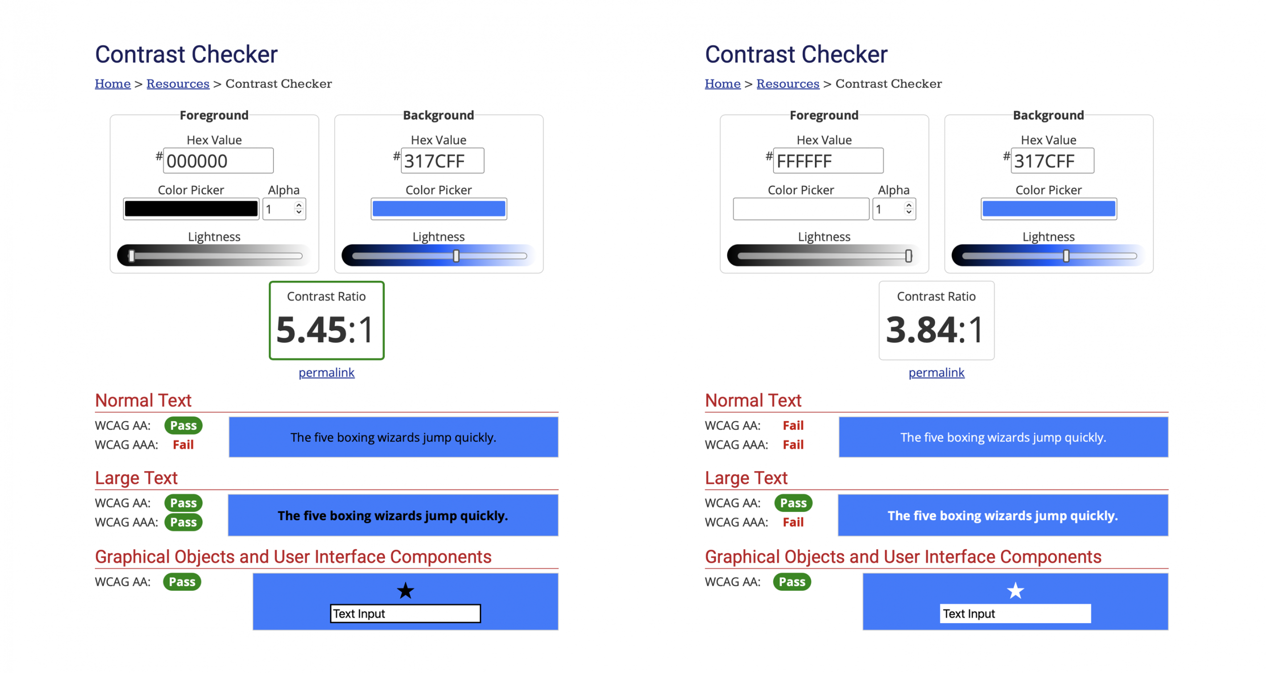
In fact, if you try out our demo in Safari Technology Preview now (as this article is published in May 2025), you’ll find many of the pairings with mid-tone background colors don’t result in enough contrast. It often seems like the wrong choice is being made. For example, this #317CFF blue returns a contrast-color of black.

When white is clearly the better choice for perceptual contrast.

What is happening here? Why is the less-contrasting choice being made?
Well, the current implementation in Safari Technology Preview is using the contrast algorithm officially defined in WCAG 2 (Web Content Accessibility Guidelines version 2). If we put this color blue through a well-respected color contrast checker at WebAIM, it does clearly recommend using black for the text color, not white. WCAG 2 is the current authoritative standard for accessibility on the web, required by law in many places.
The WCAG 2 algorithm calculates black-on-#317CFF as having a contrast ratio of 5.45:1, while white-on-#317CFF has 3.84:1. The contrast-color() function is simply choosing the option with the bigger number — and 5.45 is bigger than 3.84.
When machines run the WCAG 2 algorithm, the black text has higher contrast mathematically. But when humans look at these combinations, the black text has lower contrast perceptually. If you find this odd, well, you aren’t the only one. The WCAG 2 color contrast algorithm has long been a subject of criticism. In fact, one of the major driving forces for updating WCAG to level 3 is a desire to improve the contrast algorithm.
The Accessible Perceptual Contrast Algorithm (APCA) is one possible candidate for inclusion in WCAG 3. You can try out this algorithm today by using the APCA Contrast Calculator at apcacontrast.com. Let’s look at what it thinks about black vs white text on this particular shade of blue background.
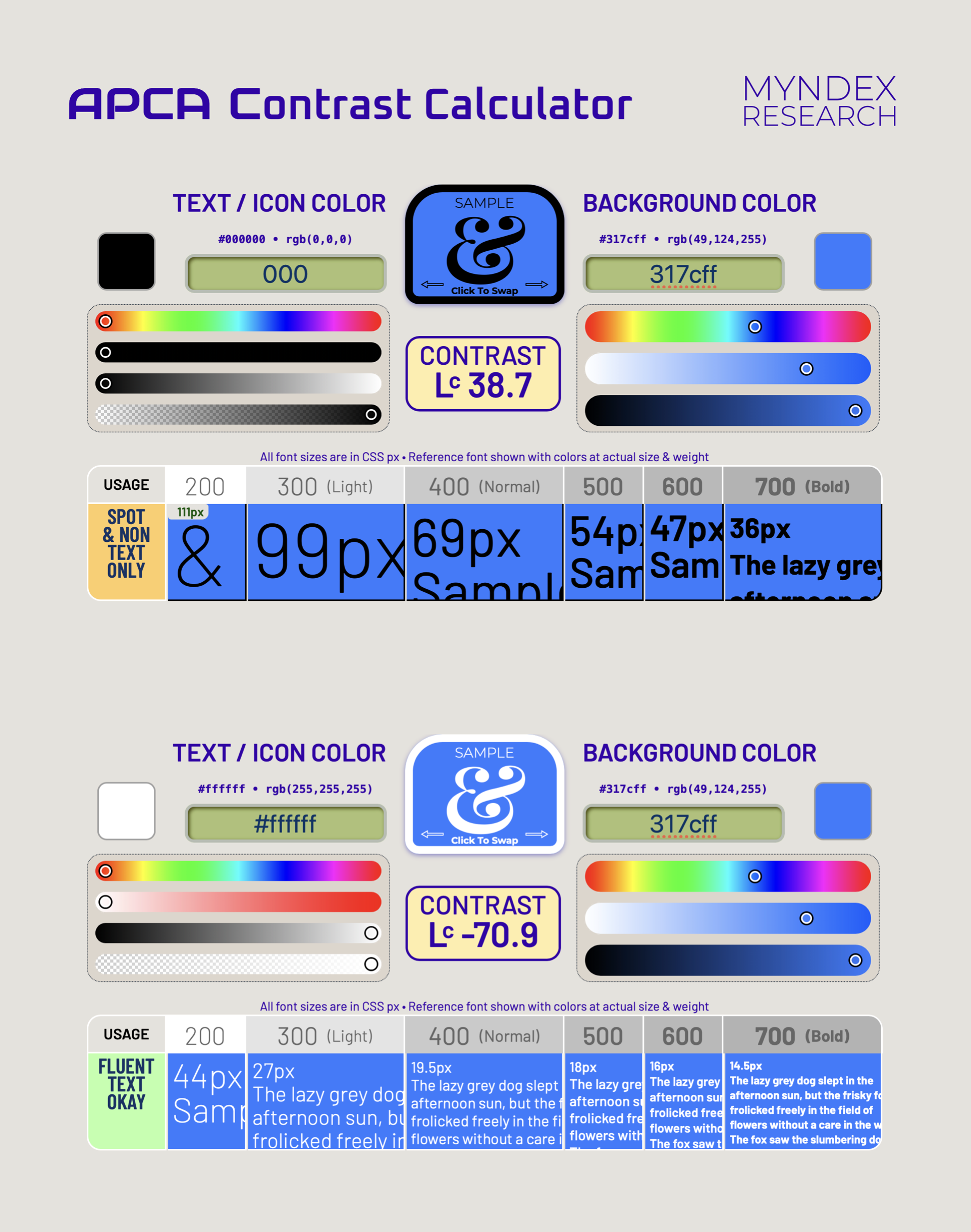
This contrast algorithm evaluates black-on-blue as having a score of Lc 38.7, while white-on-blue scores Lc -70.9. To know which has more contrast, ignore the negative sign for a moment, and compare 38.7 to 70.9. The bigger the number, the more contrast. The APCA test results say that white text is clearly better than black. Which feels exactly right.
(In the APCA scoring system, the negative number simply signifies that the text is lighter than the background. Think light mode = positive numbers, dark mode = negative numbers.)
Why is APCA giving such better results than WCAG 2? Because its algorithm calculates contrast perceptually instead of with simple mathematics. This takes into consideration the fact humans do not perceive contrast linearly across hue and lightness. If you’ve learned about LCH vs HSL color models, you’ve probably heard about how newer approaches to color mathematics do a better job of understanding our perception of lightness, and knowing which colors seem to be the same luminance or tone. The “Lc” marking the APCA score stands for “Lightness contrast”, as in “Lc 75”.
Luckily, the algorithm behind the contrast-color function can be swapped out. Support for this feature first shipped in March 2021, in Safari Technology Preview 122. (Also, at that time it was named color-contrast.) Back then, it was too early to choose a better algorithm.
The CSS standard still calls for browsers to use the older algorithm, but contains a note about the future: “Currently only WCAG 2.1 is supported, however this algorithm is known to have problems, particularly on dark backgrounds. Future revisions of this module will likely introduce additional contrast algorithms.” Debates over which algorithm is best for WCAG 3 are still ongoing, including discussion of licensing of the algorithms under consideration.
Meanwhile, your team should still take great care in choosing color palettes, keeping accessibility in mind. If you are choosing clearly-light or clearly-dark colors for the contrasting color, contrast-color() will work great even when backed by the WCAG 2 algorithm. It’s in evaluating contrast with mid-tones where the algorithms start to differ in their results.
Plus, the contrast-color() function alone will never guarantee accessibility, even when updated with a better algorithm. “This one has more contrast” is not the same thing as “this one has enough contrast”. There are plenty of colors that never have enough contrast with either black or white, especially at smaller text sizes or thinner font weights.
Providing enough contrast in the real world
While thinking about color contrast, we should remember another tool in our arsenal to ensure we provide good contrast for everyone — theprefers-contrast media query. It lets us offer alternative styling to those who want more contrast.
@media (prefers-contrast: more) {
  /* styling with more contrast */
}
Let’s think through how to use these tools in a real world situation. Imagine we are creating a website for a tree nursery whose main brand color is a particular shade of bright medium green. Our design team really wants to use #2DAD4E as the main button background.
To keep things simple, let’s also pretend we live in a future when a better contrast algorithm has replaced the WCAG 2 algorithm in CSS. (In this article, we’ll use the APCA algorithm.) This change will mean contrast-color() will return white for our text color against this medium green, not black.
But looking up this color combination, we see there might not be enough contrast for some users, especially if the text is small. This is where good design is important.
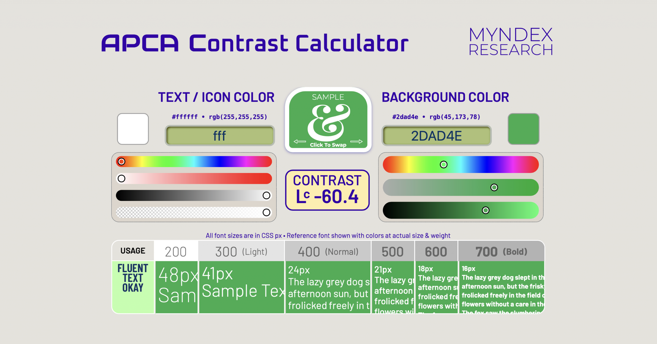
When using this shade of green as the background for white text, the APCA score is Lc -60.4.
You might remember that WCAG 2 evaluates contrast with a ratio (like “2.9:1”). However, APCA scores are a single number, ranging from Lc -108 to 106. Whether or not Lc -60.4 has enough contrast depends on how big the text is — and, new in APCA, how thick the font weight is.
There’s information about what’s considered a good target for Bronze, Silver, and Gold level conformance in the APCA Readability Criterion. These recommendations can really help guide designers to select the size and weight of text to ensure enough contrast, while allowing a range of beautiful color combinations. In fact, the WCAG 3 itself is being designed to provide flexible guidance to help you understand how to support all users, rather than binary judgments the way WCAG 2 does. Good accessibility isn’t about simply meeting a magical metric to check off a box on a list. It’s about understanding what works for real people, and designing for them. And what people need is complex, not binary.
You’ll notice that this particular APCA Contrast Calculator not only provides a score, but also evaluates the success of dynamic examples showing combinations of font size and font weight. In our case, for “Usage” it says “fluent text okay”. (For the black on blue example above, it instead says “Usage: spot & non text only”.) The Calculator is showing that white text on #2DAD4E works at 24px text if the font weight is 400 or bolder. If we want to use a font-weight of 300, then the text should be at least 41px. Of course, this will depend on which font-face we use, and we aren’t using the same font as that Contrast Calculator does, but there’s far more nuance in this guidance than tools for the WCAG 2 algorithm. And it helps our team come up with a plan for a beautiful design.
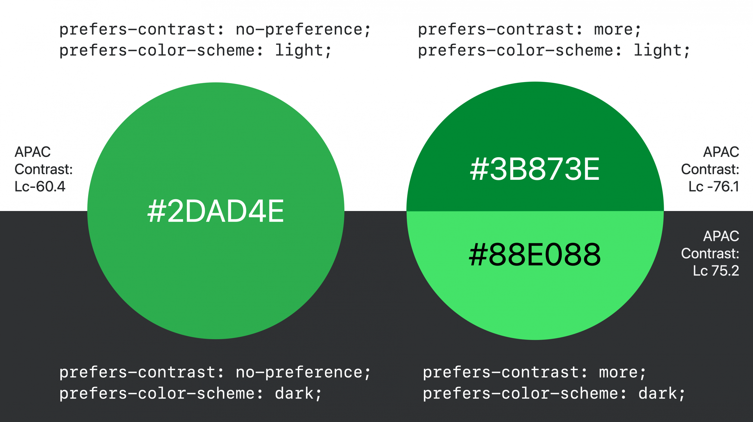
Our tree nursery website supports both light and dark mode, and our designers determined that #2DAD4E works as a button color for both light and dark mode for many users, as long as they carefully designed our buttons considering how font size and weight impacts contrast. But even with those considerations, Lc -60.4 is not quite enough contrast for all users, so for anyone who has set their accessibility preferences to ask for more contrast, we’ll replace the button background color with two options — a darker #3B873E green for light mode (with white text, scoring Lc -76.1), and a lighter #77e077 green for dark mode (with black text, scoring Lc 75.2).
Here’s the color palette our fictional design team wants us to accomplish in CSS:
When we define colors in variables, it’s incredibly easy to swap out color values for these various conditions. And by using contrast-color(), we only need to worry about the background colors, not the text color pairings. We’ll make the browser do the work, and get the paired colors for free.
To accomplish all of these things at once, we can just write this code (because, remember, we are pretending to live in a future when a better algorithm has replaced the WCAG 2 algorithm in CSS):
--button-color: #2DAD4E;  /* brand green background */

@media (prefers-contrast: more) {
  @media (prefers-color-scheme: light) {
    --button-color: #419543;  /* darker green background */
  }
  @media (prefers-color-scheme: dark) {
    --button-color: #77CA8B;  /* lighter green background */
  }
}

button {
  background-color: var(--button-color);
  color: contrast-color(var(--button-color));
  font-size: 1.5rem;  /* 1.5 * 16 = 24px at normal zoom */
  font-weight: 500;
}
In reality, since the WCAG 2 algorithm is the one driving contrast-color(), we probably couldn’t use it on this website. But if we had another project where the brand color was a darker green, and the choice between white/black was the correct one, it could be quite helpful today.
Using contrast-color() is especially helpful when defining colors for multiple states or options like enabled/disabled, light/dark mode, prefers-contrast, and more.
Beyond black & white
You might be wondering, “but what if I want the browser to choose a color beyond just black/white?” If you read about or tried out our original implementation in Safari Technology Preview 122 four years ago, you might remember that the original feature did much more. The newer contrast-color() function is greatly simplified from the original color-contrast().
Because a decision on which color-contrast algorithm to use for WCAG 3 is still being debated, the CSS Working Group decided to move forward with a tool that simply chooses black or white to contrast with the first color. Keeping it simple makes it possible to swap out the algorithm later. By hardcoding the list of options to be black/white, websites are far less likely to break when the WCAG 2 algorithm is replaced, giving the CSSWG the flexibility it needs to keep making needed changes, even as contrast-color ships into the hands of users.
In the future, more complex tools will come along to support more powerful options. Perhaps you’ll be able to list a set of custom color options and have the browser pick from those, instead of picking from black/white. Perhaps you’ll list a set of options, plus specify a contrast level that you want the browser to aim for, instead of having it picking the choice that yields maximum contrast.
In the meantime, often a simple choice between black and white is all you need. We wanted to get the simple version into your hands sooner, rather than waiting for a process that will take years.
And while all of the examples above show black/white text on a color background, contrast-color can be used for much more. You can use a custom color for your text, and make the background be black/white. Or not involve text at all, and define colors for borders, background — anything. There’s a lot you can do.
Continue the conversation
You can learn more about the APCA (Accessible Perceptual Contrast Algorithm) by reading documentation from the folks creating it. Including:
- The Easy Intro to the APCA Contrast Method — a plain-language introduction to perceptually uniform contrast
- Bronze Simple Mode — a “most basic” design guideline, intended for users migrating from WCAG 2 contrast
We’d love to hear your thoughts about contrast-color(). Your feedback on this tool can help shape its future. You can find me, Jen Simmons, on Bluesky / Mastodon. Or follow our other web evangelists — Saron Yitbarek on BlueSky, and Jon Davis on Bluesky / Mastodon. You can also follow WebKit on LinkedIn.