Introducing Backdrop Filters
Our recent blog posts have focused on important performance and developer features added to WebKit. But WebKit is about more than just great developer tools; we also build features for authoring amazing web content. In this post I’m excited to share a great new feature that designers have been demanding for some time: backdrop filters. Let’s start with a few words explaining why this feature is important, then we can delve into how you can start using it. If you are running a recent nightly build of WebKit, you can try out the example yourself!
Background
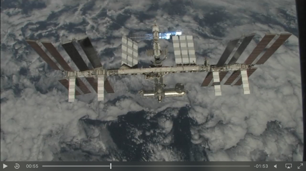
The User Interface design language for iOS 7 and OS X Yosemite changed to incorporate some beautiful backdrop blur effects. This layering gives a sense of depth, while preventing detail from the content underneath from cluttering the foreground. The following image shows the WebKit media controls on top of a video. Notice that you can see some of the background content through the frosted glass effect.

It’s even easier to see in this close up, which was captured using a more vivid source video.

We wanted the WebKit media controls to have this visual style on relevant platforms. However, the controls are implemented in HTML, CSS, and JavaScript. Designers want to use these kind of beautiful effects in their web designs, but have been unable to because these effects were only available to native applications. This prevented embedded web views from looking as good as native controls. It also prevented these kinds of effects from being used for authoring websites. Until recently, there was no standards-compliant method for producing these kinds of effects. Many designers were forced to create the illusion of blurred backdrops using pre-rendered background content and carefully clipping and positioning these assets to achieve the desired effect. Unfortunately, as with most illusions, this approach doesn’t hold up to close scrutiny.
- New artwork must be generated any time the background image or blur characteristics are changed.
- The careful alignment and clipping required to maintain this illusion can lead to pixel cracks and other display gitches.
- Different blurred images are needed for each targeted display resolution.
- Dynamic layouts or animations require complicated and potentially costly calculations as the user interacts with the page.
In short, instead of focusing on their site design, developers were forced to take heroic measures to achieve the desired effect.
Backdrop Filter
We saw so many instances of these Sisyphean techniques being used that we created a new CSS style and proposed it as part of the CSS Filter Effects Module Level 2. The backdrop-filter style allows us to style elements with backdrop effects that resemble those in iOS and OS X that motivated this discussion. This new style allows the browser engine to do the complicated calculations and positioning needed to achieve this effect.
- WebKit starts with the content behind the styled element. Note that this is not the background of the element, but rather the content that would be drawn behind the element.
- WebKit then applies the blur effect to the content.
- Finally, the backdrop is composited with the other elements on the page to yield the final result.
Example: backdrop-filter: blur(10px);

Since these blur operations are being done in the browser engine, we can take advantage of hardware support, resulting in very efficient operations. However, be warned! The nature of this backdrop effect forces the engine to perform more rendering passes, which will have an impact on performance. Make sure you only use this feature where it is most necessary.
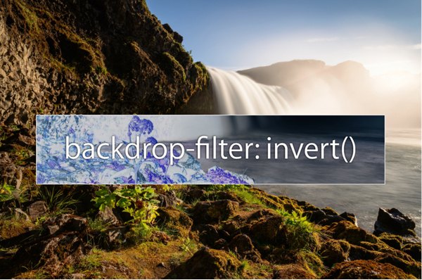
We wanted to give developers the freedom to use all kinds of filters in their designs, so backdrop-filter supports the full range of effects provided by our CSS Filters implementation. This means we can do all kinds of exciting things with our backdrops:
Example: backdrop-filter: invert();

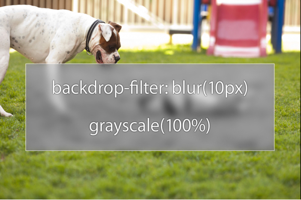
And we can combine multiple filters:
Example: backdrop-filter: blur(10px) grayscale(100%);

And best of all, this effect is completely dynamic — it can be used on top of HTML5 media, CSS animations, WebGL, and other dynamic content.This is an amazing advancement of what you can do with your designs. Prior to this style, you could not achieve this kind of effect.
Standardization
WebKit proposed this feature to the CSS Working Group last year, and it is currently in the Editor’s Draft of the CSS Filters Level 2 specification. We are currently prefixing this property to comply with the W3C requirements for features that have not completed the standardization process. Consequently, you will need to write -webkit-backdrop-filter when using it in your own CSS.
Feedback
We hope you enjoy this new feature, and share your creations with us! If you find bugs, please report them at bugs.webkit.org. As always, if you have suggestions or feedback on this (or other) Filter Effects, please share them on the public-fx@w3.org mailing list. For short questions, you can contact me or Dean Jackson on Twitter. For longer questions, you can email webkit-help.
Acknowledgements
The images and video of the International Space Station were obtained from NASA’s website, and are used under the Public Domain.