Simplified Responsive Design Mode
Responsive design is a well-established practice of creating designs that adapt to different screen sizes. Gone are the days when you could create a new website designed for one screen size. Today’s devices are a menagerie of resolutions, from screens that fit on your wrist to the one you hold in your hand or rest on your lap, and even virtual screens that wrap around your entire field of vision.
There are so many screen sizes today that it’s made designing to a specific set of resolutions almost meaningless. Instead, we’re using powerful modern layout tools like Container Queries, Grid, and Flexbox to create fluid layouts so that designs can adapt to any screen size.
Creating resilient, adaptive designs requires tools that help you quickly explore your layouts in every resolution. Responsive Design Mode in Safari does just that. It gives you a fast preview of how your web page layout adapts to different viewport dimensions and aspect ratios in real time.
As part of the suite of developer tools, Responsive Design Mode is available when you enable Show features for web developers in Safari’s Advanced settings. Once enabled, you can jump into Responsive Design Mode for the currently focused tab or window by choosing Enter Response Design Mode from the Develop menu or pressing Command-Control-R (⌃⌘R).
New Design
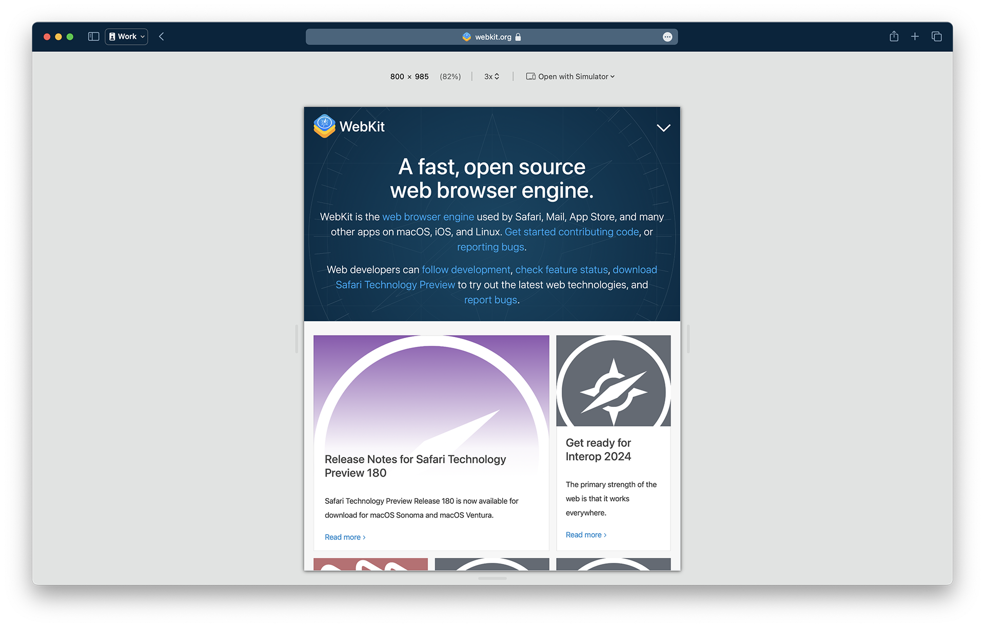
With its streamlined design in Safari 17, Responsive Design Mode makes it faster and easier to test your designs.

Resizing
Notably, the row of device and window icons is gone, helping you focus on creating adaptive designs that fluidly respond to any screen size as the web moves away from rigid, resolution-specific designs.

Resizing is as easy as clicking the “handles” at any side of the viewport preview and dragging them to any size. You can watch the dimensions of the viewport change in the size display shown in screen point units at the upper-left.
You can even test viewport sizes beyond the size of the display you’re actively using. Keep dragging the handles, and the preview fluidly scales, showing the zoom level as a percentage of the actual size of the viewport. At 100%, each pixel of web content is visible in the preview. When the viewport grows to a size larger than the window size of Safari, the zoom level decreases, indicating the preview is scaled down to fit the available space in the window.
Pixel Density
Another dimension of screen size designers need to consider today is the pixel density of screens. Pixels have gotten much smaller on modern devices, affecting the pixel-based assets in your designs, like interface icons, photos, or videos. A menu next to the effective viewport dimension allows you to change the pixel ratio used in the preview. The 1x, 2x, and 3x settings help you test all the assets you went the extra mile to prepare to give your users the best experience regardless of their device capabilities.
Instead of generating each asset by hand, many folks opt to configure their build tools to automatically resize assets for the srcset attribute on image elements or the image-set() function in CSS to set the pixel ratio for a background-image.
<img src="image_1x.jpg" srcset="image_2x.jpg 2x, image_3x.jpg 3x">

<style>
body {
    background-image: image-set("background_1x.jpg" 1x, "background_2x.jpg" 2x);
}
</style>
Here, the pixel ratio control helps you ensure your tooling is configured correctly to generate all the needed assets.
In CSS you can use media queries to apply styles based on the pixel ratio of the display. For instance, you can set thinner lines on a 2x display:
@media (min-resolution: 2dppx) {
  .dividerLine {
    border: 0.5px solid grey;
  }
}
The pixel ratio control also allows you to test those styles.
Simulators
Responsive Design Mode shows you a good approximation of how your web page layout will be affected by viewport sizes. But iOS, iPadOS, watchOS, and visionOS have different rendering behaviors optimized to their form factors that are necessarily different than macOS.
Fast, real-time feedback is what makes Responsive Design Mode so helpful, but it comes with a tradeoff in accuracy. It’s a familiar problem in technology. For example, Xcode offers SwiftUI developers a preview mode that allows them to see the interfaces their code generates and even lets them interact with the interface in a limited capacity. But the complete experience requires building the project to see the result run in a simulator or on an actual device.
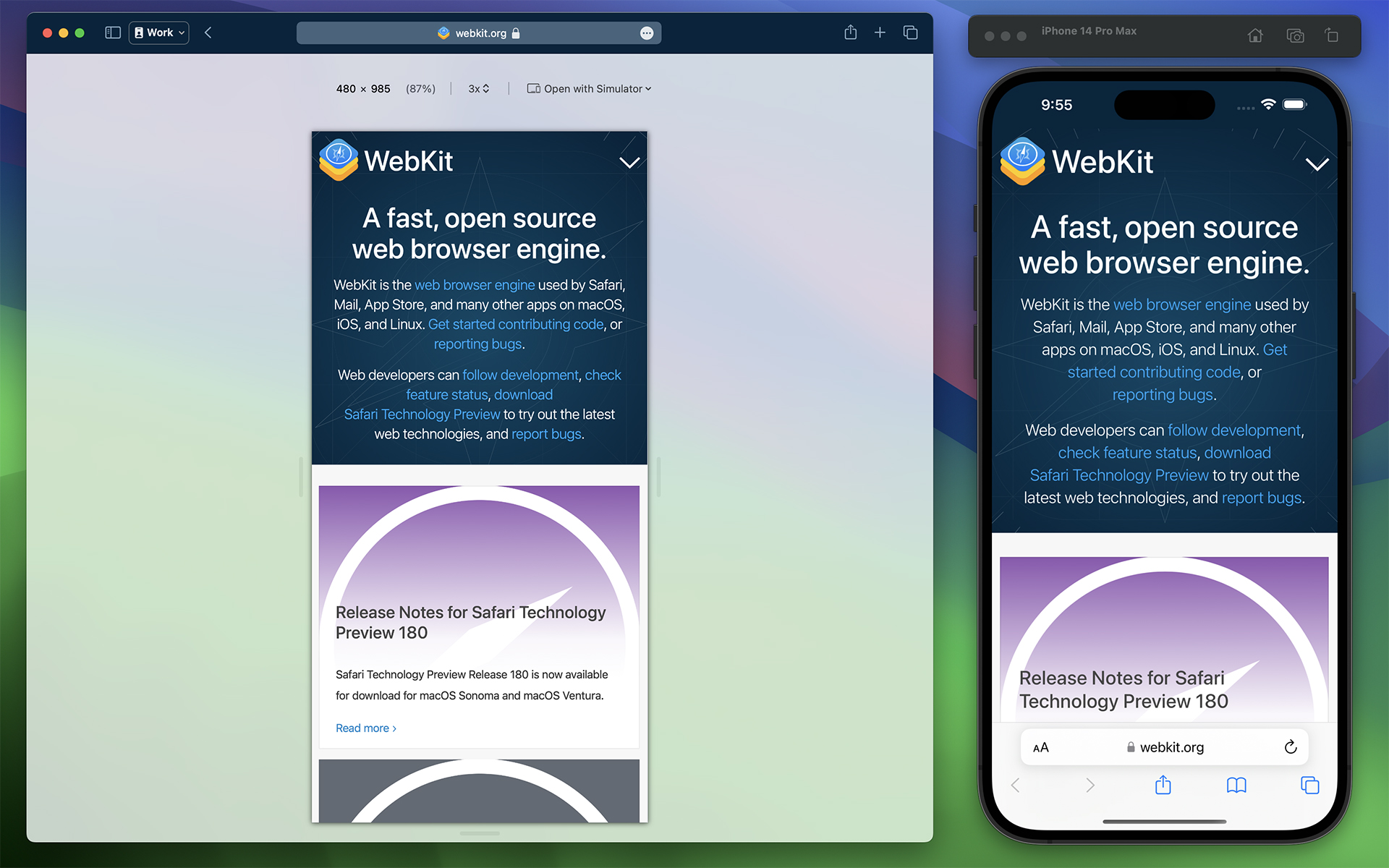
So now, it’s easy to jump into device simulators to try your site designs with the same full-fidelity experience as an actual device.

Responsive Design Mode offers a new Open with Simulator menu for quickly jumping into an Xcode device simulator for the current web page. It shows a list of suggested simulators, but many more are available than what’s listed. You’ll need to download and install Xcode from the App Store for free to run simulators. Selecting the Add simulators… option from the Open with Simulator menu will open a new tab in Safari with instructions on adding more simulators.
To get a more accurate idea of how your web pages will behave in those environments, you can use simulators without needing access to the devices themselves.
Web Inspector
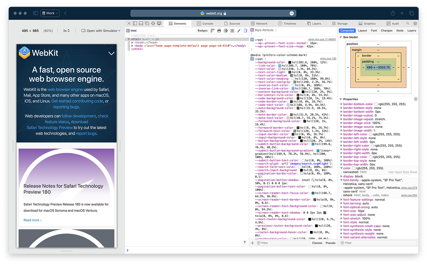
Responsive Design Mode becomes an even more powerful tool when combined with Web Inspector. It allows you to find the source of layout issues while resizing the page or adjusting the pixel ratio. With developer features enabled, select Show Web Inspector from the Develop menu or press Command-Option-I (⌥⌘I).

When debugging narrow viewport sizes, you might find it helpful to click the Dock to left or Dock to right button in Web Inspector to put it side-by-side with the preview viewport.
Feedback
The updated Responsive Design Mode distills the tools to the essentials for quickly assessing the layout of your web pages at any screen size. It gives you at a glance access to layout issues and accelerates testing your pages in a variety of device-accurate simulators.
We love to hearing from you. Send a tweet to @webkit to share your thoughts Responsive Design Mode. Find us on Mastodon at @jensimmons@front-end.social and @jondavis@mastodon.social. If you run into any issues, we welcome your feedback on Safari UI like Responsive Design Mode, or your WebKit bug report about web technologies or Web Inspector. Reporting issues makes an enormouse difference.
Download the latest Safari Technology Preview to stay at the forefront of the web platform and to use the latest Web Inspector features.