Help us choose the final syntax for Masonry in CSS
Back in April 2024, we wrote about “Masonry” layout in CSS and the ongoing work to bring this feature to browsers. In it, we described a debate about whether or not the full power of CSS Grid (subgrid, spanning, explicit placement, and all the options for track sizing) should be combined with the packed layout currently accomplished with tools like masonry.js. Some believed that the full complexity wasn’t necessary, or even practical to implement, and that a simpler feature focused on solving the classic Masonry use case would be better. There were very practical performance concerns about the feasibility of integrating with the full power and flexibility of Grid track sizing. Could browser engines handle Grid + Masonry while remaining lightning fast?
We asked you to help us by joining the debate. Thanks to everyone who shared their thoughts, use cases, diagrams, and demos. Your feedback is valuable and helps us move the conversation forward.
Over the last six months, the key performance concerns have been addressed. Yes, it is possible to integrate Masonry layout with the full power of CSS Grid. Our engineers at Apple have been hard at work collaborating with our colleagues at Google and the CSS Working Group (CSSWG) to go through all the details.
Once we’d proven that it is possible — and with your help, that it is a good idea to infuse this new feature with the full power of Grid — the CSSWG resolved to adopt mixed track-sizing for masonry-style layouts in September. It’s a fantastic milestone! With this consensus, the CSSWG published a First Public Working Draft of CSS Grid Layout Module Level 3.
The remaining debate over syntax
At this point, there’s one major question remaining — what should the syntax be? Currently, the specification is drafted with two options, going head-to-head — the “Grid Integrated” option and the “Grid Independent” option. (To make it clearer which is which, we’re going to call them the “Just Use Grid” option and the “New Masonry Layout” option throughout this article.)
The syntactical decision depends on how we conceive of this feature and its future. Is this an extension of CSS Grid, leveraging existing Grid properties? Or should it be treated as something completely different, with its own set of new properties and new default values? You’ll be able to code the same layouts either way. The functionality will be the same.
Recently folks from Chrome wrote an article about their perspective:
The Chrome team still believes that a separate masonry syntax would be the best way to proceed. While the biggest performance issue mentioned in our previous post is resolved, there are still concerns around syntax, initial values, and how easy a version combined with grid would be to learn.
Rachel Andrew added additional arguments in her blog post in favor of the New Masonry Layout option:
My opinion is, as it was in 2020, that defining masonry as part of grid would be a mistake… Good defaults make things easier to teach… good defaults mean less configuration.
Their argument is that developers won’t have to write as much code as they would if this feature becomes part of CSS Grid. By resetting the formatting context, the all-new properties can have new default values more suited for Masonry layouts, making it faster and easier, especially when coding the kind of classic Masonry layout made popular by Pinterest. You won’t have to override the defaults invented for CSS Grid.
The article from the Chrome team lists many side-by-side examples to prove their point. Here’s the first one, defining a symmetrical 3-column masonry layout in each syntax:
New Masonry Layout
.masonry {
  display: masonry;
  masonry-template-tracks: repeat(3, 1fr);
  gap: 10px;
}
Just Use Grid
.masonry {
  display: grid;
  grid-template-columns: repeat(3, 1fr);
  grid-template-rows: masonry; /* final name TBD */
  gap: 10px;
}
masonry should be renamed. See Footnote 1.)In all of their examples, the New Masonry Layout option does use one fewer line of code (or shorthands that require fewer values). And being able to write fewer lines of code is a valuable quality.
Plus, perhaps imagining this new feature as display: masonry just feels, well, neater. It clicks into a simple story about layout on the web: “You’ve got several options: flow, multicolumn, grid, flex, and masonry. Pick which one you want, and use it.” It’s totally understandable why for many people, that can seem like the best route forward.
When you look at isolated examples like this, with two alternative realities pitted head to head — especially if you have not learned CSS Grid yet — the New Masonry Layout option may look nicer, cleaner, easier to guess what it’s doing.
But, a real CSS file is never five lines of code. Real life is far more complicated. You might want to code a classic Grid layout up to a breakpoint, and then switch to a masonry-style layout on wider (or narrower) screens. In that case, switching layouts would require more lines of code with the New Masonry Layout option compared to the Just Use Grid option.
The WebKit team at Apple still strongly believes that separating CSS Grid and masonry-style packed layouts into two separate layout mechanisms would be a mistake. We believe that looking at simplistic code examples in isolation might not be the best way to evaluate this decision. We perceive all of this functionality as part of one layout system that would be best served by united syntax. In this article, we’ll go into why.
Design Principles
Whenever there are tough disagreements like this one, the best way to move forward is to look at the 30,000 foot view — to discuss the larger implications of the choices available. How does a W3C Working Group do this? By relying on design principles. CSS is a programming language that’s evolved over 30 years. Throughout, it’s been guided by design principles. The CSS Working Group doesn’t have official Design Principles documented the way HTML does. But in 2003, Bert Bos, co-inventor of CSS, wrote down his ideas for what makes a good web standard.
These principles include:
- Simplicity: Good programming languages have simple, understandable models and syntax. They are both easy to use and powerful enough to directly express developer intent. Languages that are complicated, or whose practical use is convoluted, are hard to understand and use correctly.
- Learnability: Web technology should be easy for developers to learn. It should be readable without being verbose; re-use familiar syntax for familiar concepts; and, in general, be designed for humans over computers.
- Minimum Redundancy: “The overlap in functionality between different specifications should be kept small, because it can easily lead to incompatible models.” While some redundancy in functionality can help developers express logic more clearly, incompatible models make technology harder to implement, and are more likely to result in errors.
- Repurposing: “Adaptation of some existing piece of data for a new purpose” is a core function of the design of the web. The HTML Design Principles calls this “Do not Reinvent the Wheel”. Extend an existing technology instead of inventing something new for the same or similar purpose.
- Use What Is There: An existing API might not be ideal. Maybe you wish we could go back and start over. But we can’t. Use what’s there, and forge the best path forward. “Throwing away software that works, although imperfectly, and teaching everybody something new would be a huge waste of resources.”
- Extensibility: CSS is designed to be extended — its parsing and interpretation rules, its general syntax, and even the specific syntax of its properties and their values — they are all intentionally designed to accommodate future extensions to CSS. It allows for progressive enhancement of an existing page in newer browsers, and for graceful degradation of a newer page in older browsers.
- Design by committee: “Specifications are created by a committee rather than by a single individual… more pairs of eyes mean more checking for errors, more creativity in finding solutions to problems, and more experience in knowing what worked or didn’t work in the past.”
In other words, reuse as much as possible of the language that already exists, repurposing things as you go. Keep things as simple as possible. Make it easy to learn. Don’t be redundant in creating more than one way to do things. And have debates like this one in order to find the best solution!
Let’s look at how these design principles apply to the syntactical decision at hand.
Simplicity | Learnability
The case the folks on the Chrome team are making could be seen as seeking simplicity. As a developer, if you can accomplish a layout in one less line of code, isn’t that simpler? And if you can just use the defaults for the new Masonry properties, instead of needing to override them, surely that’s simpler. Less code. Better defaults. Easier to learn. Right?
We believe making Masonry a separate display type only seems simpler in isolation: reading snippets of code in a blog post, focusing on a head-to-head battle. But Masonry is not going to live in isolation. We already have CSS Grid.
Let’s see if we can understand how a unified system for layout feels. What’s it like to have CSS Grid with this addition of new functionality?


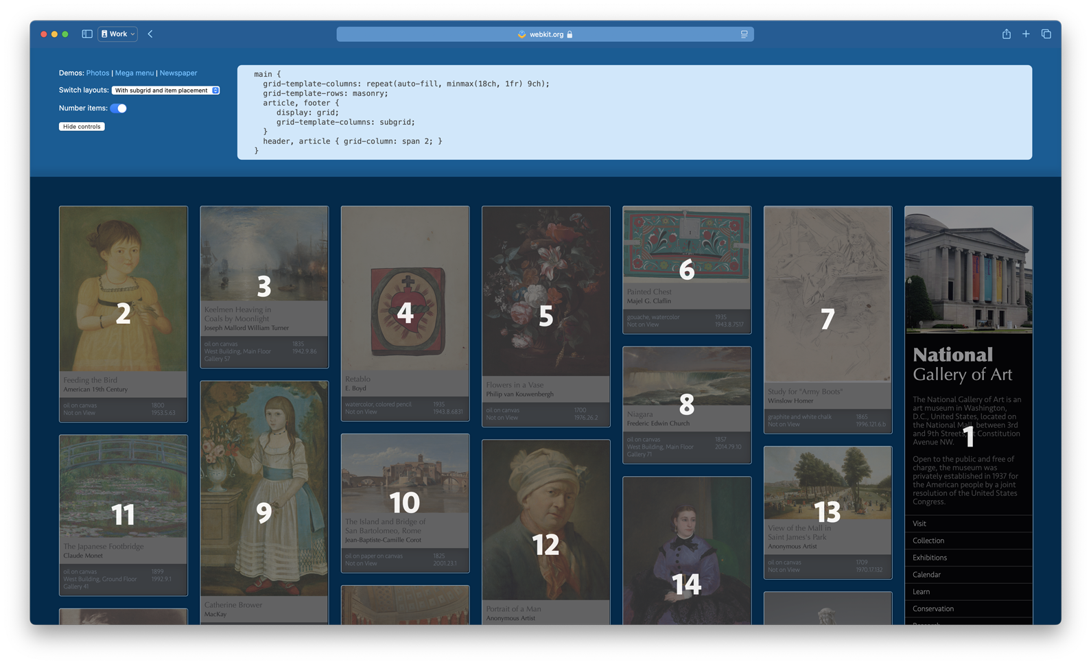
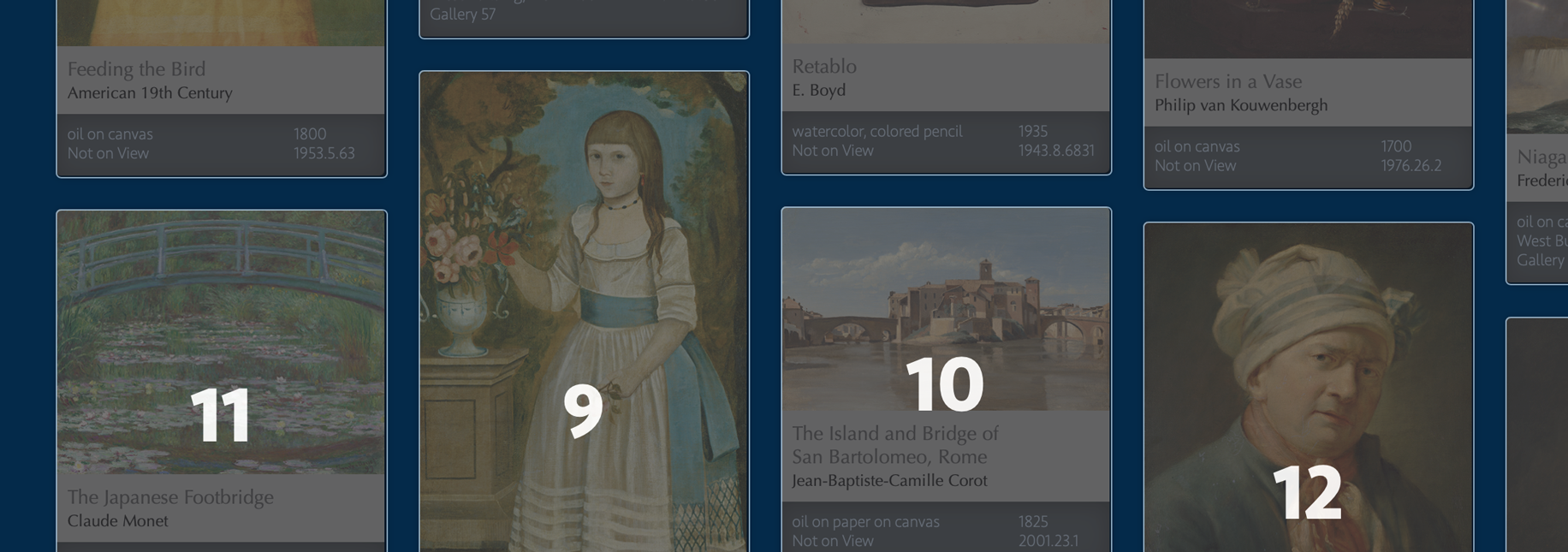
To lay out the square images seen on the left, you can write:
main {
  display: grid;
  grid-template-columns: repeat(auto-fit, minmax(14rem, 1fr));
  grid-template-rows: auto; /* default value, unnecessary to state */
  gap: 1rem;
}
To lay out the images seen on the right, with varying aspect-ratios, you will write:
main {
  display: grid;
  grid-template-columns: repeat(auto-fill, minmax(14rem, 1fr));
  grid-template-rows: collapse; /* final value name TBD */
  gap: 1rem;
}
collapse as the value instead of masonry. See Footnote 1.)Look at how simple that is. Use the CSS Grid layout system that’s been around for 7+ years, and change one value.
Let’s look at another example — this time, creating a layout that flows and scrolls sideways. This could feel especially natural for users on a phone or tablet.

To create this layout today, we could use Grid:
main {
  display: grid;
  grid-template: "tall" 2fr
                 "wide" 1fr;
  grid-auto-flow: column; /* fill by column */
  height: 600px;
  overflow: scroll;
}
.tall-item {
  grid-row: tall;
}
.wide-item {
  grid-row: wide;
}
But let’s instead pack the content together instead of having it stretch, since the images have a variety of aspect ratios. With the Just Use Grid option, we just write more one line of code — grid-template-columns: collapse.

main {
  display: grid;
   grid-template-columns: collapse;
   grid-template: "tall" 2fr
                  "wide" 1fr;
  grid-auto-flow: column; /* fill by column */
  height: 600px;
  overflow: scroll;
}
It’s an easy transition to go from thinking about CSS Grid to thinking about packed masonry-style layouts, because it’s all part of the same system. Plus, we can easily alter this layout at a breakpoint.
Now, let’s contrast the developer experience of using the New Masonry Layout option instead.
main {
 display: masonry;
 masonry: "tall wide"
           2fr  1fr;
 masonry-direction: row; /* grow along the rows */
 height: 600px;
 overflow: scroll;
}
The New Masonry Layout model might make perfect sense in isolation, but in context it requires developers to switch between mental models. It requires remembering how the Grid and Masonry syntaxes are different — flowing to the right being row instead of column; laying out area templates horizontally instead of vertically; calling things -tracks instead of -rows or -columns… these differences add up.
Developers already struggle with trying to understand the difference between Flexbox and Grid, and when to use which one. Far too many developers are responding to this burden by just using Flexbox for every single thing, and never using Grid. Adding yet another layout mode is liable to compound this challenge.
Typing out four lines of code instead of three is not a significant developer burden. Having to memorize multiple sets of similar syntax with divergent names, allowable values, and defaults is far more of a burden.
Minimum Redundancy | Repurposing | Use What Is There
One of the guiding principles that drives decisions at the CSS Working Group is to always strive to reuse existing patterns and properties when creating new possibilities.
For example — when Flexbox was invented, it came with the Alignment properties (justify-content, align-items, etc). Then when Grid came along, those same properties were reused for a similar but slightly different purpose. New properties were added (justify-items) matching the existing pattern (align-items) to extend the feature.
Same with gap. When multicolumn was invented, a new column-gap property provided a way to define the space between columns. A decade later, when the CSSWG needed a way to define space between grid columns, the column-gap property was repurposed. It got a corresponding row-gap property and a new shorthand, gap, to be more universal, and eventually made its way to Flexbox as well. It took a couple tries, but the CSSWG realized it would be a mistake to keep creating separate gap properties for different contexts — column-gap + grid-gap + flex-gap… It’s better to repurpose what already exists.
The New Masonry Layout option creates a duplicate set of properties for existing functionality. (Everything in aqua-blue is new):
| Just Use Grid option | New Masonry Layout option |
|---|---|
display: grid |
display: masonry |
grid-template-columns / grid-template-rows |
masonry-template-tracks |
grid-template-rows: collapse /grid-template-columns: collapse |
masonry-direction: column /masonry-direction: row |
grid-template-areas |
masonry-template-areas |
grid-template |
masonry-template |
grid-auto-flow |
masonry-direction |
masonry-fill |
|
masonry-flow |
|
gap |
gap |
grid-column-start / grid-row-start |
masonry-track-start |
grid-column-end / grid-row-end |
masonry-track-end |
grid-column / grid-row |
masonry-track |
grid-auto-columns / grid-auto-rows |
masonry-auto-tracks |
grid |
masonry |
grid-slack (name TBD) |
masonry-slack (name TBD) |
It will require developers to memorize a parallel layout system with an entire second set of syntax.
The Just Use Grid option adds only one new value to CSS. You can create masonry-style layouts by simply using the collapse [1] value in a track definition: grid-template-rows: collapse (or grid-template-columns: collapse in the other direction). Basically you’re “collapsing” the rows — useful for a wide variety of use cases.
By not repurposing what’s already there, New Masonry Layout creates unnecessary redundancy in CSS. The Chrome team asserts that creating a duplicate system is worth it, though, because that allows its details to be tuned for the masonry-layout use case in three ways:
- Tweaking concepts — for example use
masonry-direction: columninstead ofgrid-auto-flow: row— so they better match concepts from Masonry frameworks. - Changing the default values, so developers won’t have to specify what they want as often.
- Introducing specialized functionality that doesn’t currently exist in Grid, like
repeat(auto-fill, auto)as a track definition. (We’ll cover this point later in this article.)
We do not believe the developer burden of 10 extra redundant properties is worth the suggested gains. Yes, the new masonry-* properties can be tailored to masonry-specific use cases. But developers will have to memorize all the differences between the two systems, and master which is which.
*-slack property — which lets developers tell the browser how picky to be when determining where to place the next item. Without any slack, Item 10 is in the third column, because it’s a tiny bit higher there than if it were placed in the left-most column. With “slack” the browser could be told to ignore those kinds of “tiny” differences, resulting in Item 10 being on the far left, followed Items 9, 11, 12.The CSS Working Group does not usually duplicate existing functionality. It instead extends existing functionality for a new purpose. We are not convinced that this circumstance provides a compelling enough reason to deviate from the canonical approach.
Extensibility
The hardest job the CSS Working Group does is to try and predict an unknown future, and make wise decisions that we won’t regret later. This concern was part of long debate about CSS Nesting for example — whether or not we were boxing ourselves into a corner that would block future expansion. (In the end, we ended up with a fantastic solution for Nesting.)
As we debate this decision — to expand CSS Grid, or to create a new display type — we should carefully think through how the choice impacts the future. Which pattern do we want to establish going forward?
The Just Use Grid option leans into the idea that CSS Grid is a major layout mechanism for web pages, and we should keep expanding it to be more and more powerful. The New Masonry Layout option seems to say, no, we should keep Grid as Grid, and add new segregated display types each time we add more layout capabilities.
This is the kind of question that can be deeply philosophical and hard to discuss directly. Which direction you like better might just be a gut feeling. So let’s replace the theoretical question with a real example. Let’s imagine something else we might add to CSS layout in the future.
A possible future feature
Imagine you’re front-end developer for a website full of articles. And your designer sends over this:

How will you code this layout in CSS?
A decade ago, you probably would have reached for negative margins. Put everything in a main column, and then pull certain content (headlines, images) to the left and right, out of the main column, with code like margin-left: -20px.
Now that 99% of users have support for CSS Grid, you have more options. You can still use negative margins. Or perhaps you’ll make the article element a Grid container, and turn every headline, paragraph, figure, etc into a Grid child. That would give you the ability to line up certain content along certain grid lines. But using Grid causes other problems. Suddenly you’ve got “double margins” — your top and bottom margins stack on top of each other, instead of collapsing. Also, you also can no longer use floats. They just don’t do anything. Every direct element of the article is now a Grid child, in its own separate row.
What if instead, you could leverage the benefit of grid-template-columns, with its grid lines and and ability to explicitly place content — but also keep the benefits of flow content, with its floats, collapsing margins, etc. That feels like just the right tool for laying out articles.
We could stay in a flow layout context AND use features from CSS Grid, like this:
article {
  display: block; /* default value, unnecessary to state */
  grid-template-columns: 1fr 1fr minmax(15ch, 30ch) minmax(15ch, 30ch) 1fr;
  grid-default-column: 3 / 5;
}
A new property, perhaps named grid-default-column, could let us define the default placement for all the direct children of the article element — in this case, line 3 to line 5. (In fact, such a property would be very handy in CSS Grid for many other use cases, including masonry-style layouts.)

Once we have grid lines, we could define placements for the content we want to be elsewhere:
h1, figure {
  grid-column: 1 / 6;
}
h2, h3 {
  grid-column: 2 / 6;
}
figure.left {
  grid-column: 2 / 4;
  float: left;
}
figure.right {
  grid-column: 4 / 6;
  float: right;
}
It’s a potentially radical idea to use grid-template-columns to define columns, without creating a grid formatting context. (It’s kind of like how you can now use Alignment in flow layout. You no longer have to create a Flexbox or Grid layout context to use align-content.)
This is just one example of an idea the CSS Working Group might discuss in the future.
By choosing the Just Use Grid option for masonry-style layouts, that seems to say yes to an idea like this. Let’s keep expanding what’s possible with CSS Grid, our current layout system. Let’s expand CSS Grid to do masonry-style packing. Let’s leverage part of CSS Grid to handle flow layout. Let’s keep creating more capabilities for the layout system we already have.
The New Masonry Layout option seems to say, ok, any time we want to create another layout pattern, we should do so by creating another new formatting context. This novel idea should not be display: block; grid-template-columns: [track sizes]. Instead, it should be a separate layout system, with its own set of new properties and new default values that better match the purpose at hand. Perhaps like this:
article {
  display: pillar;
  pillar-template-columns: 1fr 1fr minmax(15ch, 30ch) minmax(15ch, 30ch) 1fr;
  pillar-default-column: 3 / 5;
}
If the CSSWG went in this direction, we’d end up with three sets of grid layout properties. The next time there’s another idea, would we feel compelled to create a fourth copy of the same properties?
| Grid | Masonry | Pillar | Another future feature |
|---|---|---|---|
display: grid |
display: masonry |
display: pillar |
display: foobar |
grid-template-columns |
masonry-template-tracks |
pillar-template-columns |
foobar-template-baz |
grid-column |
masonry-track |
pillar-column |
foobar-qux |
grid-template-areas |
masonry-template-areas |
pillar-template-areas |
foobar-template-areas |
| … etc … | … etc … | … etc … | … etc … |
What’s actually simpler is having one set of syntax to learn, remember and use — even if sometimes that takes four lines of code to do something you could do in three because you need to declare the value you want, instead of relying on customized defaults.
Also, would the new pillar-default-column property only work inside Pillar Layout, and not also come to Grid or Masonry — causing these separate systems to keep diverging over time?
The Chrome team believes it’s better for Grid and Masonry to be segregated layout modes so that there is no requirement for them to evolve together. They’ve argued it will be easier to add specialized functionality to Masonry without the hassle of figuring out if the new feature makes sense to “also” add to Grid and vice versa.
We believe it is better for these layout modes to be intertwined. We want the CSSWG to think through new additions — like grid-default-column — and make them work for the original Grid use cases, the masonry-style layout use cases, and anything else that comes along in the future. We don’t want a new feature for one to get left out of the other because it’s easier to implement in one mode vs the other. We want CSS to be a consistent, coherent, predictable system.
Extending Masonry with repeat(auto-areas, auto)
This brings us to the final reason (of the three enumerated above) Chrome believes creating a duplicate system of properties for Masonry is a good idea — because then it will be possible to introduce specialized functionality that doesn’t currently exist in Grid. They’ve proposed adding three new track definitions to Masonry — repeat(auto-areas, auto), repeat(auto-fill, auto), and repeat(auto-fit, auto). The first would be the brand new default:
.masonry {
  display: masonry;
  masonry-template-tracks: repeat(auto-areas, auto); /* new default value */
}
There’s excitement about these new track values because people believe they’ll provide a super easy way to create Masonry layouts with even less code. The width of each column (or height of rows) will be figured out automatically, based on the size of the contents. And the number of columns (or rows) could also be figured out automatically.
Imagine, as a developer, you don’t have to describe the number of columns or the size of columns… just apply display: masonry to your container. The browser looks at your content, calculates all the sizing, makes the needed number of columns, and shazam! You get a classic Masonry layout, just like Pinterest, in one line of code. What could be easier to learn and use? That does sound promising! But we are not convinced that masonry-template-tracks: repeat(auto-areas, auto) will actually deliver the desired experience.
There are actually two features here, tied together. The new default, and a fallback that becomes the default if the conditions for the first are not met. We have concerns about each. Let’s tackle them one at a time.
WARNING! This section of this article goes deeper and deeper into concepts that start to get really hard to understand. This is our concern with the current proposal for the New Masonry Layout option. Developers will have to understand auto sizing (and the other concepts we’re about to explain) in order to confidently use it. And this stuff is not easy to understand. But, hey, let’s try…
First, the new default. The value repeat(auto-areas, auto) automatically assigns auto as the size of the columns, with the number of columns taken from masonry-template-areas:
.masonry {
  display: masonry;
  masonry-template-areas: "a b c";

  /* default value, so you don't need to state it */
  masonry-template-tracks: repeat(auto-areas, auto);
}
This is a very good idea. In fact, CSS Grid already has this feature:
.grid-with-auto-sizing {
  display: grid;
  grid-template-areas: "header header"
                       "main  sidebar"
                       "footer footer";

  /* default value, so you don't need to state it */
  grid-auto-columns: auto;
}
Today, CSS Grid takes the “missing” column sizes from grid-auto-columns, which has the default of auto. There’s no need to invent repeat(auto-areas, ...) to provide the same functionality a second time with completely-different syntax.
Presumably, the reason for creating this mechanism is so that masonry-template-tracks is set up to have an appealing fallback default that kicks in when no areas are defined.
Extending Masonry with repeat(auto-fill, auto)
When masonry-template-areas is not in use, the auto-areas behavior is defined to fall back to auto-fill. Since most layouts don’t define areas, the functional default for the New Masonry Layout option is masonry-template-tracks: repeat(auto-fill, auto). This is the code advocates expect will create the Pinterest layout automagically.
There is a very interesting idea here. Can we get the browser to figure out how many columns to make, and how big to make those columns, by just looking at the content sizing — with no information from the web developer?
There’s nothing like this today in CSS Grid. It was previously considered impossible because the browser can’t count the tracks until it knows their size, and it can’t size the tracks until placement is done, but it needs to know the number of tracks in order to do placement. (Creating an impossibly circular loop.) As the Chromium team discussed Masonry, they realized it might actually be possible to do this by making some assumptions that are good enough for typical use cases.
If you’ve used CSS Grid, you’ve likely coded repeat(auto-fill, minmax(200px, 1fr) to tell the browser to create however-many columns are needed fill the available space, where each column is at least 200px wide and flexible. But what does repeat(auto-fill, auto) do?
Let’s turn to an example. Imagine we have a page of photos to layout with Masonry. And we are using a CMS or a CDN to resize all of our image files to be naturally 600px wide, with varying heights.
<article class="container">
  <figure><img width="600" height="500" alt="[description]"></figure>
  <figure><img width="600" height="300" alt="[description]"></figure>
  <figure><img width="600" height="150" alt="[description]"></figure>
  <figure><img width="600" height="750" alt="[description]"></figure>
  <figure><img width="600" height="400" alt="[description]"></figure>
  <figure><img width="600" height="250" alt="[description]"></figure>
  <figure><img width="600" height="375" alt="[description]"></figure>
  <figure><img width="600" height="360" alt="[description]"></figure>
  <figure><img width="600" height="450" alt="[description]"></figure>
  ...etc...
</main>
We want the images to be flexible, so we apply a classic responsive design technique:
img {
  width: 100%;
}
With the proposed defaults for the New Masonry Layout, we should be able to create a masonry-style layout with very little code! That’s the desired magic. We can just write:
.container {
  display: masonry;
  gap: 10px;
}
So how does the browser decide how wide to make the columns? And how many columns to make?
It looks at the images, sees they are 600px wide, and assumes each column should be at least 600px wide. It then counts up how many such columns will fit in the space available.
Let’s say, at a particular moment, a user adjusts their browser window to be 1600px wide, and with the overall page layout, the .container is 1410px wide. That means there’s space for two columns of 600px wide images, with a 10px gap and 200px left over. As a developer, you can use the Alignment properties to decide what to do with that extra space — start, end, center, space-between, etc. By default, the extra space will be distributed to the columns, so we get two 700px columns.

It’s likely you already see the problems. We didn’t intend for our columns to be this big. The images are 600px wide with the expectation they’ll be shrunk down, so they’ll look great on 2x and 3x Retina screens. Instead, our images are being stretched to fill a 700px wide column, making them look terrible. We declared width: 100% on the images, but there’s nothing “pushing on” them to make them smaller than their natural size. This means they’ll be displayed at 1x or less.
We could try putting a maximum size on the images:
img {
  width: 100%;
  max-size: 200px;
}
Now the images will look much better on those Retina screens, but the browser will just make all the images fixed at 200px wide, not flexible. They’ll be max size, inside columns that are usually larger. That’s definitely not the desired result.

Let’s instead pretend we have a way to directly tell the browser to display the images as 3x, not 1x. Long ago, CSS proposed an image-resolution property (now-obsolete). Let’s think through how it would work if we size our images like this:
img {
  width: 100%;
  image-resolution: 3dppx;
}
The browser would calculate sizing as if these images are 200px wide (really they’re 600px, displayed at 3x). This would result in fluid columns that are 200px or larger, not too big, containing fluid images that fill the column, with resolution between 2x and 3x. Great! That’s what we want.
But this technique only works if all of the images are naturally 600px wide. If they have various widths, coming from a less-controlling backend, then the columns will end up the width of whichever image is biggest divided by 3. You can’t predict the outcome. If the largest image is 1500px wide, then the columns start at 500px wide. If the largest image is 2400px, the columns start at 800px. Column sizing depends on which images happen to load. Plus, image-resolution doesn’t currently exist.
Let’s try a different idea. Instead, we can set a fixed width on the image for the purposes of columns sizing, and then override that size with min-width to make the image fluid. It’s a bit of unexpected backwards logic, but it works.
img {
  width: 200px;
  min-width: 100%;
}
The browser will make however-many fluid columns fit in the available space, as long as those columns are 200px or wider. The images will be fluid, filling the column width. And the layout will look just like Pinterest!
Oh wait… this only works if the content consists of just an image, or image with a very short string of text. If the content includes any text long enough to wrap, then we have a new problem.
Any time a browser uses auto to size a column based on its content’s size, it tries to accommodate the maximum possible size of that content. For text, max-content size is the entire width of the string of text, without any wrapping. Imagine this paragraph stretched out to exist all on one line. That’s a very wide box.
Pinterest itself puts text under every image when anonymous users visit the site. Let’s imagine how the New Masonry Layout option, with its proposed default values, would handle content where each item is a card with both an image and a headline.
<main class="container">
  <article class="item">
    <img width="600" height="450" alt="[description]">
    <h2>Coffee</h2>
  </article>
  <article class="item">
    <img width="600" height="700" alt="[description]">
    <h2>We love traveling to get a great cup of coffee, no matter how far</h2>
  </article>
  ...
</main>
The first headline, “Coffee”, is probably going to be less than 200px wide. If the image is set to 200px wide for the purposes of sizing, and the headline is 80px wide, then the max-width of this content is 200px. No problem.
The second headline, “We love traveling to get a great cup of coffee, no matter how far”, is probably going to be more than 200px wide. If the image is set to 200px wide, and the headline is 676px wide, then the max-width of this content is 676px.
The browser will look at all the cards, figure out which card has the greatest max-size and use its widest width to calculate the widths of all the columns. In this case, all columns will be 676px wide or wider, getting as big as 1351px. That’s not the result we want.
We could compensate for this by setting a size on the headline as well, forcing it to wrap. To do so we need to figure out which properties to use… width, min-width, max-width, or a combination?… and which values to set… 200px? larger?… Pop quiz! Can you figure this out?
Or, let’s back up. A better strategy might be to apply the code that controls sizing to the .item wrapper, instead of the content inside. We still have to use our width: 200px + min-width: 100% trick to make it fluid, though. It won’t default to stretching on its own. Doing so means the Alignment properties (so handy in Grid) no longer have an effect, because we’ve given the items an explicit size of 100%. This also means that if we want to add margins to our items, we have to subtract them out of that 100% ourselves manually, much like we did back in the days of float-based layouts. Say hello to our old frenemy calc(100% - var(--margin-size)).
Understanding how this works is definitely not easy! It requires a sophisticated understanding of how auto sizing works — arguably the hardest part of layout on the web. The proposed default is often not going to magically work with “only one line of code”. As a developer, you still have to do all the work to control track sizing. The needed CSS is just applied to the items and/or their content instead of the layout container. It’s a return to how it worked when everything was float-based — when we controlled layout by sizing the content.
CSS Grid massively improves developer experience by letting us create structures where our containers control sizing instead. Track sizing is a much more powerful tool than item sizing — with more ways to define interactions. Plus, by asking the browser to scan all the items to find their sizes, and then calculate the track sizes, it loses the performance advantage of reading the size directly from the defined track value instead.
But all of that doesn’t mean this idea would never be useful. Our mega menu demo of a footer of links is a good example of a use case for which repeat(auto-fill, auto) could be helpful. The strings of text are short, there are no images to worry about sizing, and the designer likely wants to avoid wrapping. Auto-sized columns would yield a great result without requiring the developer to adjust content sizing.

However, laying out short strings of text is not the most common use case. And as we’ve seen, the repeat(auto-fill, auto) value is not useful for the use cases that are most common. It does not make sense to make it the default.
Also, if the CSSWG determines this is useful enough to do, why not make it work for all of Grid, not just masonry-style layouts? We found workable definitions for the rest of Grid syntax that the Chrome team originally believed to be unworkable in Masonry, so let’s try to find a workable definition for repeat(auto-fill, auto) in Grid as well rather than creating divergence. Doing so is better for developers — more functionality, more consistency, and a unified feature set that’s easier to learn.
We want CSS layout to be a unified and consistent system. Adding support for auto inside repeat track definitions is a good example of why the masonry-style layout functionality should be part of CSS Grid, so that new ideas are integrated into all of layout, not just one part.
Summary
In isolation, Masonry as its own display type can seem appealing. It may feel more theoretically pure. But when looking at integrating it into the entire layout system of CSS, it’s not the best idea. We must consider real sites with real content. We must imagine how this new feature will live inside thousands of lines of code and change with break points. And we should contemplate how our choice impacts future layout possibilities in CSS.
CSS Design principles should guide this decision, reminding us to value true simplicity and learnability. To strive to repurpose what’s already there, creating minimum redundancy. To make smart architectural decisions regarding extensibility — decisions that expand an integrated network of features that all work predictably together.
Design by committee
This is where you come in. As a web developer, you can help the CSS Working Group make this decision.
We’d love to hear your thoughts. It will be especially helpful if you can diagram a real-world design, and write out all of the code for each of the two options. See which way of actually using this feature you prefer. Find ways to use both classic CSS Grid and the proposals for creating masonry-style layouts to see how it feels to use them together, whether nesting one inside the other or switching things up at a breakpoint. It’s much better to make this decision after using the code, rather than just contemplating it in the abstract.
We believe this syntactical decision should be made while diving into realistic examples, so we created quite a few at: webkit.org/demos/grid3. Test them in Safari Technology Preview, where the Just Use Grid option is on by default. Or turn it on in any version of Safari 17.x or 18.x by checking “CSS Masonry Layout” at Develop > Feature Flags. Or test in Firefox after enabling its flag by typing about:config in the URL, agreeing to risk, searching for “Masonry”, and clicking its icon on the right. (Demos using subgrid may not work correctly in Firefox, but the core functionality will.)
You can leave a comment here. Or even better, write your own article about your thoughts, showing off your examples — and then post the URL in a comment. At this point, thoughtful qualitative feedback is much more helpful than sheer quantity of brief opinions.
1. FOOTNOTE: As described in our previous article, “masonry” is not an ideal name, since it represents a metaphor, and not a direct description of its purpose. It’s also not a universally used name for this kind of layout. Many developers call it “waterfall layout” instead, which is also a metaphor.
Many of you have made suggestions for a better name. Two have stood out, collapse and pack as in — grid-template-rows: collapse or grid-template-rows: pack. Which do you like better? Or do you have another suggestion? Comment on this issue specifically about a new value name (for the Just Use grid option).
We used grid-template-rows: collapse throughout this article to help imagine what CSS Grid would be like, integrating a new feature for masonry-style layouts. Meanwhile, grid-template-rows: masonry is what you should use today when testing demos in Safari, Safari Technology Preview and Firefox.