Improving Color on the Web
The past few years have seen a dramatic improvement in display technology. First it was the upgrade to higher-resolution screens, starting with mobile devices and then desktops and laptops. Web developers had to understand high-DPI and know how to implement page designs that used this extra resolution. The next revolutionary improvement in displays is happening now: better color reproduction. Here I’ll explain what that means, and how you, the Web developer, can detect such displays and provide a better experience for your users.
Let’s call the typical computer monitor, the type that you’ve been using for more than a decade, an sRGB display. Apple’s recent hardware, including the late-2015 Retina iMac and early-2016 iPad Pro, are able to show more colors than an sRGB display. Such displays are called wide-gamut (I’ll explain what sRGB and gamut are below).
Why is this useful? A wide-gamut system will often provide a more accurate representation of the original color. For example, my colleague @hober has some extremely funky shoes.
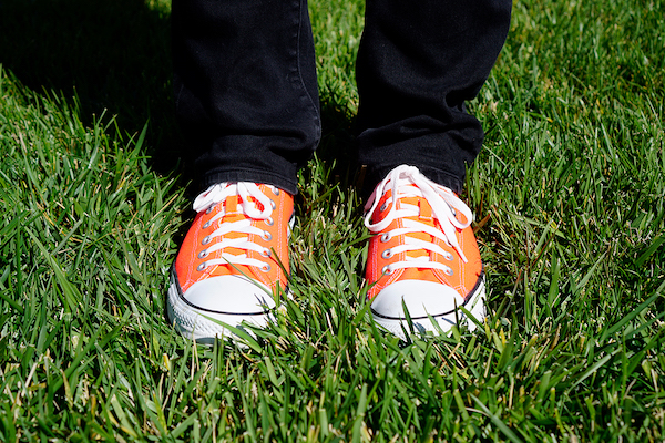
Unfortunately, what you’re seeing above doesn’t really convey just how funky the shoes are! The problem is the shoe fabric uses colors that are unable to be represented by an sRGB display. The camera that took the photograph (Sony a6300) has a sensor that is able to capture more accurate color information, and that data are included in the original file, but the display can’t show it. Here’s a version of the photo where every pixel that used a color outside the range of a typical display has been replaced with a light blue:
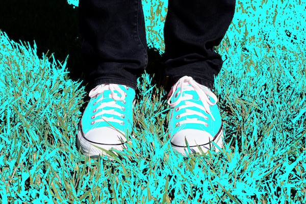
As you can see, the colors on the shoe fabric and much of the grass are outside the range of the sRGB display. In fact, fewer than half of the pixels in the photograph are accurately represented. As a Web developer, you should be concerned by this. Suppose you’re an online store selling these shoes. Your customers are not going to know exactly what color they’ve ordered, and might be surprised when their purchase arrives.
This problem is lessened with a wide-gamut display. If you have one of the devices mentioned above, or a similar device, here is a version of the photograph that will show you more colors:
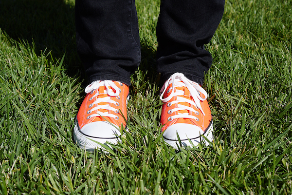
For those of you on a wide-gamut display, you’ll see the shoes are a brighter orange, and there is slightly more variation in the green grass. Unfortunately, if you don’t have a wide-gamut display, you’re probably seeing something very close to the first image above. In this case, the best I can offer is that tinted image that highlights which parts of the image you’re missing out on.
Anyway, this is great news! Wide-gamut displays are more vibrant, and provide a more accurate depiction of reality. Obviously you’re going to want to make sure you serve your users with imagery that makes use of this technology.
Here’s another example, this time with a generated image. To users on an sRGB display there is a uniform red square below. However, it’s a bit of a trick. There are actually two different shades of red in that image, one of which is only distinct on wide-gamut displays. On such a display you’ll see a faint WebKit logo inside the red square.
Sometimes the difference between a normal and wide-gamut image is subtle. Sometimes it is more dramatic.
Demo
Take a look at this page of examples that lets you swap between different versions of images to compare, as well as shows you where in the image there are pixels outside of the range of an sRGB display. There’s also a slightly more interactive version that shows you the different images side by side.
Definitions
Here’s a quick explainer for terms you often hear when discussing color.
Color Space: A color space is an environment in which you can define and compare colors. There are a few types of color spaces, each using a different set of parameters to describe the colors. For example, a greyscale color space only has one parameter which controls the level of brightness going from black to white. You’re probably familiar with RGB-type color spaces that use red, green, and blue as parameters representing the colors of the lights in a display that add together to make a final color. Print workflows often use CMYK-type color spaces, where cyan, magenta, yellow, and black are the parameters representing the colors of the inks.
Color Profile: In 1993, a group of vendors formed the ICC to define a standard that described color spaces. A color profile is data that defines what the color space of a device is, and can be used to convert between different spaces. The common ones are given names, such as sRGB (or more formally, IEC 61966-2-1). My use of sRGB above now makes a bit more sense: such a display is able to show colors corresponding to the sRGB color space. Color profile data can be written to a file, or embedded directly into an image, which allows a computer to understand what the color values in the image actually mean.
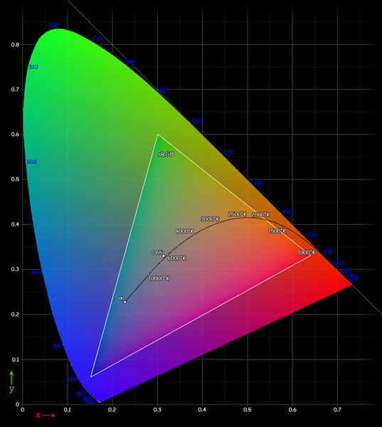
Gamut: A gamut is the range of colors a device can process, or that a color space can define. In the case of a computer display, a gamut is all the colors it can accurately show. Visualizing a gamut is a bit complicated, but it is slightly similar to the color pickers you see in design software. Imagine the range of all possible colors applied to a surface, with the primary colors at different extremes. As you move towards the red extreme, the color gets more red. Moving towards blue, more blue, etc. A gamut is the area on this imaginary surface that represents as far as the device can go in all directions. You might see a gamut represented with a diagram such as this, where the colored shape is showing what a typical human eye can see, and the white triangle shows the range of the sRGB color space (as you notice, it’s a lot smaller than what the eye could detect).
These diagrams can be a bit misleading because they are showing you colors that you can obviously see, and then telling you that a gamut doesn’t include those colors. However, they do give you a nice way to compare the size of different gamuts. Note also that here you’re seeing a two-dimensional representation of a color gamut surface, when in reality it is a three- or four-dimensional space (this is all pretty complicated – we’re just trying to give a simple introduction).
Wide-gamut: This is an informal term that the industry is using to describe devices or color spaces that have a gamut larger than sRGB, which is the gamut that nearly all computer displays have used for the last decade or so. Wider gamut displays have been around for a while, but were mostly limited to professional use. Now they are becoming available to regular consumers, which means that there are more colors available. Sometimes wide-gamut is also referred to as extended color. The modern Apple displays support the Display P3 color space, which is about 25% wider than sRGB. (Update: Chris Lilley has pointed out that P3 has a volume of about 1.2 million Lab units, where sRGB is about 0.8 million, making P3 about 50% larger)
Color Depth: Computers can use varying levels of precision, or depth, to represent a color. This is not the same as gamut, which describes a range of colors. Rather it is the number of distinct colors within the gamut that can be defined. Web developers are probably familiar with the CSS rgb() syntax, which takes 0-255 values for red, green and blue. That is a depth of 8 bits per channel, for a total of 16,777,216 different colors. If you add in alpha/opacity, you can store the color in 32 bits. If you use a depth of 8 bits per channel, you can only ever represent that same number of colors, no matter what color space you’re using – it would just be a different set of colors. If you chose 16 bits per channel, you would have a deeper space, and could represent more colors within the gamut. A good example of this is when you draw a gradient between similar colors: you can see banding, where the computer and display don’t have the depth to show a smooth range of colors between the end points.
Here is an example which shows how a lack of color depth produces banding, even though all the colors between the end points are within the gamut (it’s an artificial example to exaggerate the effect).
A smaller color depth might demonstrate distinct jumps between similar colors.

With a larger color depth, the jumps are much less noticeable.

With that introduction, let’s get into the details of color on the Web and recent improvements in WebKit to help you develop content that is more aware of color. We also introduce some features we’ve proposed to the W3C that will allow you to take even more advantage of this new display technology.
Colors on the Web
The Web has often struggled to handle colors correctly. I’m sure there are some readers out there who painfully remember Web-safe colors! While we’ve moved on from that, we still have limitations, such as HTML and CSS having been defined to work only in the sRGB color space. Just like the example of hober‘s shoes above, this means there are many colors that your CSS, images, and canvas are unable to represent. This is a problem if you’re trying to show your family the spring flowers blooming in your garden, or shopping for a bright red sports car to help with your mid-life crisis.
So when we showed the photograph of the shoes above, an sRGB display squished all the colors outside the sRGB gamut into colors that it could show. But a display with a wider gamut such as Display P3 didn’t need to squish into sRGB. Here’s a visual representation showing the difference between sRGB and the Display P3 color space.
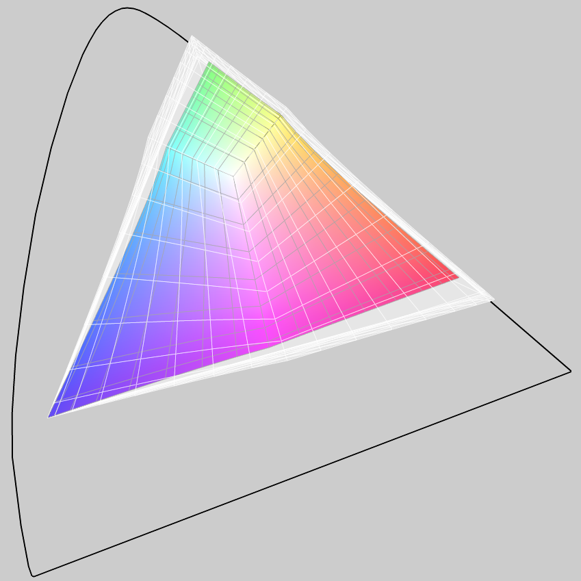
The colored triangle is the sRGB space. The white triangle shows the coverage of the Display P3 space, significantly bigger than sRGB, particularly in the more saturated reds, yellows, purples and greens. The black outline shows the ability of the typical human eye.
Remember the red square with the faint WebKit logo? That was generated by creating an image in the Display P3 color space, filling it with 100% red, rgb(255, 0, 0), and then painting the logo in a slightly different red, rgb(241, 0, 0). On an sRGB display, you can’t see the logo, because all the red values above 241 in Display P3 are beyond the highest red in sRGB, so the 241 red and the 255 red end up as the same color.
So now you understand why you should be aware of color, and that you should use this technology to give users a better experience. That’s the background — let’s talk about what this means for WebKit.
Color-matching Images
We mentioned above that the Web is defined to use sRGB. WebKit/Safari on Mac has operated in this color space for a number of years now, meaning you’d get consistent colors across different displays (at the time of writing, most other browser engines just operate in what’s called the device color space, which means they don’t process the color values before passing them on to the display hardware).
WebKit color-matches all images on both iOS and macOS. This means that if the image has a color profile, we will make sure the colors in the image are accurately represented on the display, whether it is normal or wide gamut. This is useful since many digital cameras don’t use sRGB in their raw format, so simply interpreting the red, green and blue values as such is unlikely to produce the correct color. Typically, you won’t have to do anything to get this color-matching. Nearly all image processing software allows you to tag an image with a color profile, and many do it by default.
With the examples linked above, you’re seeing this color-matching in action on Safari from OS X 10.11.3 and above, as well as iOS 9.3 and above (Retina devices). All I had to do was make sure that the images had been tagged with the appropriate color profile.
If an image doesn’t have a tagged profile, WebKit assumes that it is sRGB. This makes it easy for your generated artwork, such as border and background images, to match what you have defined in CSS. That is, a CSS value of rgb(255, 0, 0) would match the corresponding full sRGB red value.
That’s ok for the display technology from the last decade. But now that we have displays that support a wider gamut, you’ll want more control over how your content is shown.
Detecting the Display
I’ve explained above why you should prefer to serve wide-gamut images to users on a wide-gamut display. If you serve wide-gamut images to users not on a wide-gamut display, WebKit will color-match the images and show them in the sRGB space. However, this conversion into sRGB can be done a few ways and isn’t guaranteed to happen identically on other browsers or platforms. As a discerning Web developer or designer you will want to convert your images offline to better control what the end user will see. Also, embedding the color profile adds a little to the file size, so you might not want to send that extra data if it isn’t necessary.
The best solution is to serve a wide-gamut image when the user is on a wide-gamut display, and an sRGB image when the user is not on a wide-gamut display. This is just another case of responsive images, and is exactly what the
WebKit now supports the (new to CSS Color Level 4) color-gamut media query. Here’s how you use it:
<picture>
  <source media="(color-gamut: p3)" srcset="photo-wide.jpg">
  <img src="photo-srgb.jpg">
</picture>
You can also use this query inside a style sheet:
.main {
  background-image: url("photo-srgb.jpg");
}

@media (color-gamut: p3) {
  .main {
    background-image: url("photo-wide.jpg");
  }
}
Or script:
if (window.matchMedia("(color-gamut: p3)").matches) {
  // Do especially colorful stuff here.
}
The color-gamut query accepts p3 and rec2020 as values, which are intentionally vague terms to specify the range of colors supported by the system, including the browser engine and the display hardware. By default, since nearly all displays support sRGB, there is no need to test for that functionality. But a typical modern wide-gamut display can support the range of colors included in the DCI P3 space, or near about, and would pass the media query. For example, the Display P3 space I mentioned above is a variant of DCI P3. The rec2020 value indicates the system has a display that supports an even wider color gamut, one approximately defined by the Rec. 2020 space (at the moment, it’s quite rare to come across hardware on the Web that actually supports Rec. 2020, so you probably don’t need to worry about that yet).
Since media queries have a graceful fallback, you can start using color-gamut right away to give wide-gamut users nicer colors while still accomodating users who don’t yet have compatible browsers or hardware.
Future Directions
Serving and rendering wide-gamut images is relatively straightforward, but what about if you want to combine it with other page elements like a background color, or paint the image into a canvas element? These are some of the challenges the standards bodies are grappling with, and I’d like to talk about where they’re going.
Wide-gamut colors in CSS
I showed above that rgb(241, 0, 0) in Display P3 is rgb(255, 0, 0) in sRGB. What can you do if you want a color defined in CSS to match something inside a wide-gamut image? We can’t yet specify those colors in CSS.
This is what members of the WebKit project have proposed for CSS. The current idea is to add a new function called color() that can take a color profile as well as the parameters defining the color.
/* NOTE: Proposed syntax. Not yet implemented. */
strong {
  color: color(p3 1.0 0 0); /* 100% red in the P3 color space */
}
In practice, you’d probably use this with an @supports rule.
strong {
  color: rgb(255, 0, 0); /* 100% red in the sRGB color space */
}

@supports (color: color(p3 0 0 0)) {
  strong {
    color: color(p3 1.0 0 0); /* 100% red in the P3 color space */
  }
}
color(p3, 255, 0, 0). This is one of the annoyances of the existing rgb() function. The new color() function will take floating point numbers as parameters, not 8-bit integers.
CSS will define some known color profile names, so you can easily find the color values you want. There is still some discussion about allowing authors to link to external profiles, or maybe point at an image that has an embedded profile.
In addition, CSS might decide to allow you to specify values outside 0-255 (or 0-100%) in the existing rgb() function. For example, rgb(102.34%, -0.1%, 4%) would be a color that has more red, less green and a tiny touch of blue. The problem here is that it might be confusing to understand these values (what does it mean to be a negative green?).
Another suggestion is to be able to define a color space for the entire document, which would mean that all the regular CSS color values would be interpreted in that space. External images with embedded profiles would still be color matched.
These discussions are happening in the W3C CSS Working Group at the moment. Your opinions are valuable – the group needs more input from Web developers. If you’re interested in participating, look for emails with subjects starting “[css-color]” on the www-style email list.
WebKit hopes to implement these features as soon as we’re confident they are stable.
Wide-gamut colors in HTML
While CSS handles most of the presentation of an HTML document, there is still one important area which is outside its scope: the canvas element. Both 2D and WebGL canvases assume they operate within the sRGB color space. This means that even on wide-gamut displays, you won’t be able to create a canvas that exercises the full range of color.
The proposed solution is to add an optional flag to the getContext function, specifying the color space the canvas should be color matched to. For example:
// NOTE: Proposed syntax. Not yet implemented.
canvas.getContext("2d", { colorSpace: "p3" });
There is something else to consider, which is how to create a canvas that has a greater color depth. For example, in WebGL you can use half-float textures that give you 16 bits of precision per color channel. However, even if you use these deeper textures inside WebGL, you’re limited to 8 bits of precision when you paint the WebGL into the document.
There needs to be a way for the developer to specify the depth of the color buffer for a canvas element.
This gets more complicated when combined with the getImageData/putImageData functions (or the readPixels equivalent in WebGL). With today’s 8 bit per channel buffers, there is no loss of precision going into and out of a canvas. Also, the transfer can be efficient, both in performance and memory, because the canvas and program side data are the same type. But when you have variable color depths, this might not be possible. For example, WebGL’s half float buffer doesn’t have an equivalent type in JavaScript, which means there will either have to be some transformation as the data is read or written, as well as use more memory to store the data, or you’ll have to work with a raw ArrayBuffer and do awkward math with bit masks.
These discussions are currently happening on the WhatWG github and soon at the W3C. Again, we’d love for you to be part of the conversation.
Summary
Wide-gamut displays have arrived and are the future of computing devices. As your audience using these beautiful displays grows, you’ll want to take advantage of the stunning range of colors on offer and provide users with a more engaging Web experience.
WebKit is very excited to provide improved color features to developers through color matching and color gamut detection, available today in the Safari Technology Preview, as well as the macOS Sierra and iOS 10 betas. We’re also keen to start implementing more advanced color features, such as specifying wide-gamut colors in CSS, tagging canvas elements with profiles and allowing greater color depth.
If you have any comments, questions, delicious cookies or spam I can be found at dino@apple.com or @grorgwork. You can also contact Jonathan Davis at web-evangelist@apple.com, @jonathandavis, or send general comments to the @webkit Twitter account.