CSS Grid Layout:
A New Layout Module for the Web
People have been using grid designs in magazines, newspapers, posters, etc. for a long time before the Web appeared. At the point when web developers started to create web pages, many of them were based on a grid layout. Different solutions have been used to create grid layouts, like tables, floats, inline blocks, or flexboxes, but all of these techniques have different issues when you try to define a complex grid design.
In order to solve these problems, a new standard was defined to provide a good solution to create grid designs. This specification, called CSS Grid Layout, allows users to very easily create two-dimensional layouts on the Web. It has been designed specifically for this purpose and it brings very powerful features to divide the web page into different regions, granting great flexibility to web authors in order to define the sizing of the different sections and how the elements are positioned in each of them.
Grid Layout has been under development in WebKit for a while, and you can experiment with Grid Layout today using WebKit in Safari Technology Preview.
Basic Concepts
A grid is a structure made up of a series of intersecting lines. The main concepts of the CSS Grid Layout spec are:
- The grid lines that define the grid: they can be horizontal or vertical,
and they are numbered starting at 1. - The grid tracks, which are the rows (horizontal)
or columns (vertical) defined in the grid. - The grid cells, the intersection of a row and a column.
- A grid area, one or more adjacent grid cells that define a rectangle.
Grid Definition
To create a grid you just need to use a new value for the display property: grid or inline-grid. This is the same syntax as Flexbox, so you might be already used to it.
Then you will need to define the structure of your grid. For example, to define the size of the tracks you can do something like this:
display: grid;
grid-template-rows: 100px 100px;
grid-template-columns: 400px 200px 100px;
This will create a grid with two rows of 100px each, and three columns, with sizes 400px for first column, 200px for the second column, and 100px for the third column. This grid will have four vertical lines (1, 2, 3, 4) and three horizontal lines (1, 2, 3). You can also name the lines, so you can then reference them later easily. For example:
grid-template-columns: [first] 400px [main] 200px [side] 100px [last];
Regarding track sizing, you have a lot of flexibility:
- You can define a fixed size track, setting the length or percentage.
- You can define an intrinsic-sized track, where the size is based on the size of its content, using
auto,min-content,max-content, orfit-content. - You can use a new unit
frto take advantage of the available space.
In addition, there are some functions that can be useful to set the track sizes:
minmax(), to set the minimum and maximum size of the track, so its size will end up depending on the available space and the size of the rest of the tracks.repeat(), to define a fixed number of repetitions. It can also be used in automatic mode to cause the number of tracks to depend on the available space.
There is a special syntax that allows you to define the grid structure using ASCII art:
    grid-template-areas: "header  header"
                         "sidebar main  "
                         "sidebar footer";
In this example we create a 2×3 grid where the first row is the header, the rest of the first column is the sidebar, the main content is in the second row and second column, and the footer is in the last row and column.
You can also define the gutter between tracks. For that, you just need to use the grid-row-gap and grid-column-gap properties.
Item Placement
The children of a grid container are called grid items. They can be positioned in the different parts of the grid using the placement properties grid-row-start, grid-row-end, grid-column-start, and grid-column-end. But in most cases you’ll be using the shorthands grid-row, grid-column, and grid-area.
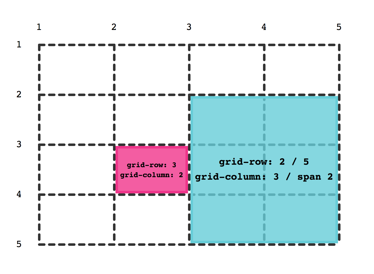
Note that these properties refer to the grid lines, so if you want to put an element on the third row and the second column you can use something like this:
    grid-row: 3;
    grid-column: 2;
The item can also span several lines, so you can use the following syntax to take three rows and two columns:
    grid-row: 2 / 5;
    grid-column: 3 / span 2;

Apart from that, you can also refer to named lines or areas with these properties, which is very convenient in some scenarios.
As you can imagine, when you’re using Grid Layout you can very easily break the relationship between the DOM order and the visual order. You have to be careful to keep the right order in the DOM to avoid making your content less accessible.
Lastly, there’s also the possibility to let the items place themselves into the grid. If you don’t set any placement property (or if you use auto), the items will be automatically placed on some empty cell of the grid, creating new rows (by default) or columns (if specified through grid-auto-flow property) when required.
Alignment
One of the big things that come for free when you use CSS Grid Layout is the alignment support. In Grid Layout you can align horizontally and vertically without any issues with just some simple CSS properties.
The alignment capabilities of Grid Layout operate over two different subjects: grid tracks, with regard to the grid container, and grid items in their respective grid areas. In addition, we can operate on both axes, horizontally and vertically.
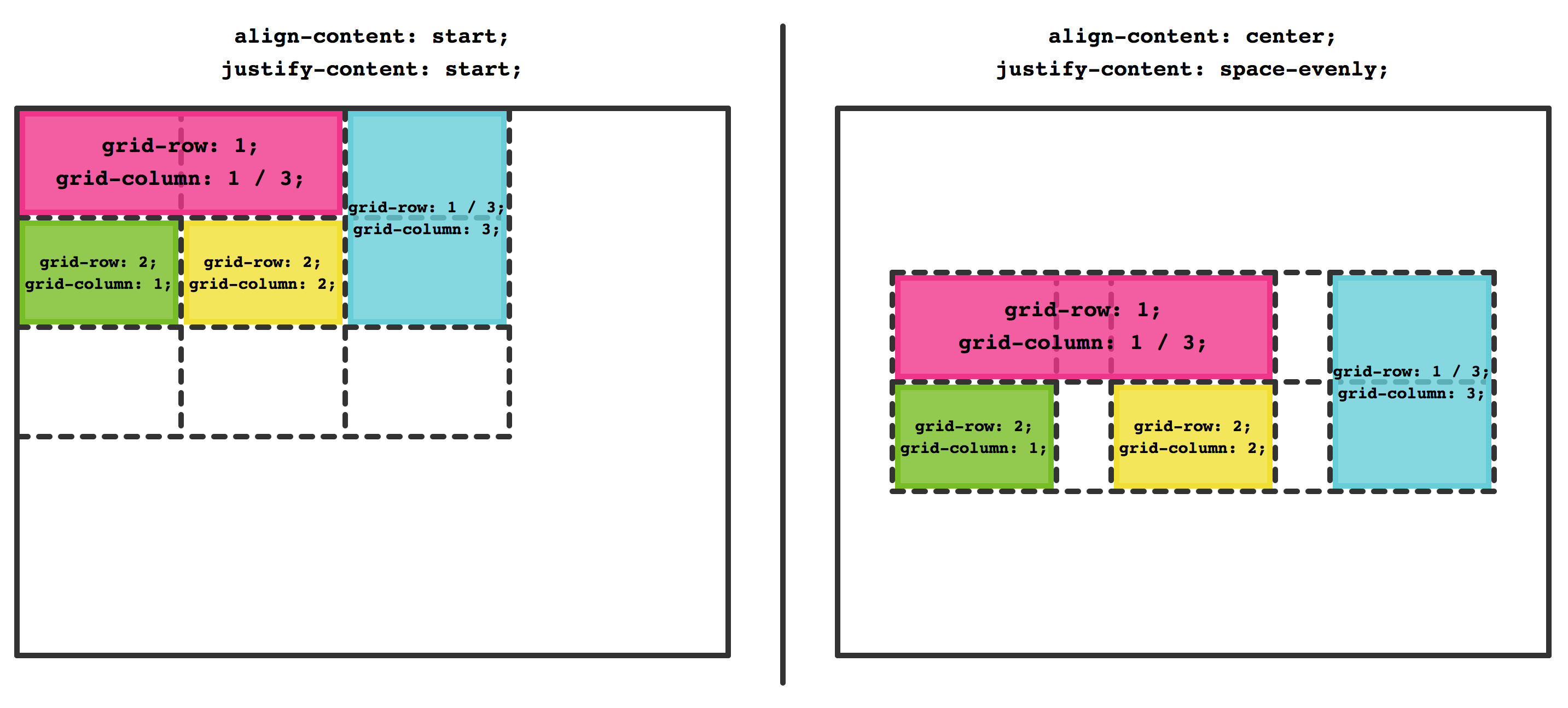
The CSS properties justify-content and align-content apply to grid tracks to align them horizontally and vertically, respectively. These properties, which define what is known as Content Distribution behavior, can also be used to distribute the grid container’s available space among the tracks following different distributions: between, around, evenly, and stretch. For example, check the following grid:
    display: grid;
    grid-template-rows: 100px 100px;
    grid-template-columns: 150px 150px 150px;
    height: 500px;
    width: 650px;
    align-content: center;
    justify-content: space-evenly;

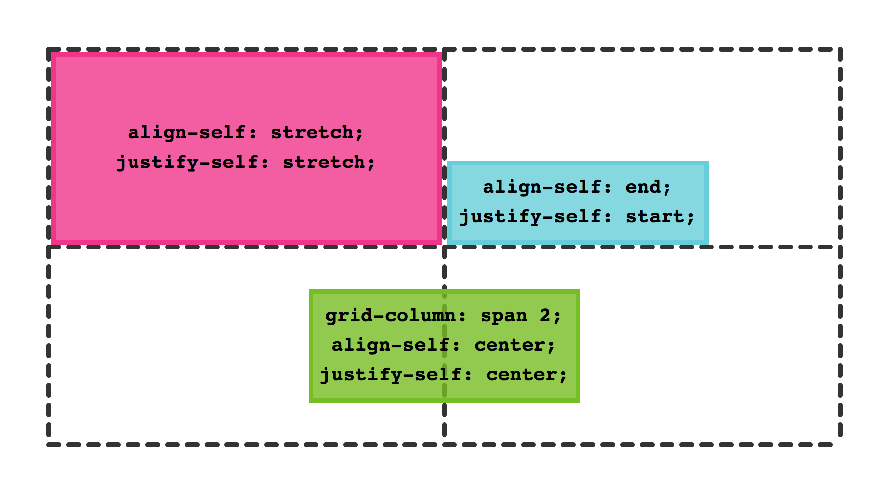
When it comes to aligning the grid items, the justify-self and align-self properties are used to align horizontally and vertically, respectively. These properties define the Self Alignment behavior of the grid items. It’s possible to define a default behavior for all the items of a grid container by using the Default Alignment properties, align-items and justify-items, which gives an incredible syntactic flexibility for defining the grid’s alignment behavior.

Responsive Design with Grid
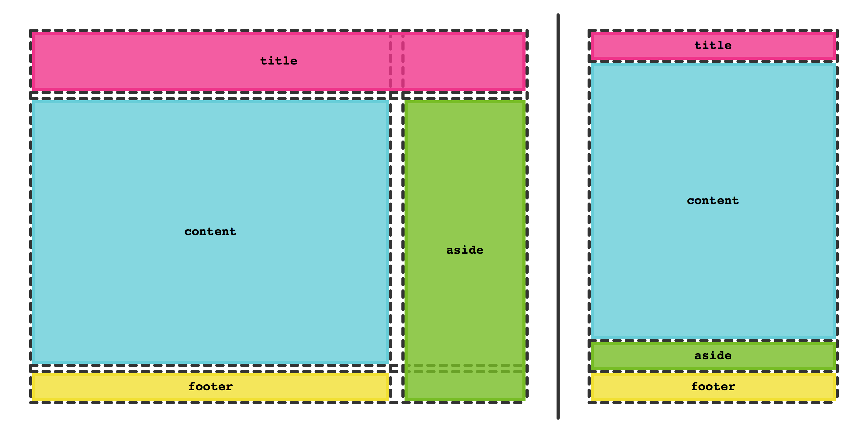
As you can already imagine, all the different Grid Layout properties make it more comfortable to create responsive designs. You can take advantage of the powerful track sizing mechanisms like the fr unit, minmax(), or repeat(). Combine this with media queries to completely change the structure of your grid with just a few CSS lines.
For example:
display: grid;
grid-gap: 10px 20px;
grid-template-rows: 100px 1fr auto;
grid-template-columns: 1fr 200px;
grid-template-areas: "header  header"
                     "content aside "
                     "footer  aside ";

@media (max-width: 600px) {
    grid-gap: 0;
    grid-template-rows: auto 1fr auto auto;
    grid-template-columns: 1fr;
    grid-template-areas: "header "
                         "content"
                         "aside  "
                         "footer ";
}

And Much More
This is just an introductory blog post about Grid Layout, not a deep review of all the different features that it provides: that would require much more than a single post. The different examples explained in this blog post have been published online. You can start to play with them now!
If you want to learn more about CSS Grid Layout, there are a bunch of good resources out there:
- Grid by Example is an excellent website by Rachel Andrew with lots of resources.
- The CSS-Tricks page by Chris House is a very nice reference.
- Jen Simmons has some awesome examples on her website.
On top of that, several people have been talking about Grid Layout at different conferences and events. You won’t have problems finding some of the talks published online.
Conclusion
CSS Grid Layout is here to stay. We’re looking forward to seeing this soon in shipping versions of Safari and other web browsers. This is very good news for the Web authors that have been waiting for a tool like this for years. We believe this is going to be a huge step forward for the Web.
The implementation of Grid Layout in WebKit has been performed by Igalia’s Web Platform team and sponsored by Bloomberg. If you have any comments or questions, don’t hesitate to contact any of the people working on it: Javi (@lajava77), Manuel (@regocas), or Sergio (@svillarsenin). If you want to keep track of the development you can follow bug #60731. New bug reports are very welcome, especially now that Grid Layout is hitting your browser and testing is easier than ever. Exciting times ahead!