Dark Mode Support in WebKit
With the introduction of Dark Mode in macOS Mojave last year, web developers have been asking for support in Safari to style web content that matches the system appearance. With the Safari 12.1 update in macOS 10.14.4, iOS 13, and iPad OS 13, dark mode support in WebKit and Safari has arrived.
Dark Mode Behaviors
By default there are no behavior changes with how pages look when a user is in dark mode. This preserves the standard assumptions web designers have had for almost thirty years — that a page defaults to a white background and black text. To change these defaults in dark mode would be a web compatibility nightmare.
However, this leaves a large area of the screen with potentially bright content in dark mode. For simple content, an app could transform colors in the document for dark mode. This is what Mail does in macOS Mojave — it displays simple email messages with a dark mode interpretation.
Not all web content is simple. For this reason Safari and WebKit do not auto-darken web content — documents will need to opt-in to dark mode. The main way to signal that your content supports dark mode it to adopt the new color-scheme style property, specified in this proposal.
You would use this inherited property in your stylesheet like this:
:root {
    color-scheme: light dark;
}
Specifying the values light and dark on the root element lets the engine know both modes are supported by the document. This changes the default text and background colors of the page to match the current system appearance. Also standard form controls, scrollbars, and other named system colors change their look automatically. Without this declaration, it would not be safe for the engine to use dark form controls or a dark color scheme, since many documents are designed with an assumed light color scheme.
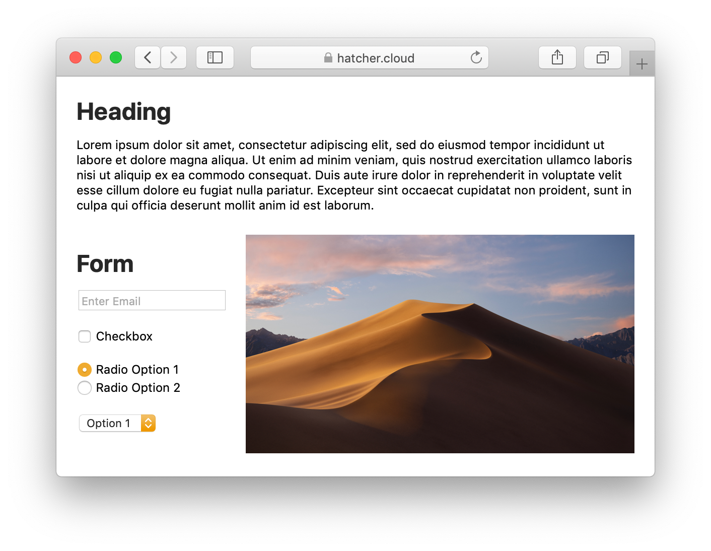
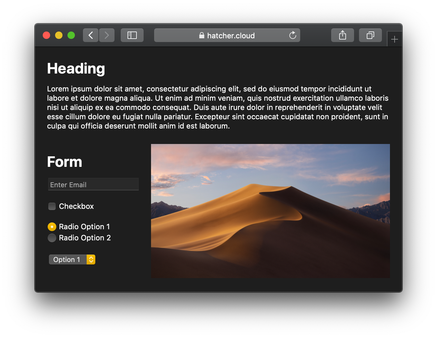
For example, this simple page, with color-scheme: light dark specified, will be entirely ready to use in both appearances.
These default background and text colors can be different values when using the high contrast accessibility mode or with different browser and system versions. You should not assume they will always be the same color values.
The color-scheme style property is also supported on style rules that select specific elements in the document, not just the root element. This is useful if you have content or components that need a specific color scheme, specifically content with form controls, since dark mode form controls would not look correct on light backgrounds.
This style property also allows Mail to know which color scheme to use for an email message, as it can affect the auto-darkening transformations that get applied to the message’s colors. Declaring color-scheme: light dark in a rich email message lets Mail know it supports its own styling for dark mode. You can also specify light only, informing Mail that it should not transform your light color scheme email message.
If using a meta tag declaration is better suited for your content, there is also <meta name="color-scheme">, specified in this proposal.
color-scheme property and meta tag were renamed from supported-color-schemes in Safari Technology Preview 81 and macOS Catalina. The old name is supported by WebKit, Safari, and Mail in macOS 10.14.4. This is a developing standard that could change in the future.Styling For Dark Mode
Defining color-scheme will get you going for simple content. For most web content, you will need to adopt the prefers-color-scheme media query, specified in this proposal, to style elements with custom colors or images. You can use this media query anywhere media queries are supported, such as in <picture> elements or window.matchMedia() for script triggers.
The best way to deploy a dark and light color scheme in your documents is to utilize CSS variables. Then you can easily specify the colors in one place with the media query, and use those variables throughout your stylesheets. When the media query matches, the variables will change wherever they are used — auto switching with any appearance change.
Here is an example using the media query to specify color values with CSS variables:
:root {
    color-scheme: light dark;
    --special-text-color: hsla(60, 100%, 50%, 0.5);
    --border-color: black;
}

@media (prefers-color-scheme: dark) {
    :root {
        --special-text-color: hsla(60, 50%, 70%, 0.75);
        --border-color: white;
    }
}

.special {
    color: var(--special-text-color);
    border: 1px solid var(--border-color);
}
Images and Dark Mode
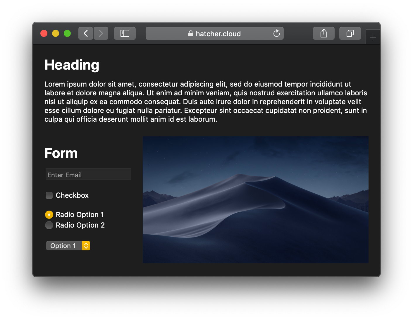
For most hero images, they will still look great in dark mode — they might even pop off the page more than ever! As mentioned before, you can use the prefers-color-schemes media query in <picture> elements or style rules to select a different image if you have a dark mode version.
For our simple example page, we can select a different hero image of the Mojave desert:
<picture>
    <source srcset="mojave-night.jpg" media="(prefers-color-scheme: dark)">
    <img src="mojave-day.jpg">
</picture>
You might also have images for controls or other interactive elements that you will need to update for dark mode. Many sites today have adopted vector images for these glyphs, such as SVG or web fonts. Fonts will naturally adapt to your dark mode text colors, but SVG images will need some additional styling to look correct. One trick you can use with SVG is the currentColor keyword to have embedded SVGs use the current text color — thus automatically adapting to your dark mode text colors. You can also use CSS variables to style colors inside of SVG, just like your other elements.
For specific images that you can’t style any other way, you can use a CSS invert() filter. If the image also has color, you might consider using invert() hue-rotate(180deg) to moderately preserve the image intent. In any case you should not use an overall filter on broad sections of content, since that can have high memory and performance costs. Using direct styling of colors is the best approach for color accuracy and performance.
Debugging Dark Mode
Web Inspector now includes a navigation bar button in the Elements tab to toggle dark or light mode, depending on your current overall system preference. This allows you to quickly test pages in both appearances without having to toggle the whole system appearance in System Preferences. The Styles sidebar updates to reflect the current matching rules, as well as any CSS color variables.

Examples
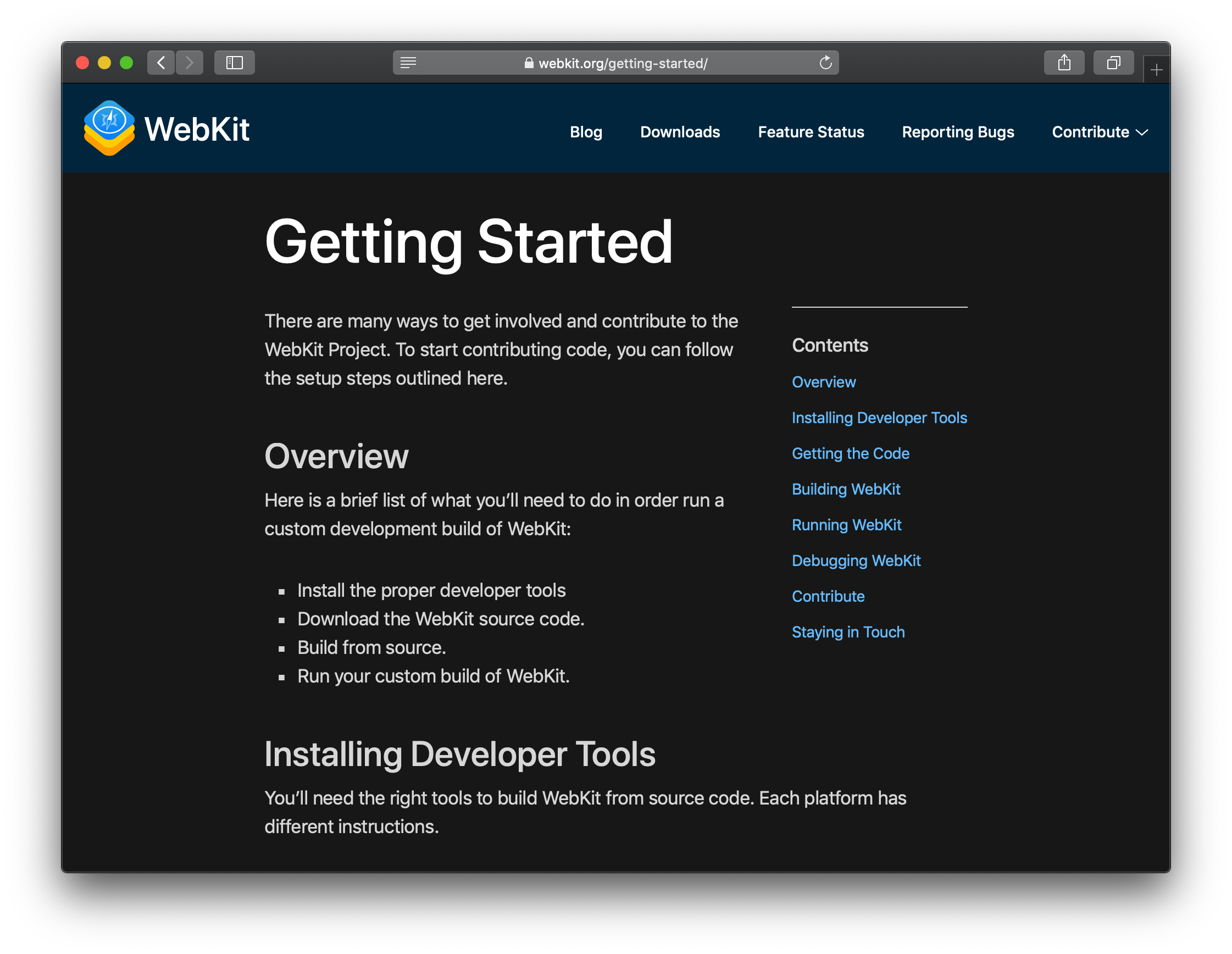
As you might have noticed, if you are using Safari on macOS 10.14.4, the WebKit.org site already supports dark mode. Since we added support a while ago in Safari Technology Preview, a number of other sites have also adopted dark mode. Here are some examples you can check out today:
- Twitter — The social networking service.
- Emojipedia — Home of emoji meanings.
- NSHipster — A journal of the overlooked bits in Objective-C, Swift, and Cocoa.
- CSS DB — A database of staged CSS features.
- Stuff & Nonsense — A design studio, specializing in creative design for digital products and web.
Additional Information
Be sure to watch our WWDC 19 video, Supporting Dark Mode in Your Web Content, to learn about techniques for adding dark mode support in iOS 13 and macOS Catalina.