Dark Mode in Web Inspector
Web Inspector on macOS Mojave now supports Dark Mode.
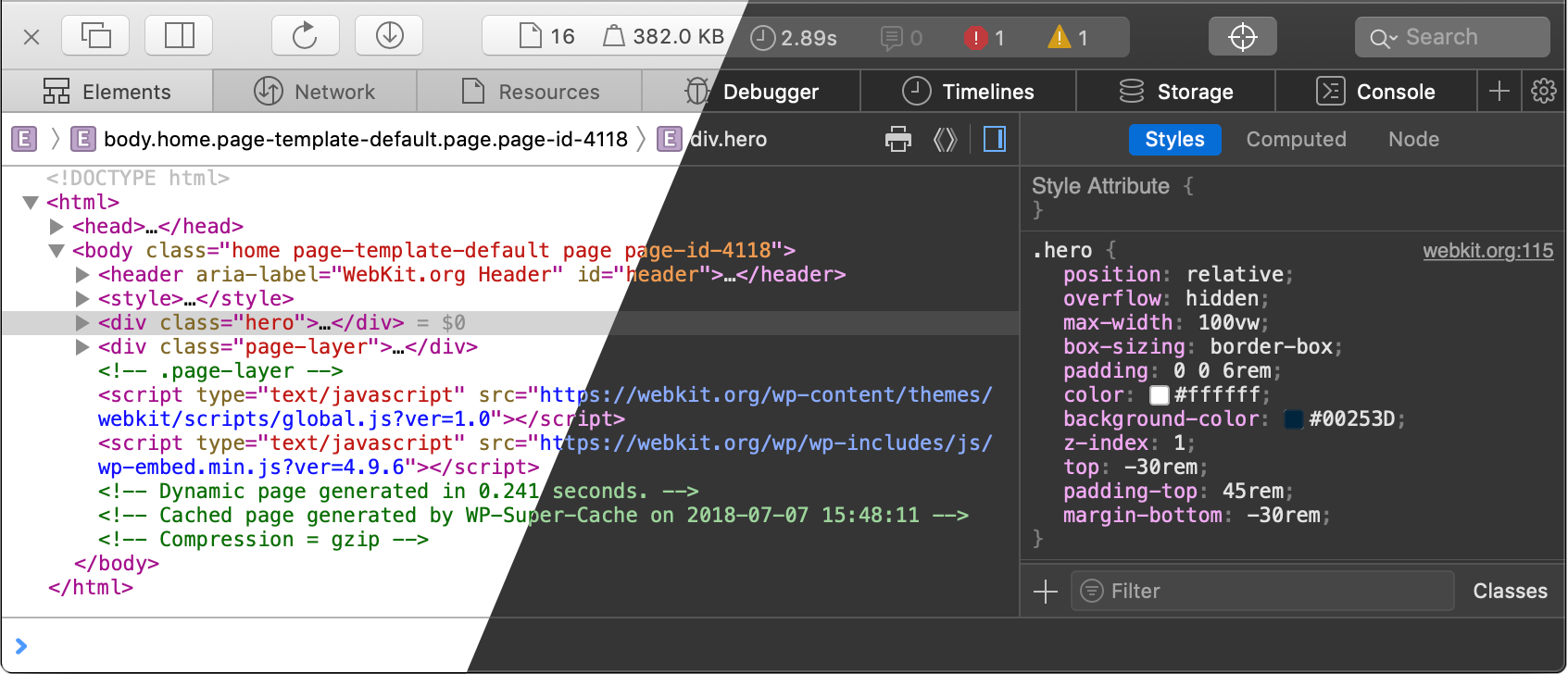
Dark Mode in Web Inspector was introduced in Safari Technology Preview last year. This article highlights implementation details which could be helpful for anyone adapting Dark Mode for their websites or web views.
How do I enable Dark Mode for Web Inspector?
Web Inspector matches macOS appearance. To enable Dark Mode in macOS Mojave, go to “System Preferences → General” and select “Appearance: Dark” (see How to use Dark Mode on your Mac for more details). Note that it’s not possible to enable Dark Mode only for Web Inspector.
Dark Mode in Web Inspector is supported in macOS Mojave and later.
Why Dark Mode isn’t supported on macOS 10.13 High Sierra and below?
Web Inspector uses native form controls. macOS Mojave has a dark version of each form control (text fields, buttons, checkboxes, drop-downs, radio buttons, and etc.).
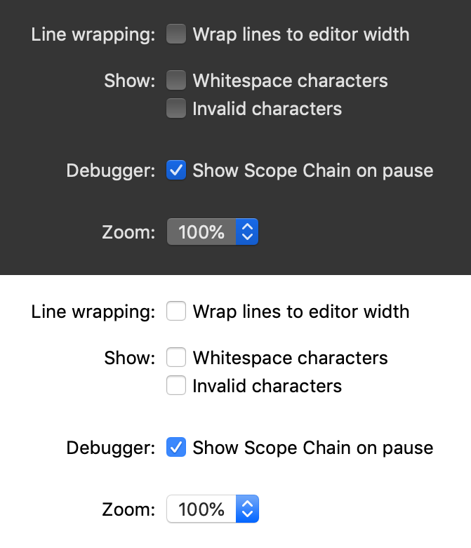
macOS 10.13 High Sierra and below don’t support Dark Mode and only have light version of form controls. Without the proper form control styles, Dark Mode experience would be inconsistent so we decided not to do it.
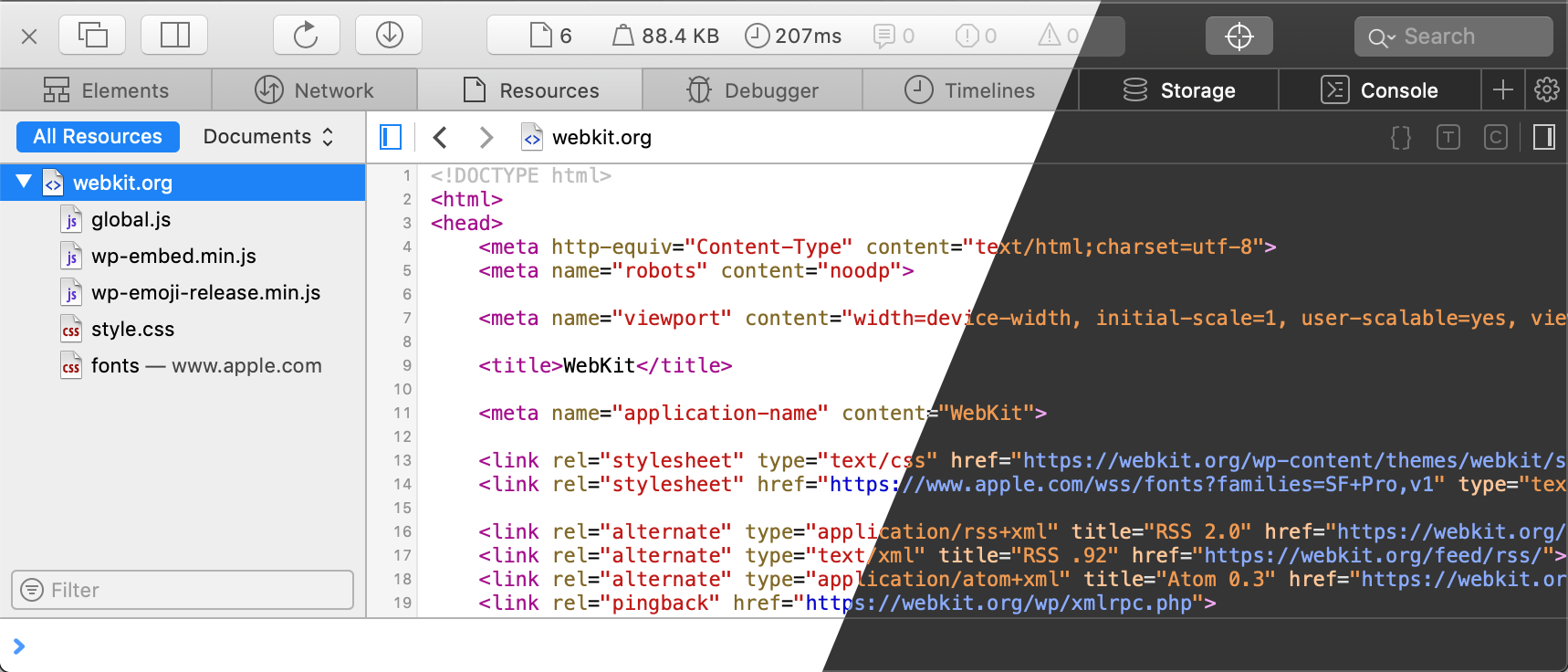
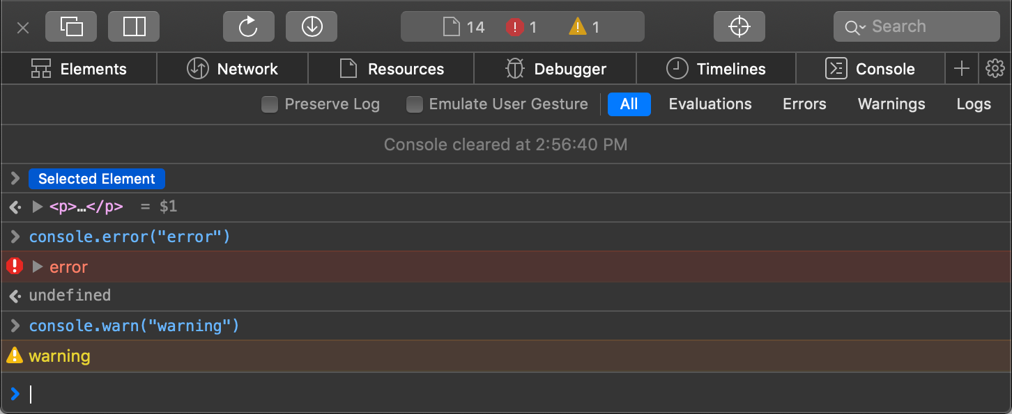
We tried to preserve syntax highlighting colors of the light theme. To keep text readable, we increased luminosity — by increasing brightness and sometimes changing the hue.
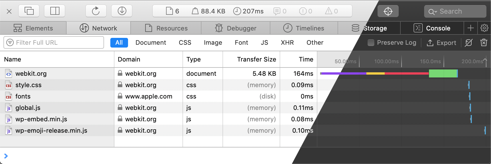
For some cases, like the bars in Network tab, we didn’t have to change anything. The same colors are readable in both light and dark themes.
SVG and currentColor
Instead of maintaining a separate set of icons for Dark Mode, we changed the colors of the existing icons with CSS wherever possible.
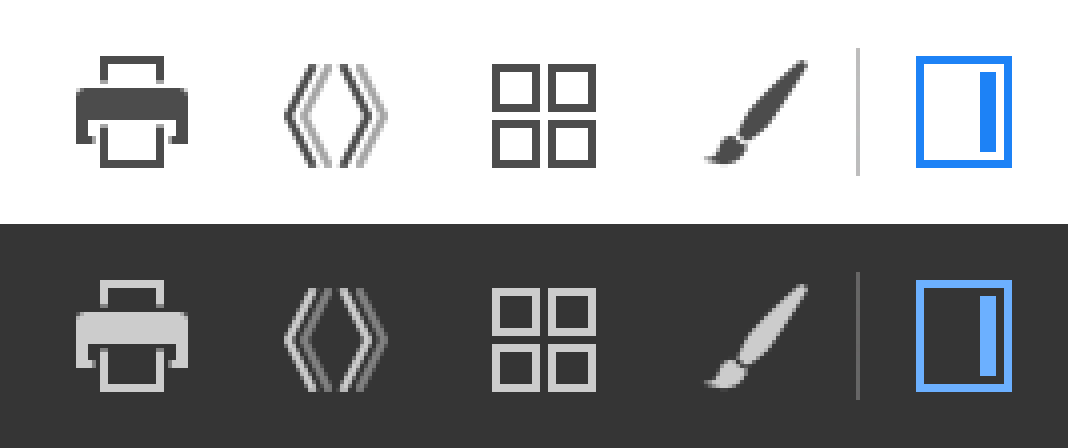
Most of Web Inspector icons are SVG files included inline in HTML:
<svg style="color: blue">
    <use xlink:href="Images/Paint.svg#root"/>
</svg>
Paint.svg:
<svg id="root">
    <path fill="currentColor" d="..."/>
</svg>
currentColor is the color of the parent element. In this example, it’s blue.
currentColor only works for inline SVGs. It doesn’t work for SVGs included via <img> element or CSS (e.g. via background-image or content). For these cases, we used CSS filters to invert the colors.
CSS filters
The very first iteration of Dark Mode in Web Inspector was a single CSS rule:
body {
  filter: invert()
}
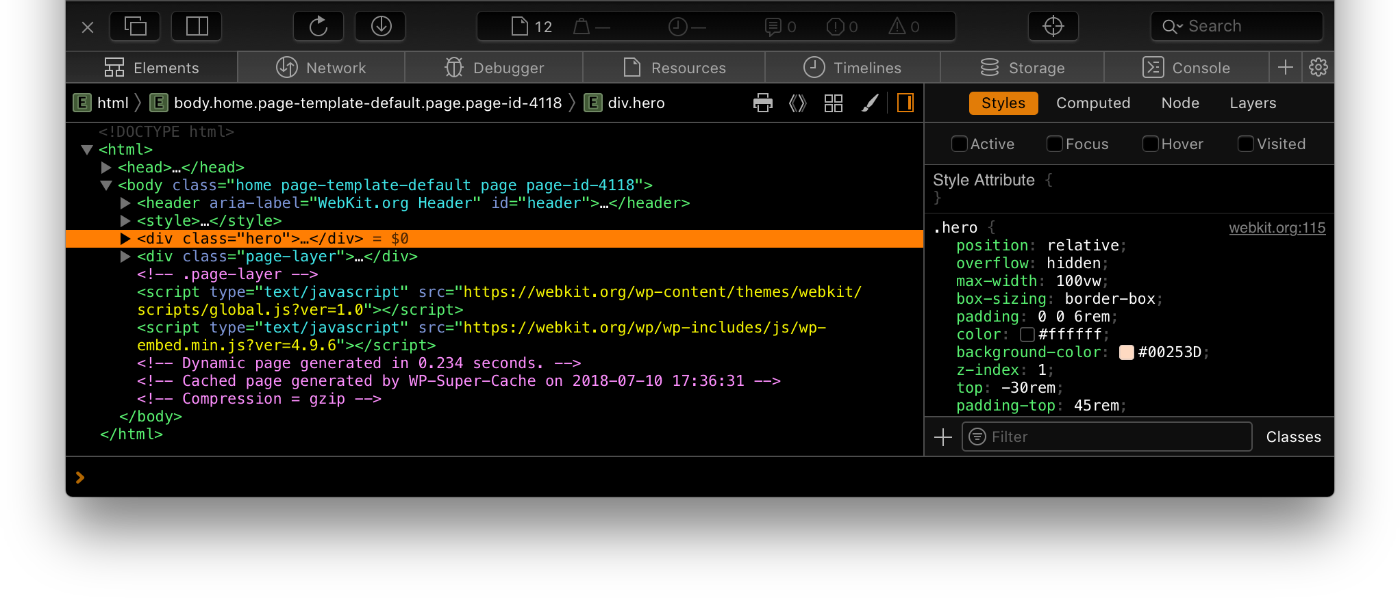
Inverting colors rotated the hue by 180 degrees. Notice how the selected color changed from blue to orange. We fixed that by rotating the hue another 180 degrees:
body {
   filter: invert() hue-rotate(180deg)
}
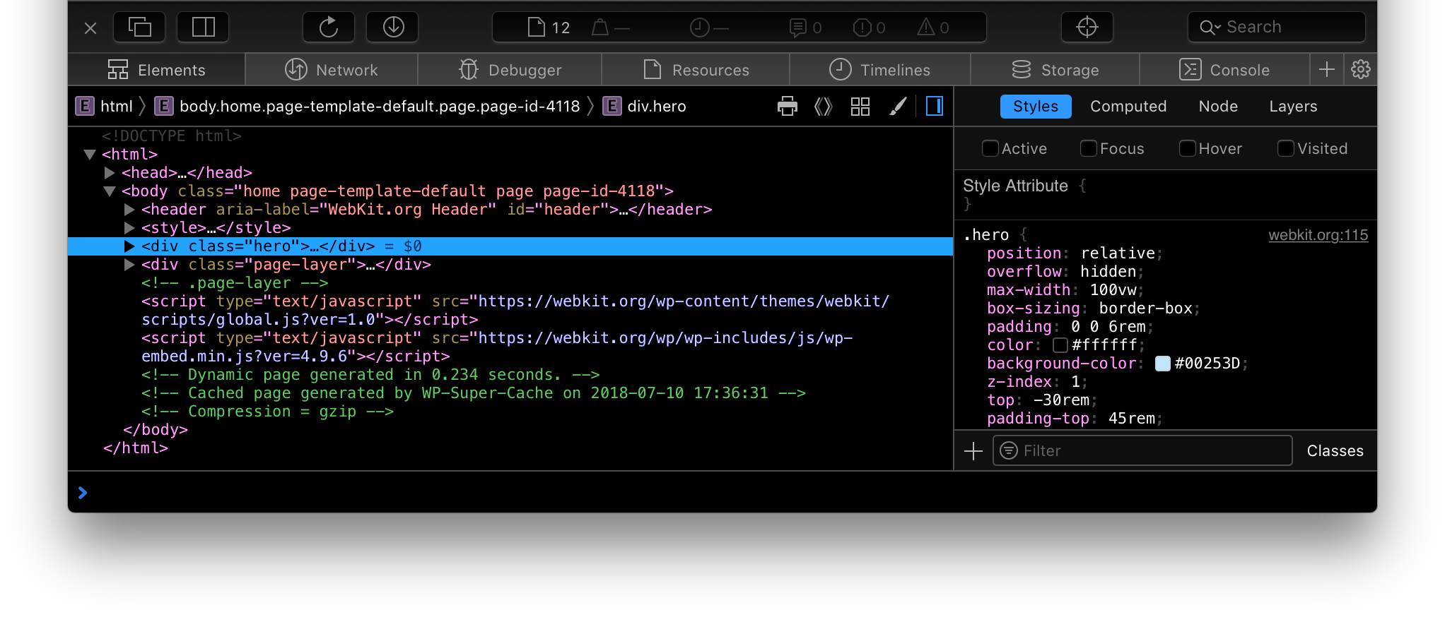
This had several issues. The colors didn’t exactly match the Dark Mode Human Interface Guidelines. The dark shadows turned light.
We ended up not using this filter for body, but we used it for icons included via CSS (e.g. via background-image or content), where currentColor didn’t work.

CSS variables
Implementing Dark Mode took over 1,000 lines of CSS. We used CSS variables extensively to reduce code duplication.
Previously, we had variable names such as --text-color-dark-gray and --text-color-light-gray. In Dark Mode, they would have to be inverted to provide desired contrast with the background: --text-color-dark-gray would become light gray, and --text-color-light-gray would become dark gray.
We started using semantic names such as --text-color-secondary instead of --text-color-dark-gray, and --text-color-tertiary instead of --text-color-light-gray.
Contributing
Please report bugs regarding Dark Mode in Web Inspector on webkit.org/new-inspector-bug. Make sure to include “Dark Mode” in the title.
If you’re interested in contributing or have any questions, please stop by the #webkit-inspector IRC channel.