Interop 2023:
Pushing interoperability forward
A year ago, Apple, Bocoup, Google, Igalia, Microsoft, and Mozilla came together to improve the interoperability of the web and to continue our commitments to web standards — actions that ensure the web will work in any browser, on any operating system, with any computer.
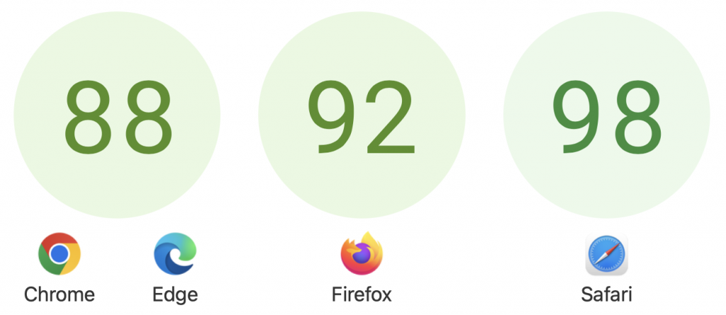
Throughout last year, Interop 2022 focused on fifteen key areas of most importance to web developers, selecting automated tests to evaluate how closely each browser engine matches the web standards for those areas. Browsers made remarkable progress between January and December 2022, improving the number of tests that pass in all three browsers from 49% to 83%.
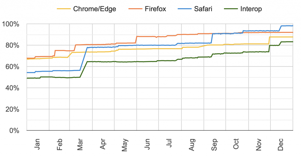
The WebKit team channeled efforts across all focus areas, and is proud to have reached a 98.2% pass-rate by the end of 2022.
Announcing this year’s Interop 2023
Now we are pleased to announce this year’s Interop 2023 project! Once again, we are joining with Bocoup, Google, Igalia, Microsoft, and Mozilla to move the interoperability of the web forward.
The scores have reset. We retired half of the tests used for scoring Interop 2022 last year, and added many new tests — all of which are focused on the technology web developers most expressed they want improved next.
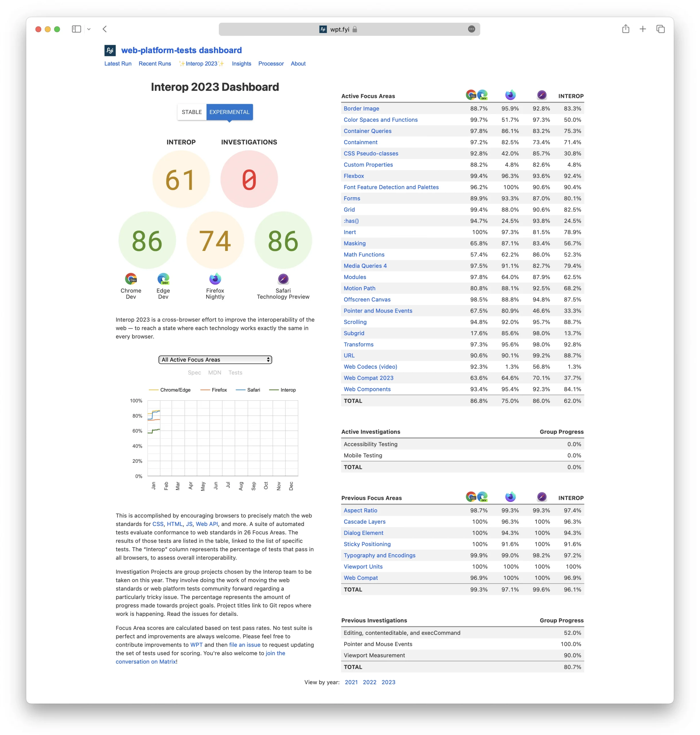
Each “Focus Area” collects together a set of automated tests for a particular technology, used to evaluate browser implementations. The “Investigations” are team projects run by the people behind Interop 2023 to investigate a particularly-complex issue as a group, and find ways to make progress.
Last fall, the collaborative team planning Interop 2023 received 87 proposals for what to include. Of those, 35 were accepted and combined into 18 new Focus Areas, plus 2 new Investigations. They join 5 Focus Areas carried over from 2022 and 3 Focus Areas carried over from 2021, for a total of 26 “Active Focus Areas” for 2023.
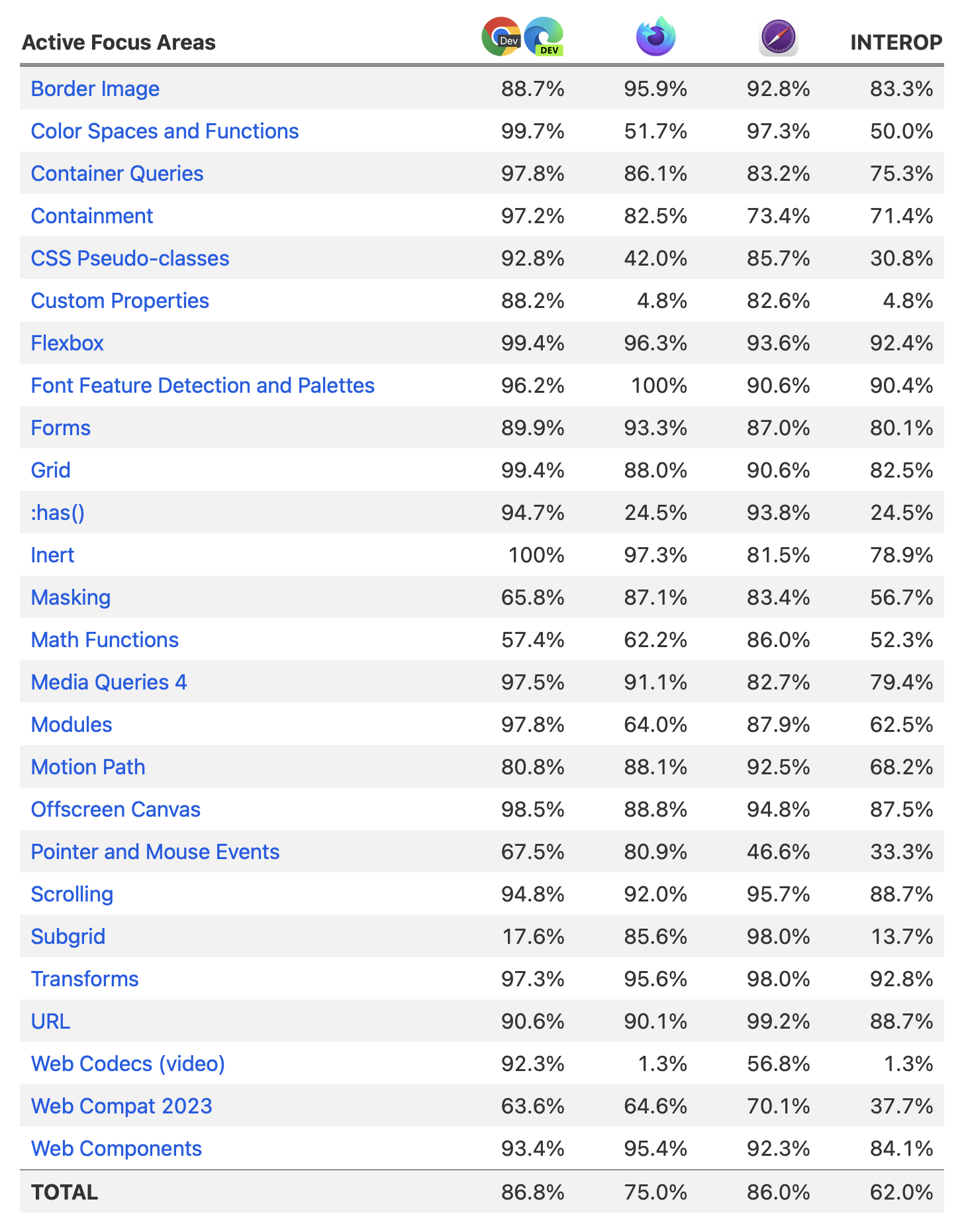
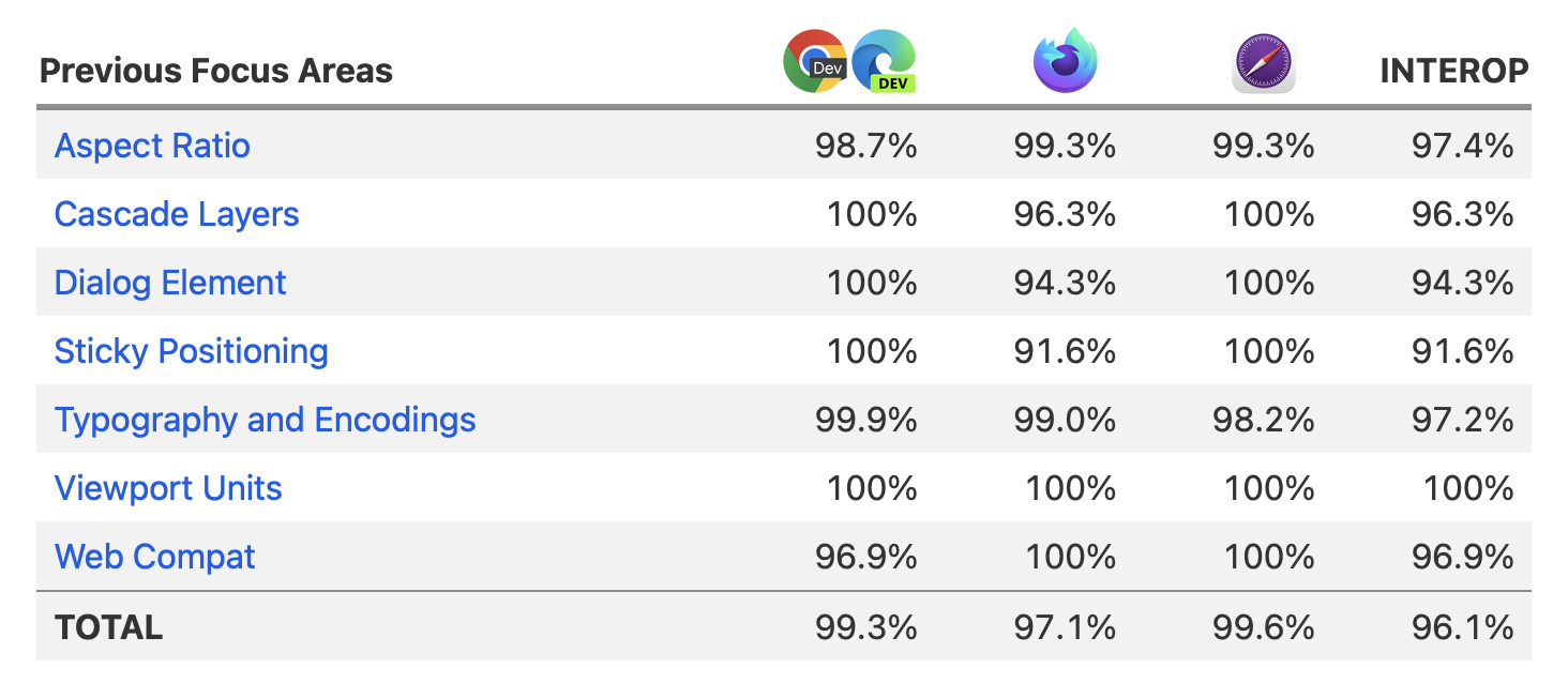
We achieved pretty great interoperability in 7 Focus Areas from 2022, and so we’re moving these to “Previous Focus Areas”, a new section on the Interop dashboard, where they no longer count towards the overall top-level score.
The 2023 Focus Areas
Let’s take a look at all the web technology included in each of the 26 Focus Areas for 2023. They now include features in JavaScript and Web APIs, as well as CSS.
- Border Image
- Color Spaces & Functions
- Container Queries
- Containment
- CSS Pseudo-classes
- Custom Properties
- Flexbox
- Font Feature Detection & Palettes
- Forms
- Grid
- :has()
- Inert
- Masking
- Math functions
- Media Queries 4
- Modules
- Motion Path
- Offscreen Canvas
- Pointer & Mouse Events
- Scrolling
- Subgrid
- Transforms
- URL
- Web Codecs (video)
- Web Compat 2023
- Web Components
Border Image

The ability to use an image to provide the visual styling for a box’s border has been supported in browsers for many years. It opens up a world of possibilities for how a border can look. But behavioral differences between browsers have discouraged web developers from using border-image. Things have greatly improved over time, but there are still inconsistencies. By including Border Image in Interop 2023, the hope is that a renewed attention to detail will make all the difference.
Color Spaces and Functions
Expression of color is vital for designers. Having complete tools to cover the gamut of color spaces helps creative designers make the web a more beautiful place to visit. Color Spaces and Functions is a Focus Area carried over from Interop 2022. To ensure the work is completed, this year’s area still includes the tests for three expanded color spaces (lab, lch, P3), and writing color in CSS through functional notation with color-mix().
For 2023, this area now includes styling gradients so that interpolation — the method of determining intermediate color values — can happen across different color spaces. This illustration shows the differences between the default sRGB interpolation compared to interpolation in lab and lch color spaces:

Learn more about color spaces and functions in Improving Color on the Web, Wide Gamut Color in CSS with Display-P3, and Wide Gamut 2D Graphics using HTML Canvas.
Container Queries
Container Queries started arriving in 2022, allowing developers to apply styles to a particular item based on qualities of the container they live inside. Size queries let developers create components that adapt depending on the size of their container, and Container Query Units provide a measurement of the container, in cq* units.
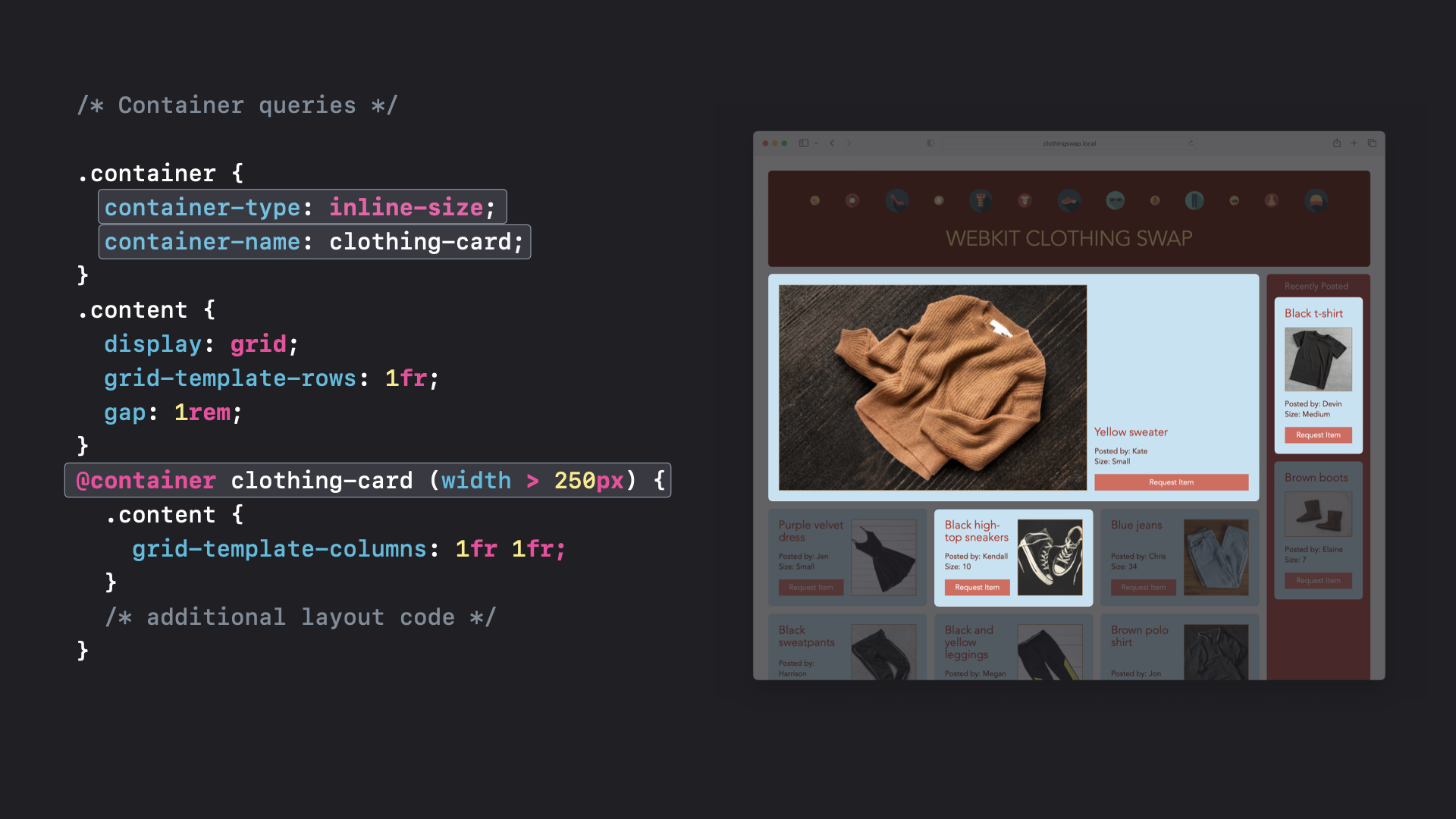
A single card component can appear in different places in the layout at different sizes — a large hero graphic, a medium size displayed in rows, and a small version for the sidebar.
By including Size Queries and Container Query Units in Interop 2023, we can ensure the web has interoperable implementations across browsers.
Containment
Containment in CSS improves performance by limiting calculations of layout, style, paint, size (or any combination) to an isolated segment of the DOM instead of the entire page. The Focus Area includes the contain, contain-intrinsic-size, and content-visibility CSS properties. They are used to help the browser make optimization decisions. For example, content-visibility: auto is a convenient way to defer element rendering until the content becomes relevant to the user by scrolling to it, find-in-page, tab order navigation, etc.
CSS Pseudo-classes
This Focus Area covers a collection of CSS pseudo-classes: :dir(), :nth-child(), :nth-last-child(), :nth-of-type(), :nth-last-of-type(), :modal, :user-valid and :user-invalid.
The :nth-child(n of <selector>) and :nth-last-child(n of <selector>) pseudo-classes are particularly interesting. For example, :nth-child(2 of .foo), matches the 2nd element that has the class .foo among all the children. Here’s an example you can try in Safari, where this feature has been supported since 2015.
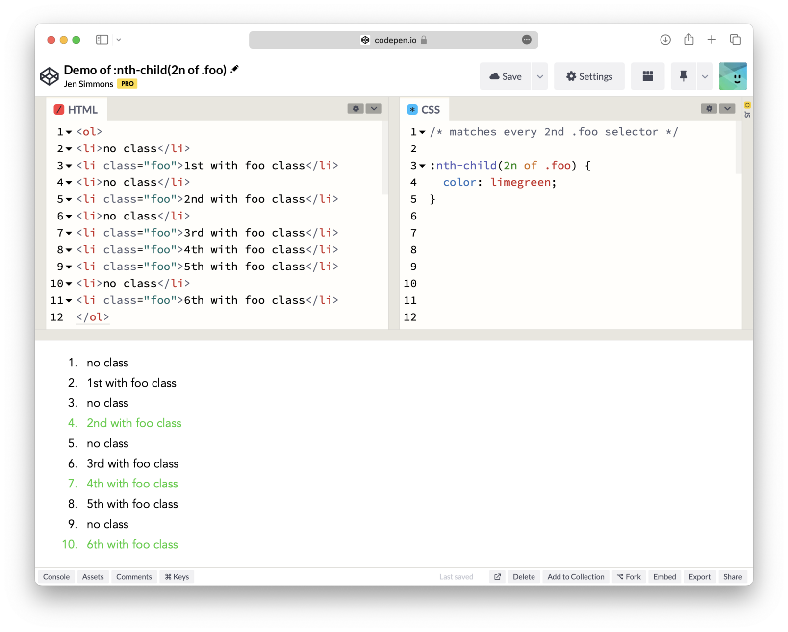
If you want to count from the bottom, use :nth-last-child(n of <selector>).
It’s a particularly exciting time to add new and improve existing CSS pseudo-classes, because they can be used inside :has() — exponentially increasing their usefulness.
Custom Properties
The @property at-rule extends the capabilities of CSS variables much further by allowing developers to specify the syntax of the variable, the inheritance behavior, and the variable initial value. It allows developers to do things in CSS that were impossible before, like animating gradients or specific parts of transforms.
@property --size {
  syntax: "<length>";
  inherits: false;
  initial-value: 0px;
}
With @property support, developers can declare custom properties in a fashion that’s similar to how browser engines define CSS properties.
Flexbox
This flexible one-dimensional layout solution for arranging items in rows or columns has been around for over fifteen years. Over that time, the Flexbox specification has matured with both slight behavior changes and updated clarifications of precise details. This year’s Flexbox Focus Area expands on previous years, adding the latest WPT tests. Staying ahead of new unevenness in implementations maintains developer confidence in this widely-used layout technology.
Font Feature Detection and Palettes

Font feature detection extends Feature Queries by adding two functions for testing which font formats and technologies are supported by a browser. Developers can write statements like @supports font-format(woff) { ... } or @supports font-tech(color-COLRv0) { ... } to conditionally apply CSS only when WOFF fonts or COLRv0 are supported.
Color fonts provide a way to add richness to designs without sacrificing the benefits of using regular text. Regardless of how decorative a color font is, the underlying text is always searchable, copy/paste-able, scalable, translatable, and compatible with screen readers.
Font palettes provide a mechanism for web developers to alter the color palette used by a color font. The font-palette property provides a way for web developers to select one of several different predefined color palettes contained inside a color font — for example, to declare that a font’s dark color palette be used for the site’s dark mode design. The @font-palette-values rule provides a way for web developers to define their own custom color palette for recoloring color fonts. Learn more by reading Customizing Color Fonts on the Web.
Forms
Setting written text vertically can be commonplace in languages like Japanese and Chinese. Support for vertical text has been available in browsers for several years, but support for vertical text in form fields has been missing. Interop 2023 is a commitment by the industry to change that with vertical writing mode support in input, textarea, and select menus.
The 2023 Forms Focus Area also carries over the tests from Interop 2022. This includes tests for the appearance property, form, events on disabled form controls, input elements, form submission, and form validation.
Grid
CSS Grid is another layout tool even more powerful than Flexbox. The ability to divide the page into regions and define the relationship of content to areas of the grid offers unparalleled control within a structured layout. Similar to Flexbox, the Grid Focus Area expands on work from Interop 2021 to ensure reliable layout and adoption of this powerful technology.
:has()
The :has() pseudo-class wasn’t considered for inclusion in Interop 2022, because it still wasn’t clear that it’s possible to implement a “parent-selector” in a performant way in browsers. Then in March 2022, Safari 15.4 proved it could be done.
This simple tool gives developers the long-awaited ability to apply styles to an ancestor based on the state of its descendant or sibling elements. It’s a powerful way to reduce the need for JavaScript, and something that will be most useful once it’s implemented interoperably in all browsers. That makes it important to include in Interop 2023. Learn about how powerful :has() can be by reading Using :has() as a CSS Parent Selector and much more.
Inert
Inert subtrees were first used by the modal dialog element to prevent user interaction with content that appears behind opened dialogs. The Inert Focus Area covers the new inert attribute, which expands this capability to all HTML elements. When an element is marked as inert, it’s no longer editable, focusable or clickable; and it’s hidden from assistive technologies. Read Non-interactive elements with the inert attribute to learn more.
Masking
CSS Masking provides several mechanisms to mask out part of an image or clip off part of a box. They have both been supported in browsers for a long time, but like many things implemented long ago there are painful differences between browsers. This is exactly the kind of developer pain point that Interop 2023 addresses. The Masking Focus Area includes improving CSS clipping and masking behaviors, including their use in animations and with SVG content.
Math Functions
CSS Math Functions help developers create complex calculations to style complex layouts or control animations without the need for JavaScript. Interop 2023 includes:
- Exponential functions:
pow(),sqrt(),hypot(),log(),exp() - Sign-related functions:
abs(),sign() - Stepped value functions:
round(),mod(),rem() - Trigonometric functions:
sin(),cos(),tan(),asin(),acos(),atan(),atan2()
Support for all of these CSS math functions first appeared on the web in Safari 15.4.
Media Queries 4
As most front-end web developers know, CSS Media Queries provide the mechanism for applying CSS depending on the size of the viewport or other qualities of the device. The most recent level of the specification, Media Queries level 4, adds new syntax for combining and modifying queries, plus a simplified range syntax that makes it easier for developers to write complicated queries. This new syntax matches the options available in Container Queries.
The and, not, and or conditionals make complex queries more readable. The new range syntax offers a more straightforward pattern for declaring a viewport range. For example, @media (500px <= width < 900px) { ... } applies when the viewport width is equal to 500px or between 500px and 900px, but not equal to 900px.
Modules
The Modules Focus Area includes support for Modules in Web Workers, Import Maps and Import Assertions.
JavaScript Modules allow web developers to import and export variables, functions, and more. Import Maps give web developers the ability to control the behavior of JavaScript imports. And Import Assertions add syntax for module import statements to indicate the expected module type to help protect sites from unintentionally running malicious JavaScript.
Motion Path
CSS Motion Path (also known as Offset Path) is used to describe a path for an element to follow. It’s powerful when combined with CSS transformations, and especially helpful with CSS animations — making it possible to code complex movements in CSS and avoid JavaScript performance costs. This Focus Area covers offset, offset-anchor, offset-distance, offset-path, offset-position, and offset-rotate.
Offscreen Canvas
When using Canvas, rendering, animation, and user interaction usually happen on the main execution thread of a web application. Offscreen Canvas provides a canvas that can be rendered off screen, decoupling the DOM and the Canvas API so that the <canvas> element is no longer entirely dependent on the DOM. Rendering can also be run inside a worker context, allowing developers to run tasks in a separate thread and avoid heavy work on the main thread.
The combination of DOM-independent operations and rendering off the main thread can provide a significantly better experience for users, especially on low-power devices.
This Focus Area also includes requestAnimationFrame() in web workers which can be used alongside OffscreenCanvas to perform other rendering and animation related tasks off the main thread.
Pointer & Mouse Events
Pointer events are DOM events that are fired for a pointing device. They are designed to create a single DOM event model to handle pointing input devices such as a mouse, pen/stylus or touch (one or more fingers).
Last year, the Interop 2022 team took on an Investigation into the state of pointer and mouse events. Older incomplete web standards had led to many differences between browsers, operating systems, and devices. The 2022 Investigation project took on a mission to assess what can be done to increase interoperability, and chose a set of specific tests to reflect what browsers can improve.
The 2023 Focus Area now includes 16 tests that cover pointer and mouse interaction with pages, including how they behave with hit testing and scrolling areas. Touch and stylus are not included since additional WPT test infrastructure is needed before the appropriate devices can be tested.
Scrolling
The Scrolling Focus Area is a carryover from Interop 2022. There’s more work to do to increase interoperability, so everyone agreed to include it again. The effort includes Scroll Snap, scroll-behavior, and overscroll-behavior.
Scroll Snap provides the tools for designers and developers to control how interfaces scroll and how content appears. The scroll-behavior property sets the behavior for a scrolling box when scrolling is triggered by navigation or CSSOM scrolling APIs. And the overscroll-behavior property determines what a browser does when reaching the boundary of a scrolling area.
Subgrid
Subgrid is another Focus Area from Interop 2022 which the team agreed to carry over. Getting an interoperable implementation of Subgrid across all browsers will take layout on the web to the next level, fully realizing the vision of CSS Grid.
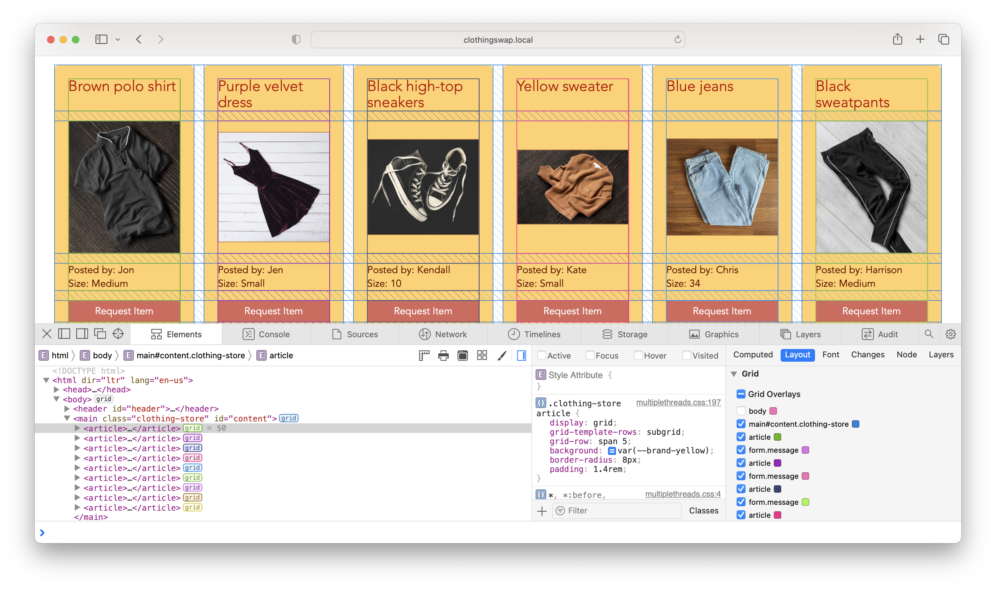
Subgrid provides an easy way to put grandchildren of a grid container on that grid. It makes it possible to line up items across complex layouts, without any regard for the DOM structure.
Transforms
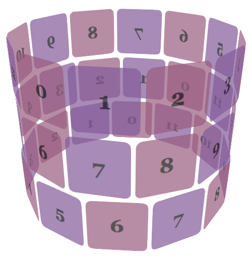
CSS Transforms is a Focus Area continued from Interop 2021. Often used in animations, CSS Transforms provide a mechanism for transforming boxes in two- or three-dimensional space. Historically, 3D transforms have been tied to how the rendering engine handles layers. Over the last two years, engineers at Firefox, Chrome and Safari have been closely collaborating to especially improve the interoperability of 3D. By continuing to keep attention on this area, Interop 2023 aims to raise the number of tests that pass in all three browser engines up from its current 92.8%.
URL
URLs are a fundamental part of the web. Without them, the web would not exist. But like many things invented very early in the history of the web, they are something that haven’t been fully interoperable. To improve this, the WHATWG wrote a specification packed with details on precisely how URLs should work. To further promote interoperability, URL is now a Focus Area for Interop 2023.
WebCodecs (video)
The WebCodecs API gives web developers complete control over how media is processed by providing low-level access to the individual frames of a video stream and chunks of audio. This is especially useful for applications that do video or audio editing, video conferencing, or other real-time processing of video or audio. For Interop 2023, this Focus Area includes the video processing portion of WebCodecs.
Web Compat 2023
Similar to Interop 2022, this year’s project includes a Focus Area named “Web Compat”. It’s a grab bag of various bugs known to cause website compatibility issues, and features that, if missing, are most likely to make a website work in one browser and not in another.
Last year’s effort was incredibly successful. The 2022 tests now have 96.9% interoperability across all three browser engines, with a score of 100% in two of the three browsers. Because of that success, the tests from Web Compat 2022 are now retired as a “Previous Focus Area”.
For 2023, a whole new set of tests have been selected. They include tests for Regex Lookbehind, inline editing, event dispatching on disabled controls, CSS image-set, white-space, and text-emphasis.
Web Components
Web Components is a suite of technologies for creating reusable custom elements, with encapsulated functionality. This Interop 2023 Focus Area includes Constructable stylesheets, adoptedStyleSheets, ElementInternals, Form-associated Custom Elements, and the basic behavior of Shadow DOM & Custom Elements.
2023 Investigation Projects
There are two Investigation efforts planned for 2023. Both are projects to improve the testing infrastructure of WPT, so that Interop 2024 can potentially include a wider range of technology.
One effort will take a look at how to test the interoperability of browser engines on mobile operating systems. The other will take a look at how to test the interoperability of accessibility-specific web technology.
Our Ongoing Commitment to Interoperability
We continue to believe that interoperability is one of the fundamental pillars that makes the web such a successful platform. WebKit’s efforts in Interop 2022 demonstrate how deeply we care about the web. We are excited to again collaborate with our colleagues in seizing this opportunity help websites and web apps work better for everyone.