Subgrid:
how to line up elements to your heart’s content
When Grid became widely available across browsers in 2017, it was an absolute game changer. It allowed us to create flexible, complex layouts using straightforward language, helping us more easily articulate our designs and bring them to life. But sometimes, we don’t just need a grid — we need a subgrid.
Subgrid is not new, but the recent State of CSS survey results showed that it was something that was still confusing to people, so we thought we’d circle back and show an easy way to understand what’s happening. It’s been supported by the major browsers for a while now, so it’s safe to use.
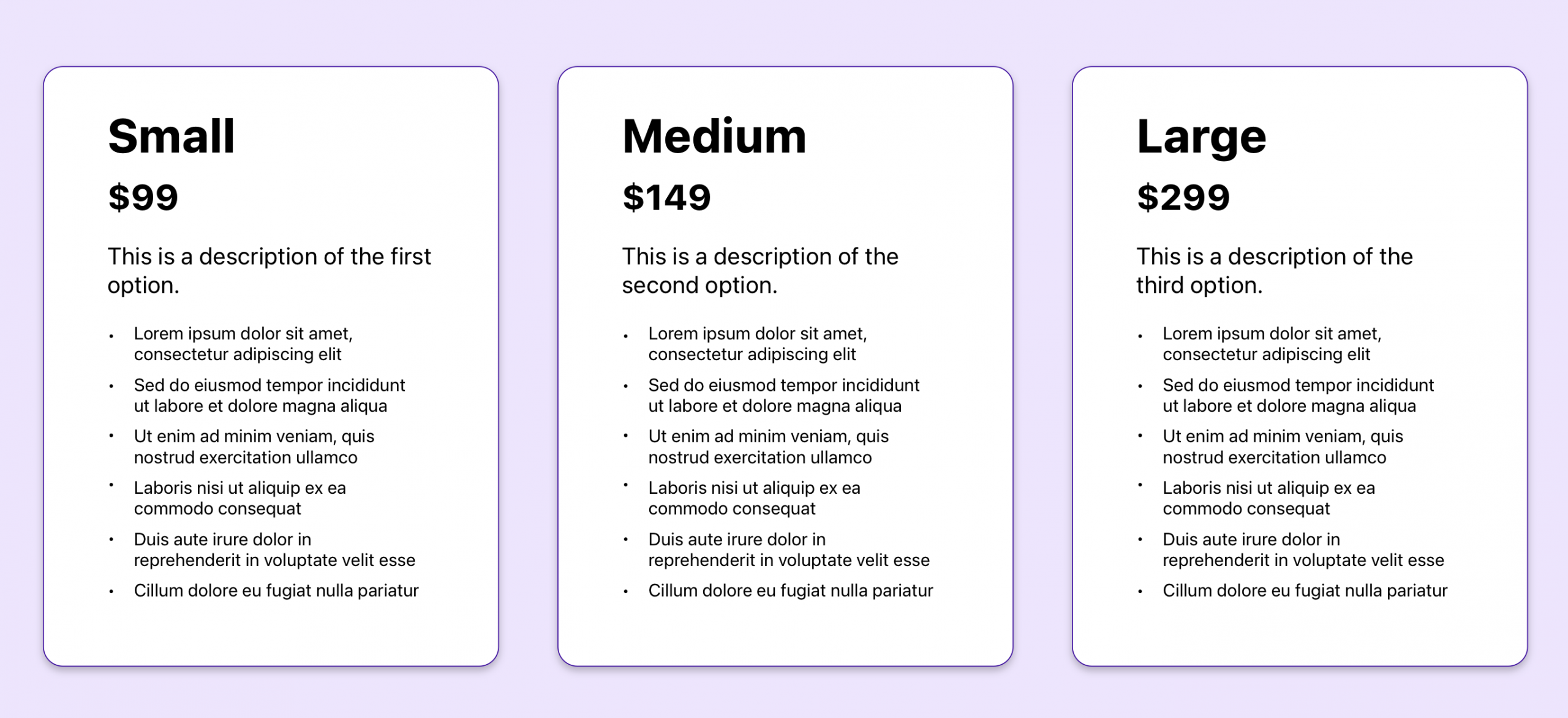
Let’s look at an example of a pricing page to find out why you might need a subgrid. We’ll start with three pricing options with a few elements explaining the details of each option. Here, we have our first grid — the parent grid — the one that divides the space into three columns, one for each pricing option.
The code might look like this:
.pricing-options {
  display: grid;
  grid-template-columns: repeat(3, minmax(0, 1fr));
  column-gap: 2em;
}
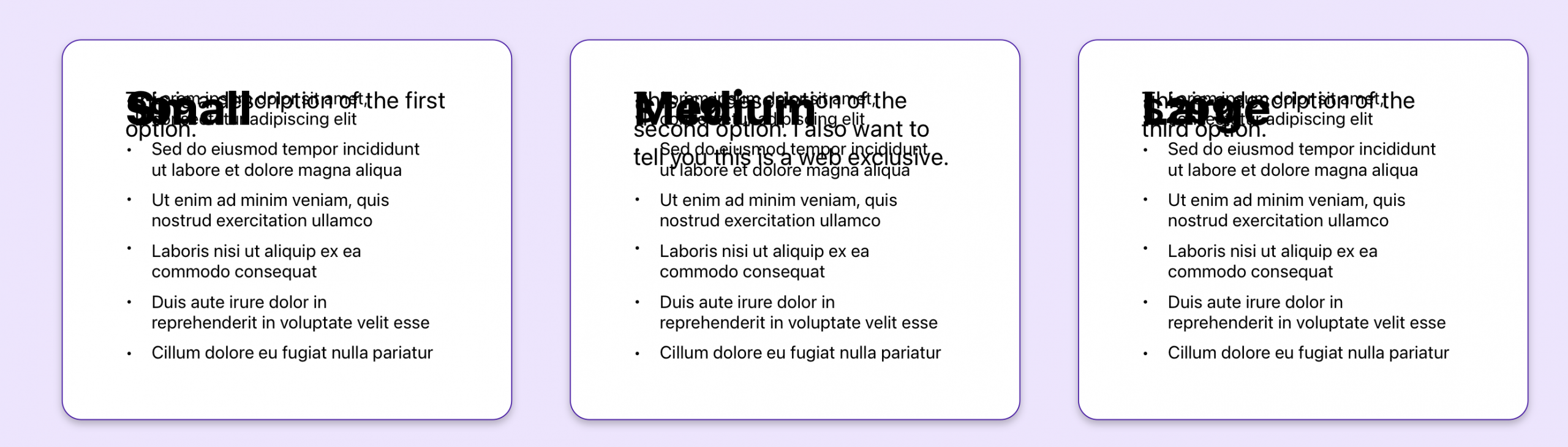
So far, so good. We’re just working with basic Grid. But wait! Here comes marketing and they want to add more info to the description of the middle option. No problem, let’s add that now.

Uh-oh, we do have a problem. Those extra words made the description so long that it pushed everything beneath it down, and now the content no longer aligns. What we want is for the product names to line up, the prices to line up, the descriptions to line up, the bullet points to line up, regardless of different heights between columns. We want to put these elements in a grid system that works across all three pricing options.
This is where subgrid comes in. Subgrid allows us to define rows and columns in the parent grid and then apply them in a nested grid. That way, each column is using the same grid and they’re able to align with each other. Here’s how it works.
If we look at the html, we have the element pricing-options where I’ve declared my parent grid. The pricing-options element has three card elements, one for each option. To apply subgrid, we’re going to first give my card element its own grid value.
.card {
    display: grid;
}
Next, I need to decide where I want to apply my subgrid value. I can apply it to the rows, the columns, or both. In this case, I want the rows of my elements to line up with each other, so I’m going to apply subgrid to my rows:
.card {
    display: grid;
    grid-template-rows: subgrid;
}
This is telling my card element to use the rows laid out in my parent element. But wait, we never set up rows in our parent grid! Let’s do that now. I have four distinct sections in my card that I want to line up, so I’m going to create four corresponding rows in my parent grid:
.pricing-options {
  display: grid;
  grid-template-columns: repeat(3, minmax(0, 1fr));
  column-gap: 2em;
  grid-template-rows: repeat(4, auto);
}
Great, we’re almost there. But if I pause and check my page at this point, things look a little messy:
Yikes! Not exactly what we’re going for. All of our elements have been squished onto just one row. That’s because, while we’ve defined the rows in our parent grid, we haven’t yet told our card element to use them.
And that’s the final step. We’ll use the grid-row property to tell our card to make use of all four rows:
.card {
    display: grid;
    grid-template-rows: subgrid;
    grid-row: span 4;
}
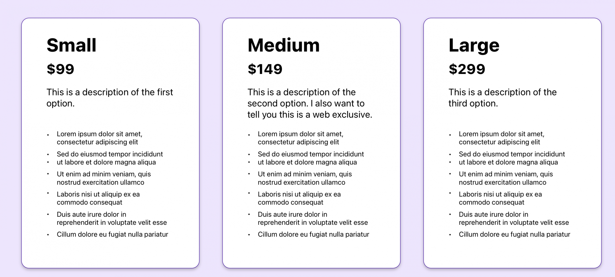
And that should get us to our final result: three columns with all of their elements neatly aligned by a system defined in my parent grid and applied to my nested grid.
Subgrid is a helpful tool for a simpler example like this, but applies nicely to more complex layouts as well. It brings the power of grid to the child elements, leveraging a single system of rows and columns to more easily create structure for your page.
While it’s not brand new to the web, it may be a feature that’s less familiar or maybe a bit confusing. Hopefully this clears things up.
If you found this helpful or have more feedback, you can share your feedback with me, Saron Yitbarek, on BlueSky, or reach out to our other evangelists — Jon Davis, on Bluesky / Mastodon, and Jen Simmons, on Bluesky / Mastodon. You can also follow WebKit on LinkedIn. If you find a bug or problem, please file a WebKit bug report.