CSS Grid:
A helpful mental model and the power of grid lines
Grid is a powerful, flexible tool that brings complex layouts to life. While it’s not new, and has been around for eight years, there’s so much to learn that it can still feel confusing and overwhelming to work with.
What’s the right mental model for thinking about Grid? What do all the new terms mean? What’s with that “/” anyway? If you have these questions and struggle to wrap your head around Grid, you’re not alone. There’s a lot of stuff to learn. Let’s see if we can unpack and explore it together, and make grid a little more comfortable to use.
When we think of laying out content on a webpage, we might start by listing out all of our elements in HTML. Then we use CSS to move and adjust them into place, changing their flow on the page, tweaking the space between them, until they’re finally in their right positions.
But with Grid, I want to try something different.
Instead of starting with that list of elements and shifting them around, we’re going to use a mental model to first focus on the container holding our elements.
Let’s think of our grid like we’re creating a brand new spreadsheet.
When you start a new document, depending on the software, you might have to first declare that it’s going to be a spreadsheet. Similarly, to use Grid we need to declare that the display for our container will be grid, like this:
.products {
  display: grid;
}
Before we put our data into a spreadsheet, we first think about what that spreadsheet will look like. We’ll probably start with the columns — what columns do we need to hold our data? If we’re working with a list of products, will the columns contain prices, discount codes, descriptions, launch dates?
Then we’ll think about the rows — how many rows of data do we need to contain everything? Once we have a sense of these columns and rows, we can decide where to place our data.
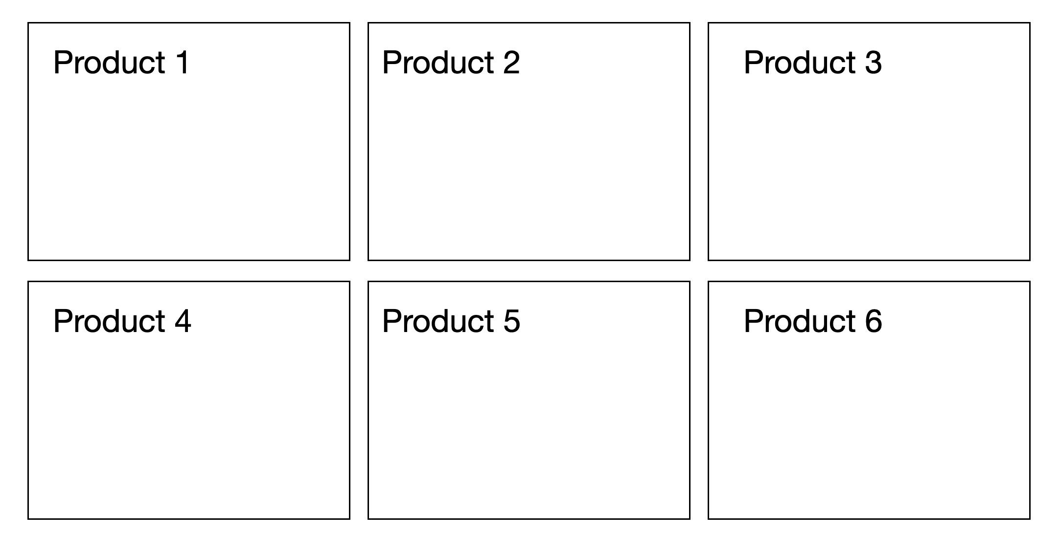
Similarly, our grid comes with columns and rows that we determine upfront. If I’m working on a grid of products, I might think about how many products I have and how that translates to columns and rows. I have six products, so I’m going to have three columns and two rows. And I’m going to throw in a grid-gap so I have some cushion. That should look good.
Here’s what that code might look like:
.products {
   display: grid;
   grid-template-columns: 1fr 1fr 1fr;
   grid-template-rows: 1fr 1fr;
   grid-gap: 2em;
}
Let’s dissect this code a bit further.
Here, I’m using fr for my values, which stands for fractional unit, and tells my CSS to divide the space up into fractions. While I don’t know exactly how wide I want each column to be, and that width should change anyway when the viewport width changes, I know that I want three equal columns. So, using my fr, I can divide up the width into three equal fractional units: 1fr 1fr 1fr.
Let’s now move on to something that might not be immediately intuitive. Why is it called grid-template-columns anyway? Why not just grid-columns? What does “template” mean in this context?
This was one of the new vocabulary of Grid that tripped me up when I first saw it. I constantly had to look up the syntax for setting columns and rows.
When it comes to columns and rows, there are actually several Grid properties that reference them.
The first, grid-template-columns and grid-template-rows reference the columns and rows on the container, the top-level element of our little grid world. The word “template” is meant to reference a sort of blueprint we’re creating — at the highest level, we are defining a template that the children within our container will adhere to. That template outlines the structure and creates the rules of our grid.
The second pair of properties is grid-row and grid-column. Unlike our first properties, these don’t refer to our container. Instead, we drop down to the children. These properties allow us to place individual items into certain rows and columns. I’ll show you how a bit later.
And the third set of properties are the auto properties: grid-auto-rows and grid-auto-columns. These allow you to define the size of any extra rows and columns for content you might not have planned for. So in my products example, I may start with six products, but since my team is always working on new ones, I might want to prepare for a future where I add a few more products. In that case, if I wanted them to take the same 1fr of space, I would set that property to 1fr , like this:
.products {
   display: grid;
   grid-template-columns: 1fr 1fr 1fr;
   grid-template-rows: 1fr 1fr;
   grid-gap: 2em;
   grid-auto-rows: 1fr;
}
Now let’s get back to my grid.
Just like I would think about my rows and columns in my spreadsheet, I’ve thought about and determined the rows and columns of my grid. Let’s explore other elements of our mental model.
In my spreadsheet, my rows and columns are separated by lines. In Grid, these are called my grid lines. Separating my columns are column grid lines, and separating my rows are row grid lines.
While we know that the cells moving from left to right (or right to left) are my rows and the cells going up and down are my columns, rows and columns are more generically known as “tracks”.
And if I have multiple cells grouped together spanning different rows and columns, that’s a “grid area.”
That’s some of the introductory vocabulary to give you a foundation of how to think about grid. Now that you know what things are called, let’s try actually laying out come products and see what happens.
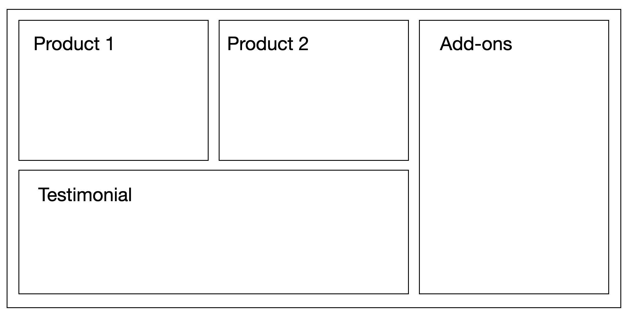
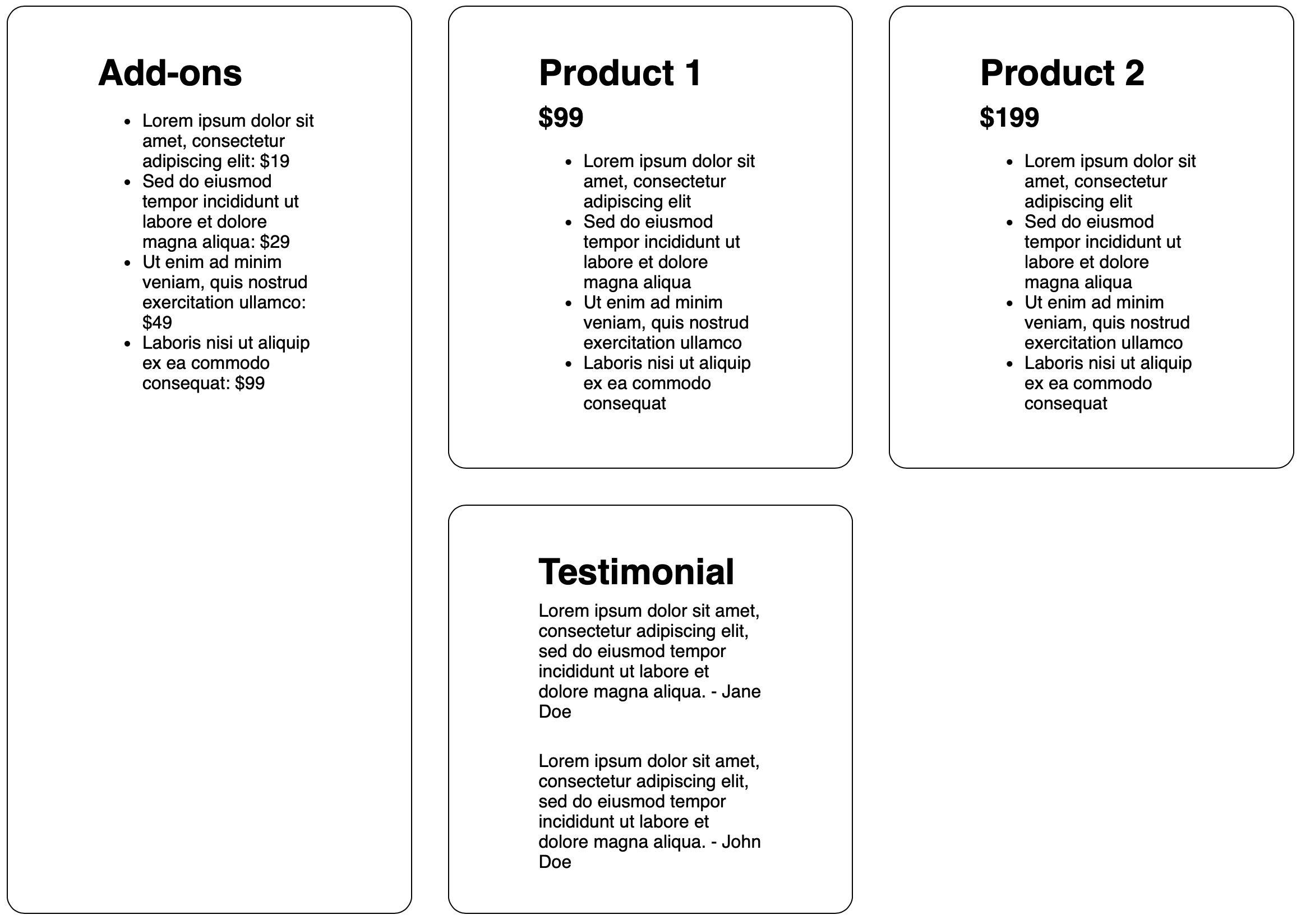
I started with six products, but I don’t think I want to display all six right now. Instead, I’m going to feature my two best sellers, have a section for add-ons, and include a testimonial at the bottom. The design I have in mind might look something like this:
Just like how we start our spreadsheet by thinking about the columns and rows, I need to create my grid and start with considering the columns and rows I’ll need, creating a template that my individual elements will use.
Looking at this mock up, I can see that I have three columns and two rows. But there’s some merging going on. Just like a spreadsheet can have merged cells, I see that one of my “cells,” the Add-ons, actually spans two rows. And my other “cell,” the Testimonial, spans two columns.
But before we implement this design, let’s see what Grid does all on its own. If we just designate our template rows and columns and do nothing else, where do our elements end up?
Here’s the code we’re starting with:
.products {
   display: grid;
   grid-template-columns: 1fr 1fr 1fr;
   grid-template-rows: 1fr 1fr;
   grid-gap: 2em;
}
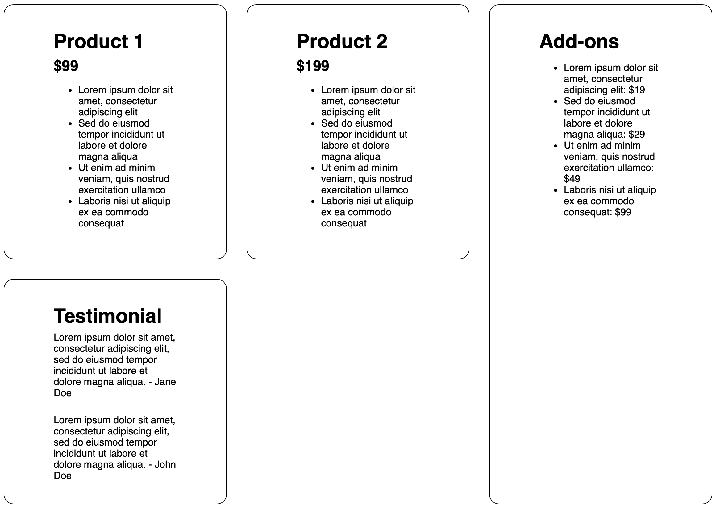
That’ll get us the following output:
Not too bad. The default behavior actually got us pretty far. Without us explicitly telling Grid where to put each element, it automatically placed the elements in the next available “cell” in our Grid, and when it ran out of column space, it wrapped around to the second row. Pretty close! This is one of the things that makes Grid so powerful — it offers a lot out of the box without us needed to be explicit.
Now we need to add the code to create the spanning action we have in our design.
This next step takes a little bit of upfront planning. Before I start merging and spanning things, I need to first establish my grid lines. But I’m going to take things a step further: I’m also going to number them.
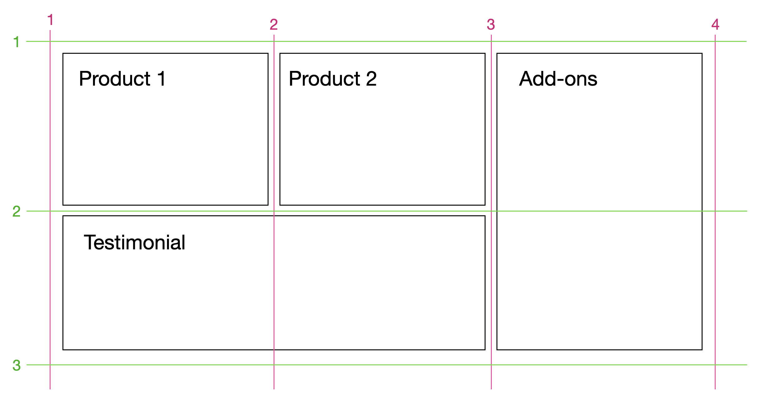
This is where our grid and the mental model of a spreadsheet start to differ. If I were to describe where Product 1 is located in a spreadsheet, I would describe it as being in the first column and the first row. In fact, in a spreadsheet, it’s these rows and columns that have labels. But in Grid, the most common way to position elements actually isn’t by using the rows and columns at all. Instead, we use the numbered grid lines to dictate where an element goes. We don’t say “the first column,” we say “between the first and second column grid lines.”
If we compare our mockup with our output, there are only two elements whose placement we need to update: Add-ons and Testimonials. Let’s look at Add-ons first.
Here, we want to keep the default behavior of the columns — it should stay between the 3 and 4 column grid lines. But we want the height to span both rows. Put in grid line lingo, we want the element to start at row grid line 1 and end at row grid line 3. Let’s write the code to make that happen.
.add-on {
   grid-row: 1/3;
}
Let’s see what that looks like.
Something interesting happened! We got the spanning across rows we wanted, but now my Add-on section has jumped to first place. That’s because Grid prioritized explicitly positioned elements over implicitly positioned ones. Since right now, Add-on is the only element with any kind of explicit positioning, it gets priority positioning in my grid. But I don’t want that. So I need to add an explicit column positioning to get it back where I want it. Let’s do that now.
Since we’re positioning based on grid lines, we’re going to explicitly put our Add-on between the 3 and 4 column grid lines, like this:
.add-on {
   grid-row: 1/3;
   grid-column: 3/4;
}
That’ll get us this output:
Wonderful. Three elements placed, one more to go.
Here, we’re going to use grid lines once again. We’re going to have my Testimonial section start at row grid line 1 and go all the way to row grid line 3. Let’s code that now:
.testimonial {
   grid-column: 1/3;
}
And we get this output:
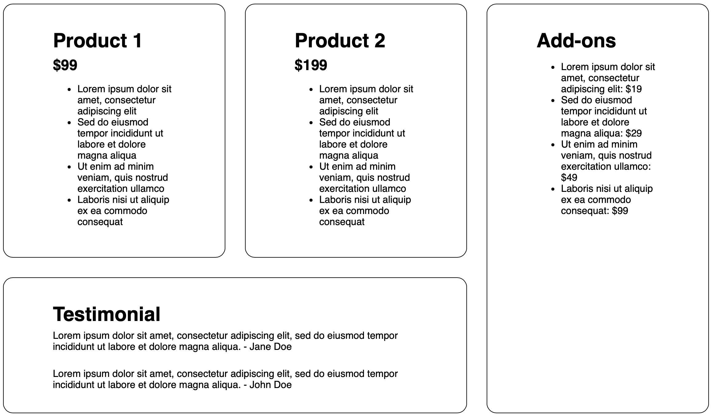
And just like that, we have our elements laid out just like our mockup.
We spent a lot of time in this article laying the foundation for Grid, establishing some important vocabulary that we later used to implement our own grid design. The biggest takeaway here, and the concept that tripped me up the most when I first learned Grid, is the importance of using those grid lines to place and span elements.
But that isn’t the only way to place items. You can also use something called grid areas that might feel a little more intuitive. We’ll cover that next.
If you found this helpful or have more feedback, you can share your feedback with me, Saron Yitbarek, on BlueSky, or reach out to our other evangelists — Jon Davis, on Bluesky / Mastodon, and Jen Simmons, on Bluesky / Mastodon. You can also follow WebKit on LinkedIn. If you find a bug or problem, please file a WebKit bug report.